Working with Prompts
This page is a guide to prompts in Plotly Studio, which can be used to guide initial app generation and to make updates to a generated app.
When you generate an app in Plotly Studio, the app has the following configurable setup and components, which are accessible from menu options in the sidebar on the left.
- Data: How the data for the app is loaded and processed, for example, details on data types and data cleaning.
- Layout: How the app is structured, what components it includes, and the size and order of those components. The layout also includes the app title and description.
- Theme: The styles and theme for the app, for example, details on typography, and background and text colors.
- Filter Component: Global app filters, which are used to filter data cards, tables, and charts. This is the only component in the app that updates other components.
- Data Cards: Cards used for highlighting important KPIs and at-a-glance statistics.
- Data Table: How the table with the app's data is displayed in the app, for example, how it is paginated and what interactive features are available.
- Charts: Charts, including the type of chart, what controls they have, and how data is displayed within them.
Prompt vs specification
Each element in the Setup, Components, and Charts sections has a prompt and a specification.
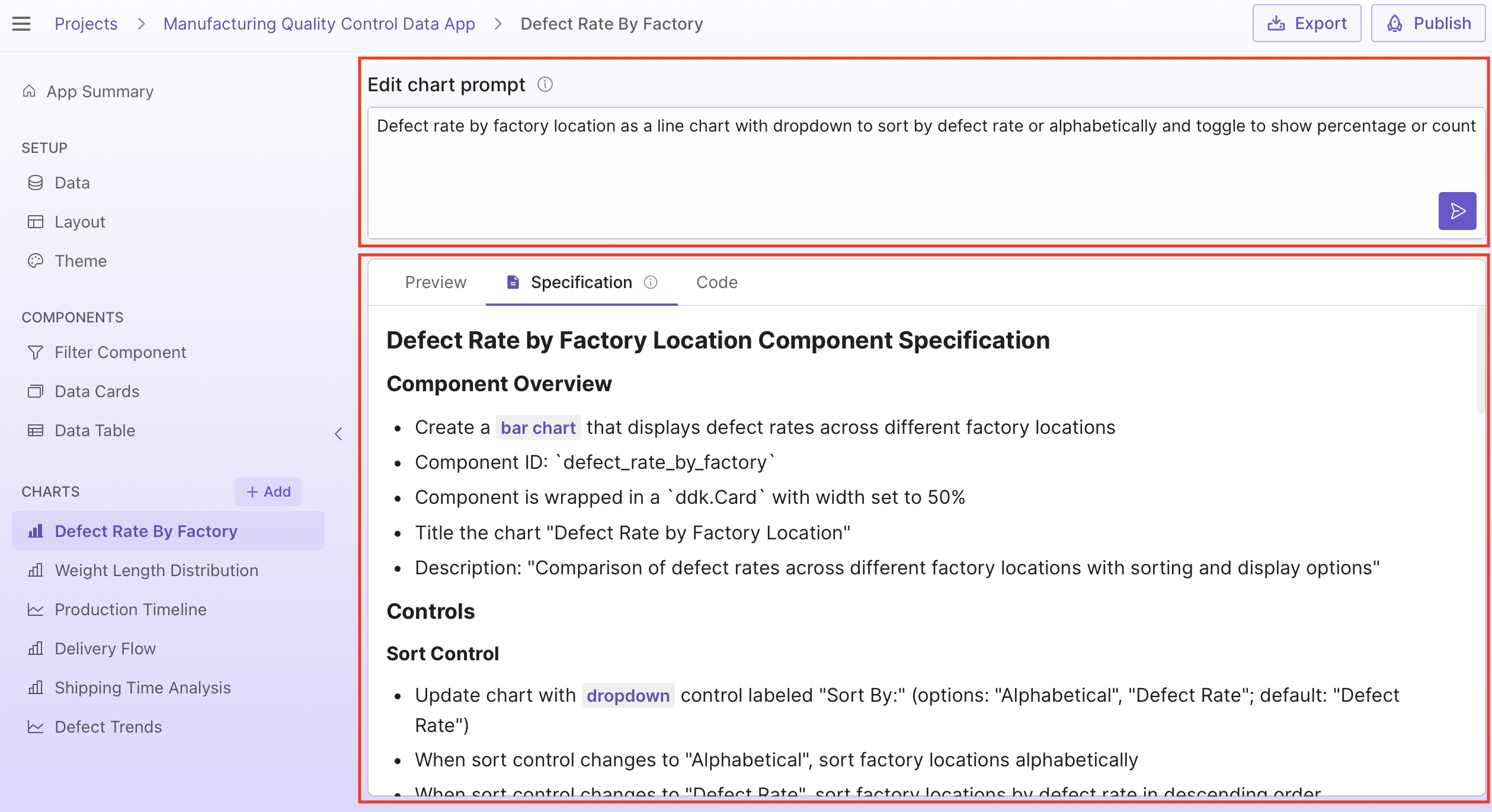
A prompt is an editable summary of the component or setup section you are editing. It can be used to make focussed edits or more broads edits. For example, you can change controls on a chart by updating the prompt.
The specification is not editable and is generated based on the prompt. It is a natural language description of the code generated by Plotly Studio. The specification is useful for quickly checking how certain rules or calculations are applied, without having to read the code. The specification can also be very useful when recreating a chart from scratch, as it is a more detailed description of how the chart should be generated.
What happens when you update a prompt
When you update a prompt, Plotly Studio generates a new specification using this new prompt, and you'll get an updated app. When you make an update to the prompt, Plotly Studio sends the updated prompt to the LLM along with the following additional information:
- The data profile
- The previous prompt
- Plotly best practices
Note: The existing app specification is not used to generate the new specification. If there are specific features of the app that you want to retain from the existing specification, add them to the new prompt.
The data profile is information about the dataset. The data profile is:
- The number of rows and columns.
- Column names.
- Up to 10 sample values per column.
- The null count, range, mean, and median for integer, datetime, and float columns.
- The null count, unique values, string length, alphabetical range, and most common values for string columns.
Prompt examples
The following section demonstrates just some of the data, layout, theme, and chart customizations that are possible in Plotly Studio using natural language.
Data
Go to Data under Setup to update how data for the app is loaded and processed. The following example updates handling of null values, changing from filtering out rows with all null values to rows with any null values:
Filter out rows where any values are null
You can also update the data prompt to create new columns. For example, using the built-in dataset, this prompt creates a new column that shows the number of days between two dates:
Create a new column "Days_to_ship" using Shipped_date - Created_date
Tip
Go to the Specification tab in Data to see a detailed view of how data for the app is loaded and processed.
Theme
Go to Theme under Setup to update the styles and theme for the app, for example, details on typography, and background and text colors. The following example updates the colors and typography used throughout the app:
Modern customer analytics theme with purple and teal color scheme emphasizing engagement and insights, clean sans-serif typography, and gradient accents for professional business intelligence
Tip
You can also make styling changes for specific components or charts. However, Plotly Studio apps generally look better with a consistent theme, so we recommend applying theming changes in the theme section.
Data table
Go to Data Table under Components to update it. The following example freezes a specific column in a dataset with many columns:
Freeze the "Ticker" column
Some more ideas to customize the table:
- Apply conditional formatting:
Apply conditional formatting to volume column: yellow background for values > 1, 000, 000. - Change table pagination options:
Show 30 rows by default, with pagination options for 30, 60, 90.
The data table uses Dash AG Grid and also supports other features shown in the Dash AG Grid documentation.
Charts
Go to a specific chart under Charts to update it. Here you can customize the chart, for example, update the type of chart, what controls they have, and how data is displayed within them. The following example updates a pie chart to use a donut-like pie chart with a sector pulled out for a specific sector. It also changes an existing dropdown to a radio items filter:
Customer segment distribution as a donut-like pie chart with radio items to filter by loyalty tier (Bronze, Silver, Gold, Platinum) and toggle to show percentages
Pull out the VIP sector from the pie chart.
Chart types
Plotly Studio uses the Plotly.py graphing library for charts, giving you access to many different chart types in Plotly Studio. Some examples of supported chart types include scatter, line, bar, pie, sunburst, and maps.
Subplots
You can display separate stacked charts or subplots within the one chart card. For example, with a stock market dataset:
Display selected stock prices as separate stacked charts
Axes
Plotly charts have configurable axes. For example, you can change the axes labels:
Use "Location" as the x-axis label. Use "Defect percentage" as the y-axis label
Some more ideas to customize the axes:
- Customize the tick labels on an axis. For example, rotating the tick labels angle:
Rotate the x-axis tick labels 45 degrees. - Configure axis label or tick label fonts:
Change the x-axis and y-axis titles to use Times New Roman, 20px. - Turn off gridlines (
Don’t show gridlines) or style the grid lines,Use LightPink for x and y axis gridlines. - Use multiple y-axes:
Add a second y-axis that shows ....
Legends
The appearance, positioning, and orientation of legends in Plotly charts all configurable. You can, for example, set a legend title:
Give the legend the title: "Category"
Some more ideas to customize the legend:
- Show or hide the legend:
Hide the legend. - Group legend entries:
Group legend items by ... - Change the legend orientation (vertical or horizontal):
Use a vertical legend.
Markers
Markers on scatter charts are customizable. You can, for example, set a marker size:
Use a marker size of 20px
Some more ideas to customize markers:
- Add a border to markers:
Add a 5px darkred border to markers. - Use a custom marker. For example, request one of the custom markers available in Plotly.py:
Use diamond markers.
Text and annotations
Add text labels to the markers
Some more ideas for text and annotations:
- Add text annotations:
Add a text annotation at ... - Style and color annotations:
Style the annotation: “White text 20px on a blue background.
Tips and tricks
- When making prompt updates, copy info from the specification if there are parts of an element that you'd like to reuse.
- If you encounter issues when updating chart prompts, try copying the prompt and creating a new chart from it.
- Save prompt updates that you know work well so you can reuse them later.
Additional resources
See the Plotly Studio section in the community forum for examples of what other users are creating and to share your own prompts and app examples.