Scatter Plots
Scatter plots are useful for showing the relationship between columns. Scatter plots in Plotly Studio are highly customizable - you can map additional columns to color and marker size, and apply styles and customizations like trend lines, opacity, and axis labels.
Writing prompts for Plotly Studio
You can create charts in Plotly Studio using natural language in different ways:
Ask a question - great for exploring your data:
Which factory produces the heaviest products?
Use a quick one-line prompt - concise and conversational:
Compare average weight by factory
Write structured detailed prompts - precise control and consistency:
Average Weight by Factory

Chart:
- Type: bar
- X: Factory location
- Y: Average weight

Data:
- Aggregation: average of weight by Factory location
Structured detailed prompts give you more control over chart type, data mappings, aggregations, and styling. Most examples on this page use this format.
Basic scatter example
Here's an example of how to structure a prompt to plot two columns against each other to see their relationship.
The prompt specifies the chart type as well as the names of the columns from the dataset to use for the X and Y axes:
<Chart Title>

Chart:
- Type: scatter
- X: <Column Name>
- Y: <Column Name>
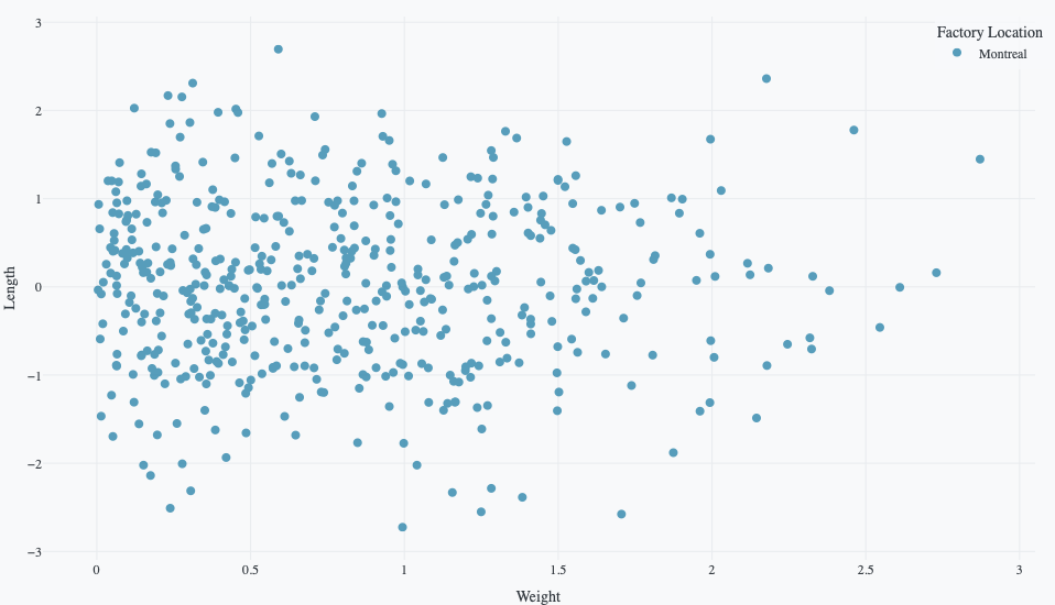
The following example uses this prompt structure with the "weight" and "length" columns from the built-in Plotly Studio dataset:
Weight vs Length

Chart:
- Type: scatter
- X: Weight
- Y: Length
Color by category example
Use color to show different values of a categorical column and identify patterns.
<Chart Title>

Chart:
- Type: scatter
- X: <Column Name>
- Y: <Column Name>
- Color: <Column Name>
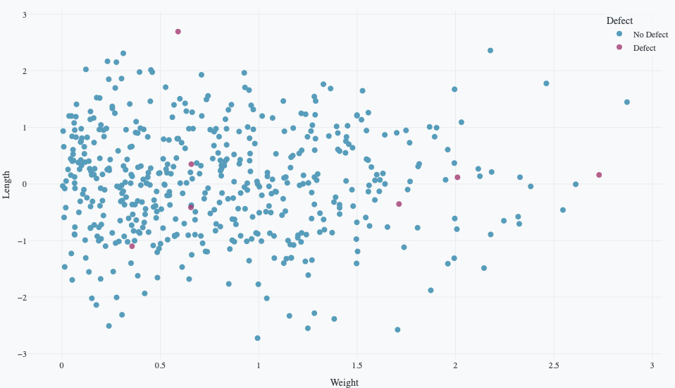
The following example uses this prompt structure with the "weight", "length", and "defect" columns from the built-in Plotly Studio dataset:
Weight vs Length by Defect

Chart:
- Type: scatter
- X: Weight
- Y: Length
- Color: Defect
Color with a numerical value
Use color to show a continuous numerical column or calculated field with a color gradient. This is useful for visualizing how a third variable changes across your scatter plot.
<Chart Title>

Chart:
- Type: scatter
- X: <Column Name>
- Y: <Column Name>
- Color: <Column Name>
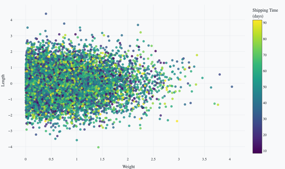
The following example plots "weight" vs "length", colored by a computed "shipping_time" field, using the built-in Plotly Studio dataset:
Weight vs Length by Shipping Time

Chart:
- Type: scatter
- X: Weight (weight)
- Y: Length (length)
- Color: Shipping time (shipping_time)

Data:
- Computed field: "shipping_time" calculated as the difference between shipped_date and created_date in days
Size by column
Vary marker size based on a numeric column to add a third dimension to a scatter plot.
<Chart Title>

Chart:
- Type: scatter
- X: <Column Name>
- Y: <Column Name>
- Size: <Column Name>
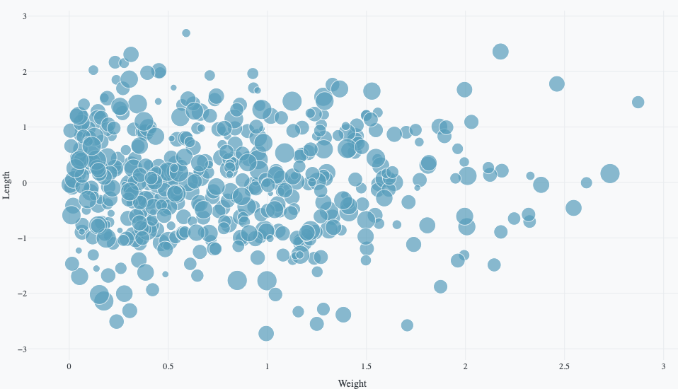
The following example uses this prompt structure with the built-in Plotly Studio dataset to plot "weight" and "length", with marker size representing "shipping time" (calculated as a computed field):
Weight vs Length by Shipping Time

Chart:
- Type: scatter
- X: Weight
- Y: Length
- Size: Shipping time

Data:
- Computed field: Shipping time calculated as the difference between Shipped date and Created date in days
Note
This example uses a computed field to calculate shipping time from the difference between two date columns. We recommend specifying computed fields in a Data: section in your prompt.
Scatter plots with categorical axes
Earlier examples show numeric values on both chart axes, but other data types can also be mapped to the axes. A scatter plot where one axis is categorical is often known as a dot plot.
<Chart Title>

Chart:
- Type: scatter
- X: <Column Name>
- Y: <Column Name>
The following example uses this prompt structure with the factory_location and weight columns from the built-in Plotly Studio dataset:
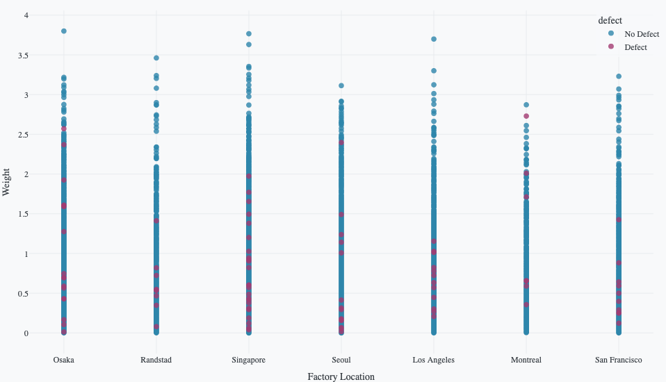
Factory Location vs Weight

Chart:
- Type: scatter
- X: Factory location
- Y: Weight
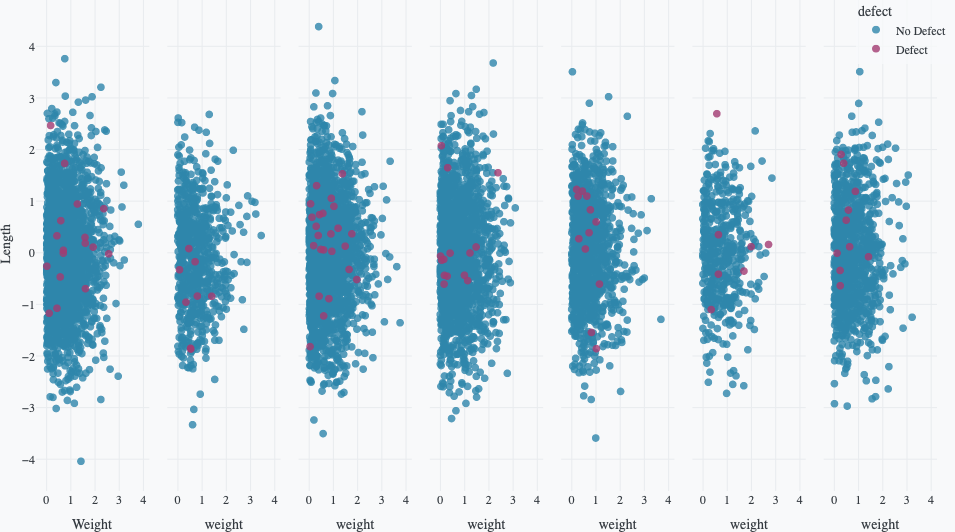
Facet plots by category
Facet plots, also known as trellis plots or small multiples, create multiple subplots with the same axes, where each subplot shows a different subset of the data. This helps you compare patterns across categories. You can arrange facets by columns (horizontally), by rows (vertically), or both.
<Chart Title>

Chart:
- Type: scatter
- X: <Column Name>
- Y: <Column Name>
- Facet columns: <Column Name>  # or use "Facet rows:" for vertical arrangement
The following example uses this prompt structure with the weight, length, and factory_location columns from the built-in Plotly Studio dataset:
Weight vs Length by Factory Location

Chart:
- Type: scatter
- X: Weight
- Y: Length
- Facet columns: Factory location
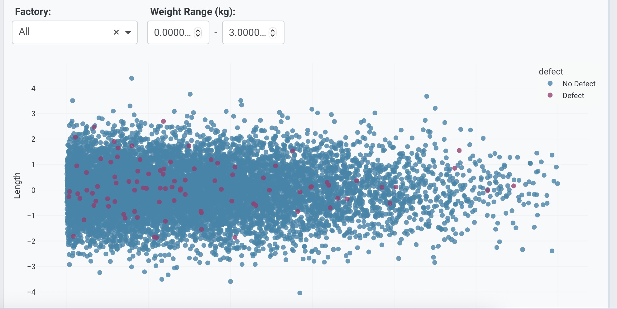
Interactive controls
Add dropdowns and other controls to make your scatter plots interactive. Controls let users filter and explore the data dynamically.
Weight vs Length by Defect

Chart:
- Type: scatter
- X: Weight
- Y: Length
- Color: Defect

Options:
- Dropdown to select factory (All, Osaka, Seoul, Singapore, Los Angeles, Montreal, Randstad) - Default All
- Dropdown to filter by Weight range (All, 0-1 kg, 1-2 kg, 2-3 kg) - Default All
Prompt keywords reference
Use these keywords and phrases in your prompts to customize your scatter plot.
Chart
Use a Chart: section in your prompt to define the basic structure of your scatter plot, including the chart type and how columns map to visual properties.
Chart:
- Type: scatter
- X: Weight
- Y: Length
- Color: Defect
- Facet columns: Factory location
Here are some keyword suggestions to use in this section:
| Keyword/Phrase | Description | Example |
|---|---|---|
| Type | Specify the chart type as scatter | Type: scatter |
| X | The column to show on the horizontal axis | X: Weight |
| Y | The column to show on the vertical axis | Y: Length |
| Color | Color points by different groups or values | Color: Factory location |
| Size | Make scatter points larger or smaller based on a value from the dataset | Size: Weight |
| Symbol | Map different marker shapes to categories | Symbol: Defect |
| Facet columns | Create multiple subplots side-by-side for each category | Facet columns: Factory location |
| Facet rows | Create multiple subplots stacked vertically for each category | Facet rows: Defect |
Data
Use a Data: section in your prompt to specify how to transform, filter, or aggregate your data before visualization.
Data:
- Computed field: Shipping days calculated as the difference between Shipped date and Created date in days
Here are some keyword suggestions to use in this section:
| Keyword/Phrase | Description | Example |
|---|---|---|
| Aggregation | Specify how to aggregate data | Aggregation: average of weight by Factory location |
| Computed field | Create new calculated fields from existing data | Computed field: Shipping days calculated as the difference between Shipped date and Created date in days |
| Filter | Filter data to show only specific records | Filter to show only defect = true |
Options
Use an Options: section in your prompt to add interactive controls that allow users to dynamically filter, transform, and visualize data without regenerating the chart.
Options:
- Dropdown to select factory (All, Osaka, Seoul, Singapore) - Default All
- Dropdown to filter by Weight range (All, 0-1 kg, 1-2 kg, 2-3 kg) - Default All
Here are some keyword suggestions to use with this section. See Chart Controls for a complete list of control types and additional examples.
| Keyword/Phrase | Description | Example |
|---|---|---|
| Dropdown | Add a dropdown menu to filter by categories | Dropdown to select factory (All, Osaka, Seoul) - Default All |
Chart styles
Use a Chart styles: section in your prompt to control the visual appearance and formatting of your scatter plot.
Chart styles:
- Use custom colors: #FF5733, #33FF57, #3357FF
- Set opacity to 0.5
- Add a linear trend line
- Label x-axis as "Product Weight (kg)"
Here are some keyword suggestions to use in this section:
| Keyword/Phrase | Description | Example |
|---|---|---|
| Custom colors | Specify exact colors for categories or gradients | Use custom colors: #FF5733, #33FF57, #3357FF |
| Marker size | Set a fixed size for all markers | Set marker size to 12 |
| Marker symbol | Set a specific shape for all markers. See marker style options | Use square markers |
| Marker opacity | How see-through the points are (0=invisible, 1=solid) | Set marker opacity to 0.5 |
| Text on points | Display text labels directly on data points | Show Serial number as text on points |
| Hover text | What to show when hovering over points | Show Serial number on hover text |
| Axis labels | Rename axis labels to be more readable | Label x-axis as "Product Weight (kg)"Label y-axis as "Product Length (cm)" |
| Background color | Set the background color of the plot | Set background color to lightblue |
| Grid lines | Show or hide grid lines on the plot | Hide grid lines |
| Color scale | Specify color scale for continuous color mapping. See built-in color scales | Use Viridis color scale |
| Trend line | Add a line showing the overall trend | Add a linear trend line |
| Logarithmic scale | Use log scale for large ranges (useful for exponential data) | Use logarithmic scale for the y-axis |
| Axis range | Set minimum and maximum values for axes | Set x-axis range from 0 to 3 |
| Legend | Control legend display and position | Show legend at top right |