Chart Controls
Interactive controls let users explore and filter data dynamically. Add dropdowns and other controls that update the chart in real-time.
Filter dropdowns
Add dropdown menus to filter chart data by specific categories or values.
<Chart Title>

Chart:
- Type: <chart_type>
- <axis mappings>

Options:
- Dropdown to filter by <Column Name> (<option1>, <option2>, <option3>) - Default <option1>
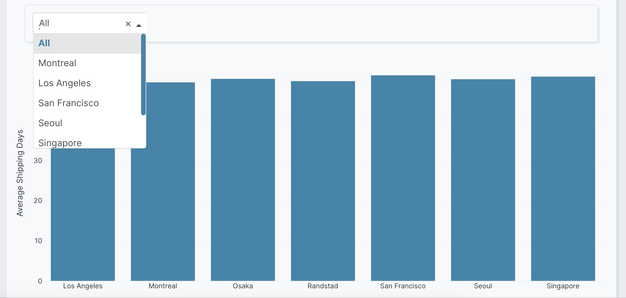
The following example uses this prompt structure with the delivery_location and factory_location columns from the built-in Plotly Studio dataset, along with a computed shipping_days field, to filter by factory location:
Average Shipping Time by Delivery Location

Chart:
- Type: bar
- X: Delivery location
- Y: Average shipping days

Data:
- Computed field: Shipping days calculated as (Shipped date - Created date) / 86400000
- Aggregation: mean of Shipping days by Delivery location

Options:
- Dropdown to filter by factory location (All, Montreal, Los Angeles, San Francisco, Seoul, Singapore, Osaka, Randstad) - Default All
Available control types
Plotly Studio supports controls from Dash Core Components. The following examples show some common controls using the built-in Plotly Studio dataset.
Date Range Terminology
Use "Latest" (not "Last") for time-based filters to reference dataset dates, not calendar dates.
Dropdown menus for filtering or selecting options. Can be single-value or multi-value.
Single-value:
Product Weight Analysis

Chart:
- Type: scatter
- X: Weight
- Y: Shipping days

Data:
- Computed field: Shipping days calculated as (Shipped date - Created date) / 86400000

Options:
- Dropdown to filter by factory location (All, Montreal, Los Angeles, San Francisco) - Default All
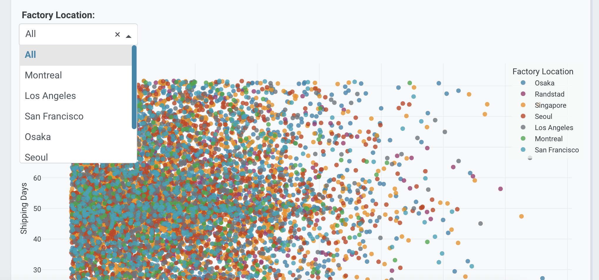
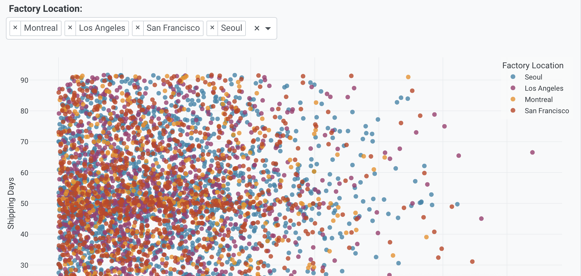
Multi-value:
Product Weight Analysis

Chart:
- Type: scatter
- X: Weight
- Y: Shipping days

Data:
- Computed field: Shipping days calculated as (Shipped date - Created date) / 86400000

Options:
- Multi-select dropdown to filter by factory location (Montreal, Los Angeles, San Francisco, Seoul) - Default All
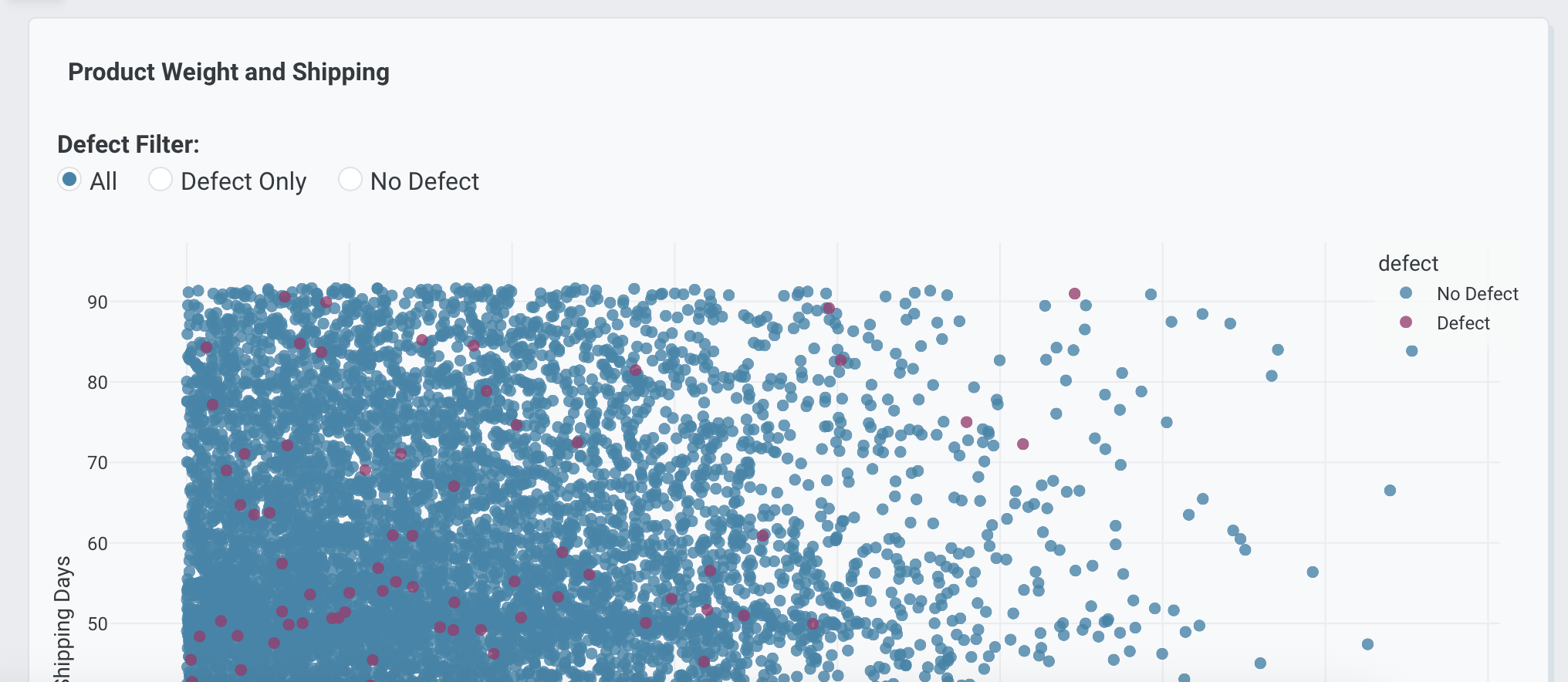
Radio buttons for mutually exclusive single selections.
Product Weight and Shipping

Chart:
- Type: scatter
- X: Weight
- Y: Shipping days

Data:
- Computed field: Shipping days calculated as (Shipped date - Created date) / 86400000

Options:
- Radio buttons to select defect filter (All, Defect Only, No Defect) - Default All
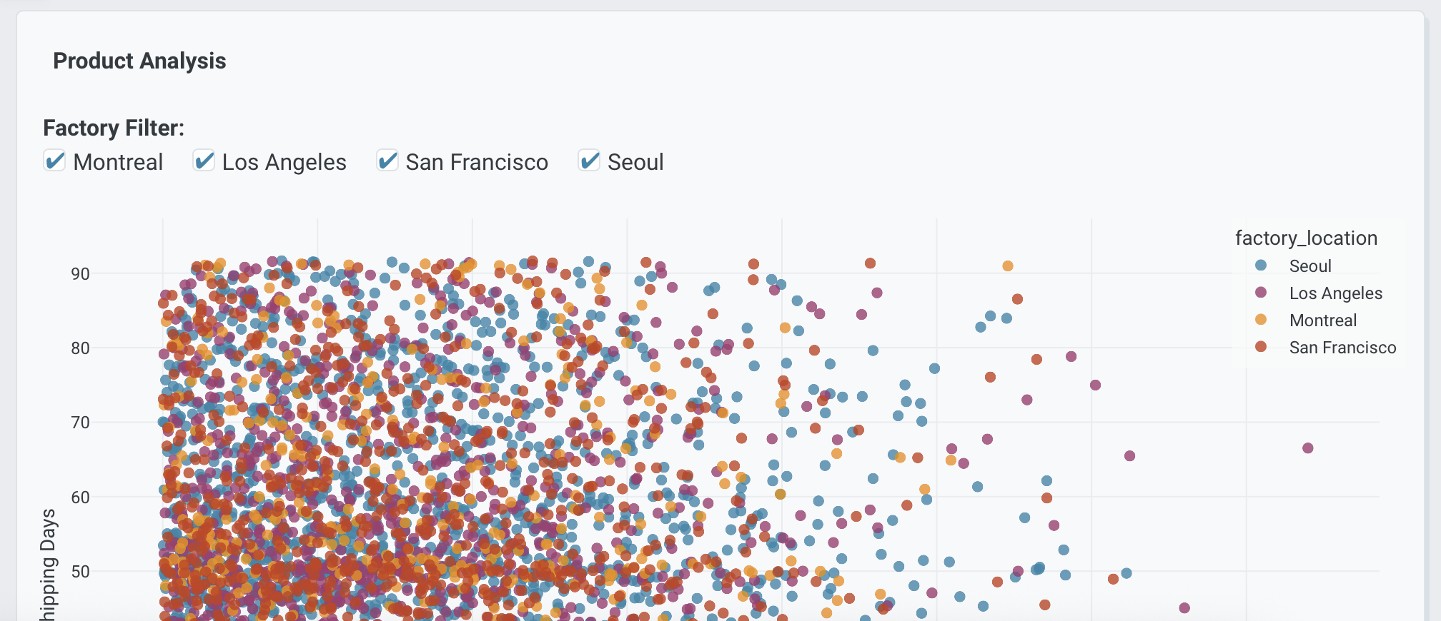
Checkboxes for selecting multiple options.
Product Analysis

Chart:
- Type: scatter
- X: Weight
- Y: Shipping days

Data:
- Computed field: Shipping days calculated as (Shipped date - Created date) / 86400000

Options:
- Checklist to select factories (Montreal, Los Angeles, San Francisco, Seoul) - Default All
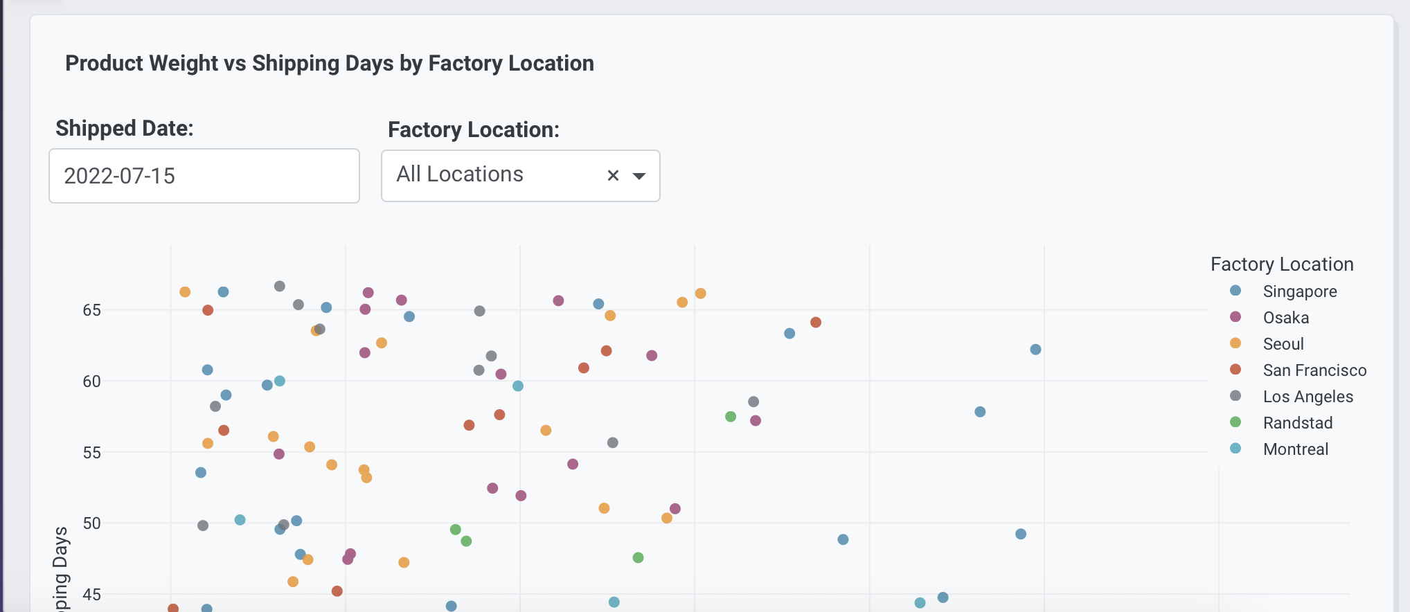
Single date picker for selecting one date.
Products Shipped on Date

Chart:
- Type: scatter
- X: Weight
- Y: Shipping days

Data:
- Computed field: Shipping days calculated as (Shipped date - Created date) / 86400000

Options:
- Date picker to select shipped date - Default 2024-01-01
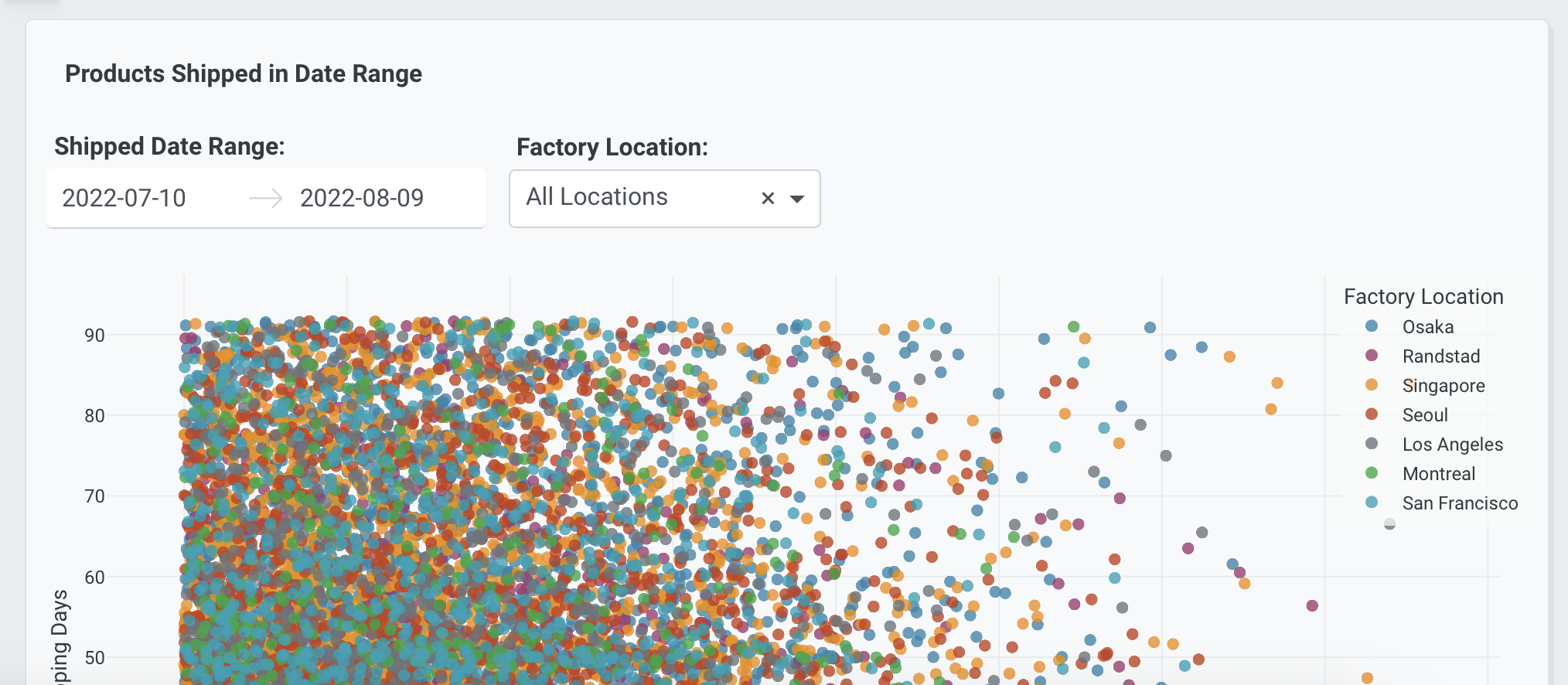
Date range picker for filtering between two dates.
Products Shipped in Date Range

Chart:
- Type: scatter
- X: Weight
- Y: Shipping days

Data:
- Computed field: Shipping days calculated as (Shipped date - Created date) / 86400000

Options:
- Date range picker to filter by shipped date range - Default Latest 30 days
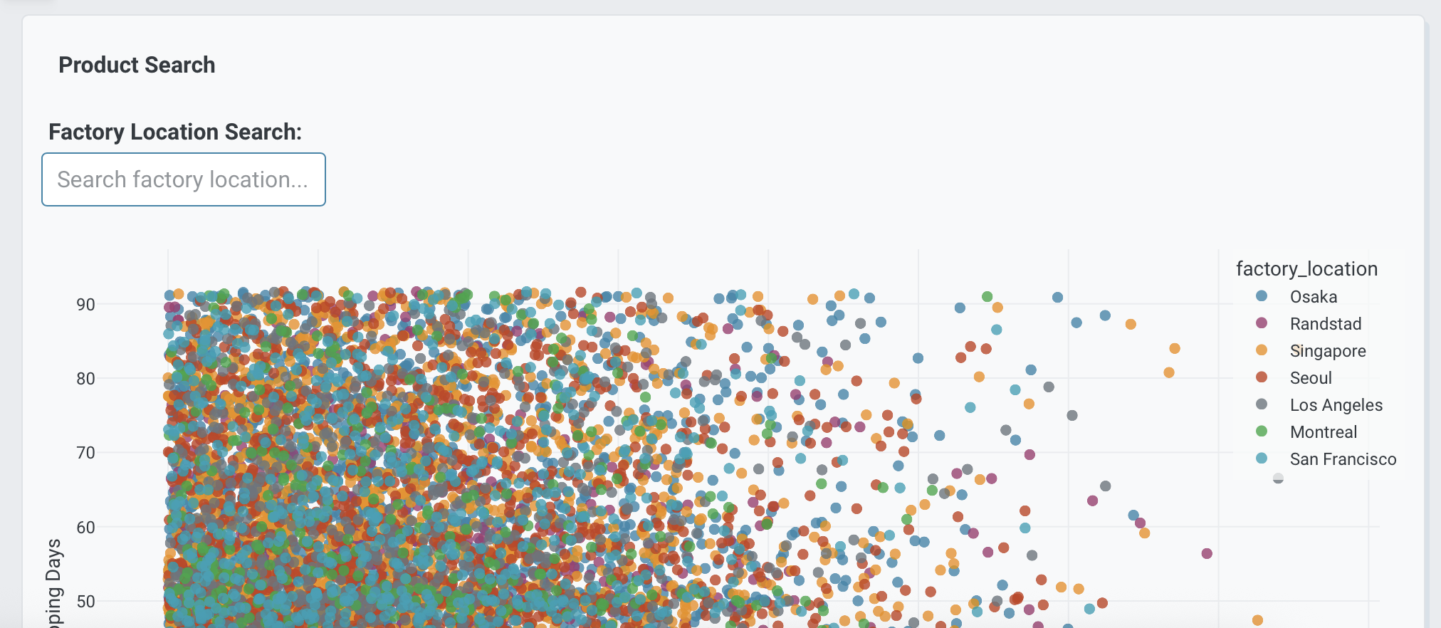
Text input field for custom values or search.
Product Search

Chart:
- Type: scatter
- X: Weight
- Y: Shipping days

Data:
- Computed field: Shipping days calculated as (Shipped date - Created date) / 86400000

Options:
- Text input to search by factory location - Default empty
Multiple filter dropdowns
Use multiple filter dropdowns for more control over the data used in the chart.
<Chart Title>

Chart:
- Type: <chart_type>
- <axis mappings>

Options:
- Dropdown to filter by <category1> (<options>) - Default <value>
- Dropdown to filter by <category2> (<options>) - Default <value>
The following example uses this prompt structure with the weight, defect, factory_location, and delivery_location columns from the built-in Plotly Studio dataset, along with a computed shipping_days field, with multiple filters:
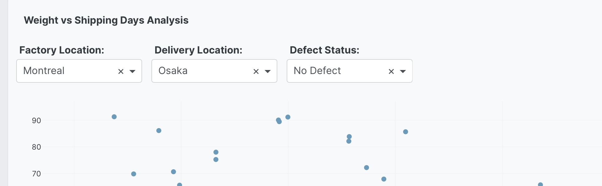
Product Distribution Analysis

Chart:
- Type: scatter
- X: Weight
- Y: Shipping days
- Color: Defect

Data:
- Computed field: Shipping days calculated as (Shipped date - Created date) / 86400000

Options:
- Dropdown to filter by factory location (All, Montreal, Los Angeles, San Francisco, Seoul, Singapore, Osaka, Randstad) - Default All
- Dropdown to filter by delivery location (All, Montreal, Los Angeles, San Francisco, Seoul, Singapore, Osaka, Randstad) - Default All
- Dropdown to filter by Defect status (All, No Defect, Defect) - Default All
Aggregation method dropdowns
Switch between different aggregation methods using a control.
<Chart Title>

Chart:
- Type: <chart_type>
- <axis mappings>

Options:
- Dropdown to select aggregation (Sum, Average, Count, Min, Max, Median) - Default <value>
The following example uses this prompt structure with the factory_location and weight columns from the built-in Plotly Studio dataset with dynamic aggregation:
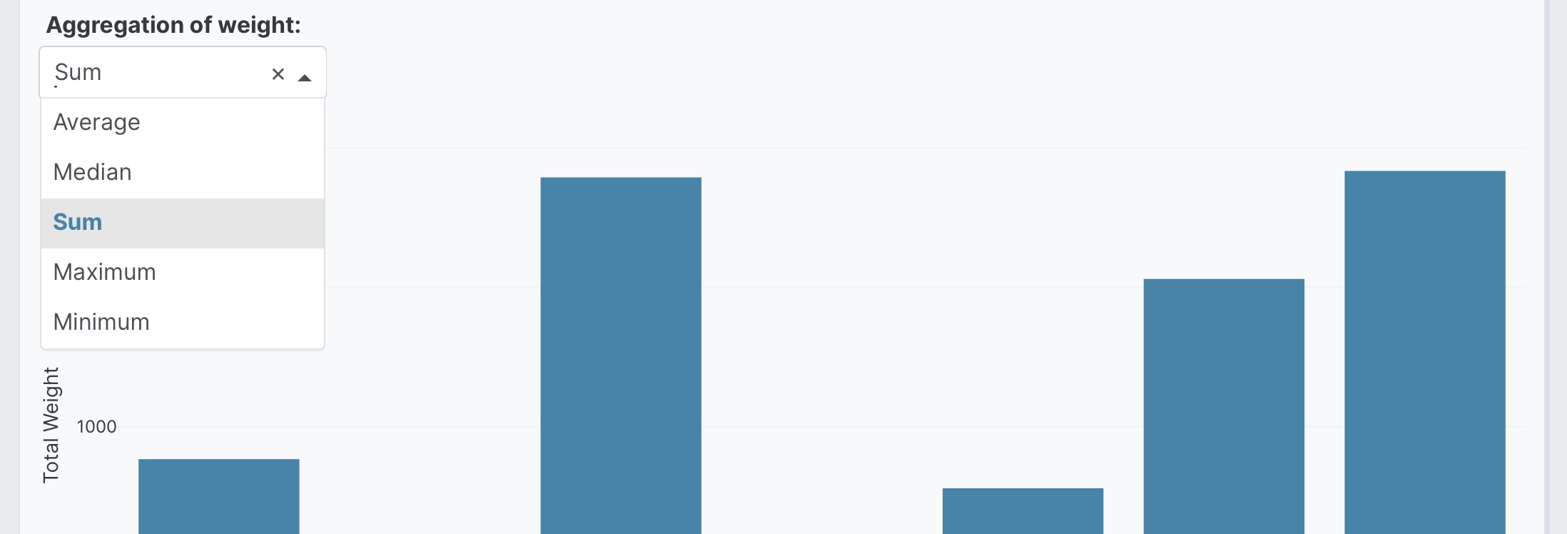
Product Weight Analysis by Factory

Chart:
- Type: bar
- X: Factory location
- Y: Weight

Options:
- Dropdown to select aggregation of weight (Sum, Average, Count, Min, Max, Median) - Default Average
Combining multiple control types
Combine different control types in the one chart.
<Chart Title>

Chart:
- Type: <chart_type>
- <axis mappings>

Options:
- <control_type_1>
- <control_type_2>
- <control_type_3>
The following example uses this prompt structure with the weight and defect columns from the built-in Plotly Studio dataset, along with a computed Shipping days field, with multiple control types:
Product Shipping Analysis

Chart:
- Type: scatter
- X: Weight
- Y: Shipping days

Data:
- Computed field: Shipping days calculated as (Shipped date - Created date) / 86400000

Options:
- Dropdown to select time range (Latest 30 days, Latest 90 days, Latest year, All dates) - Default Latest 90 days
- Radio buttons to filter by Defect status (All, Defect Only, No Defect) - Default All
- Dropdown to filter by factory location (All, Montreal, Los Angeles, San Francisco, Seoul) - Default All
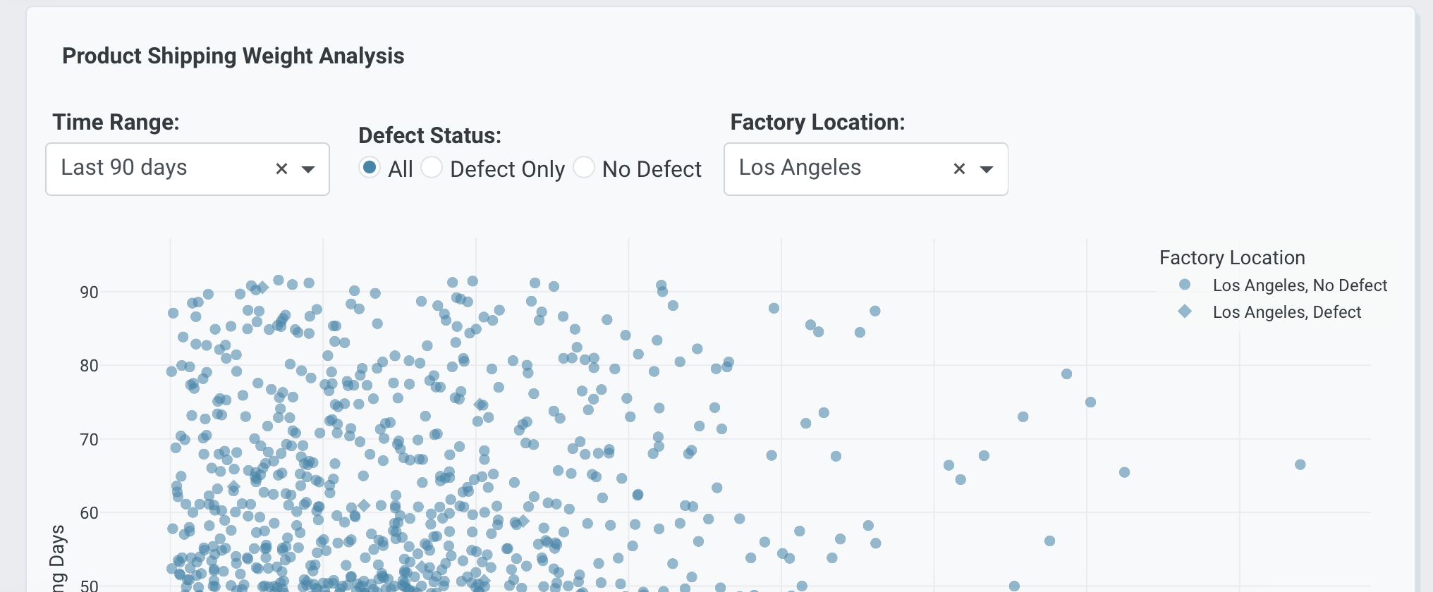
Chart type switching
Enable switching between chart types.
<Chart Title>

Chart:
- Type: <chart_type>
- <axis mappings>

Options:
- Dropdown to select chart type (<type1>, <type2>, <type3>) - Default <type1>
The following example uses this prompt structure with the factory_location column from the built-in Plotly Studio dataset with chart type selection:
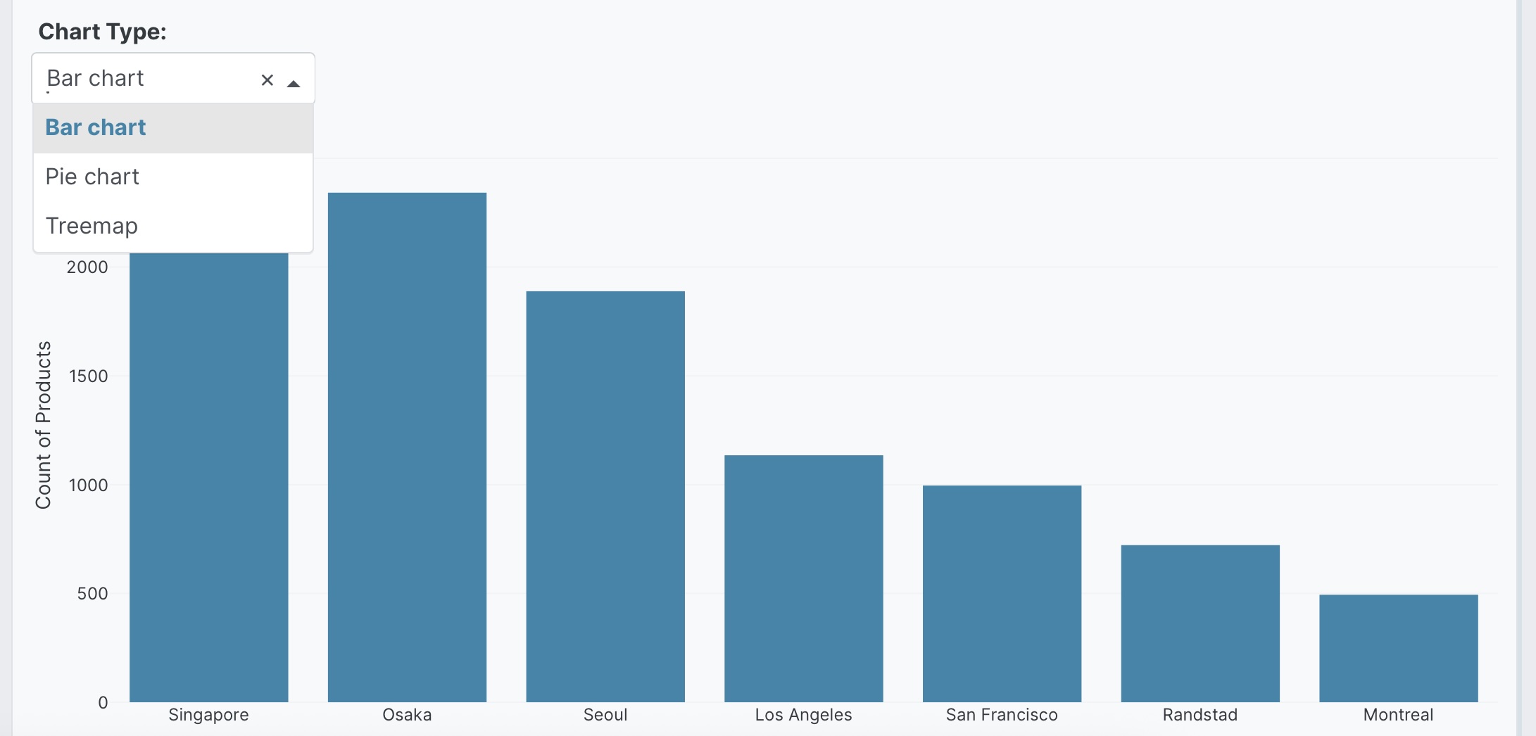
Factory Production Overview

Chart:
- Type: bar
- X: Factory location
- Y: Count of products

Data:
- Aggregation: count by Factory location

Options:
- Dropdown to select chart type (Bar chart, Pie chart, Treemap) - Default Bar chart
Prompt keywords reference
Use an Options: section in your prompt to add interactive controls.
<Chart Title>

Chart:
- Type: <chart_type>
- <axis mappings>

Options:
- <Control type> to <description> - Default <value>
Here are some keyword suggestions to use in this section:
| Keyword/Phrase | Description | Example |
|---|---|---|
| Dropdown to filter by | Add a dropdown menu to filter data by category | - Dropdown to filter by factory location (All, Montreal, Osaka) - Default All |
| Dropdown to select | Add a dropdown menu to switch between options | - Dropdown to select chart type (Bar, Line, Scatter) - Default Bar |
| Radio buttons | Add radio buttons for mutually exclusive options | - Radio buttons to select defect filter (All, Defect Only, No Defect) - Default All |
| Dropdown to select time range | Add date range filtering controls | - Dropdown to select time range (Latest 30 days, All dates) - Default All dates |
| Dropdown to select aggregation | Let users switch aggregation methods | - Dropdown to select aggregation (Average, Sum, Count) - Default Average |
| Multi-select dropdown | Add a dropdown that allows multiple selections | - Multi-select dropdown for factory location (Montreal, Osaka, Seoul) - Default All |
| Default | Set the initial value for any control | - Dropdown to filter by status (...) - Default All |