Custom Context
Custom context lets you provide instructions that guide the AI across all your projects. Your custom context is sent to the AI alongside Plotly's built-in best practices when generating chart suggestions, creating charts, updating prompts, or remixing components.
Include information about your preferences, standards, or any other instructions you want to provide to the AI. For example, you can use custom context for:
- Chart styling: Color palettes, templates, legends, gridlines, axis formatting
- Formatting and language: Date formats, number separators, currency, language for labels
- Branding: Disclaimers, captions, annotations, attribution text
- Business context: Industry, use case, author information, app audience information
- Calculations: Industry-specific calculations, calculation preferences
- Data source connection preferences: Authentication schemes, connection examples, data cleaning steps, Python library directives
- Custom chart types: Define domain-specific charts that appear as suggestions on the Explore page
Adding Custom Context
To set custom context:
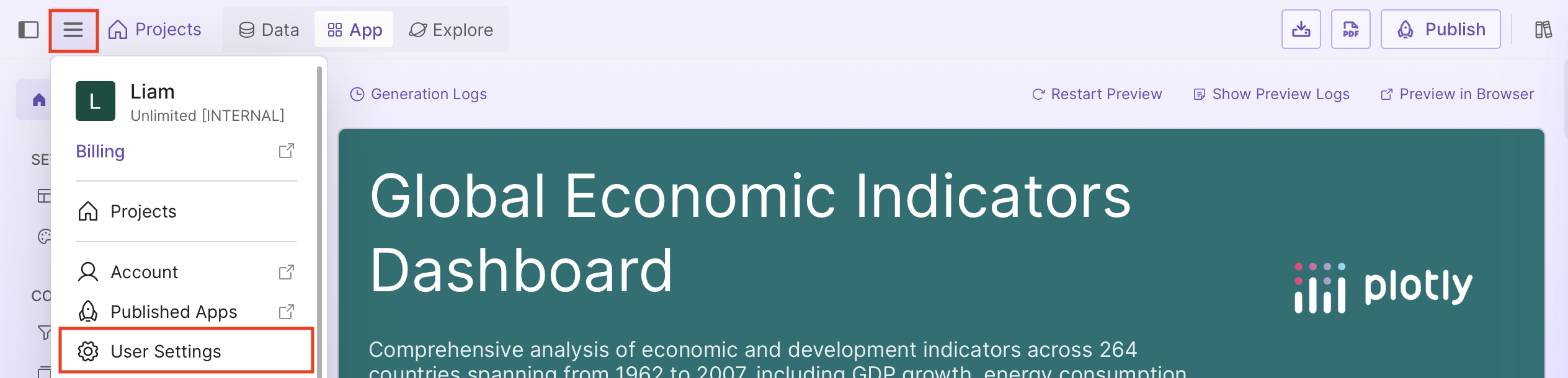
- Select the Settings icon in the sidebar, then select User Settings.
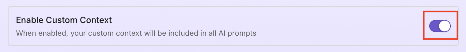
- If custom context isn't enabled, select Enable Custom Context.
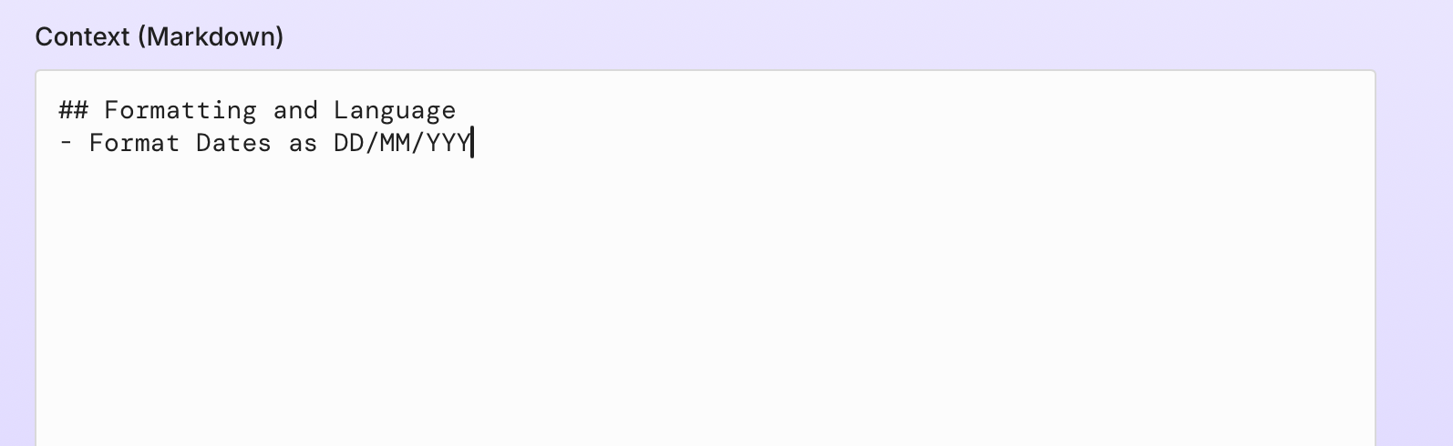
- In the Context field, add your custom context.
Tip
You can disable custom context at any time without deleting it. When disabled, your context won't be included in AI prompts.
Examples
Write clear, specific instructions that describe your preferences.
Chart styling
Define default chart templates, colors, and legend positioning:
## Chart Styling
- Hide gridlines
- Use this color sequence: ["#1f77b4", "#ff7f0e", "#2ca02c"]
- Place legends horizontally below chart
Formatting and language
Set date formats, number separators, and language:
## Formatting and Language
- Format dates as DD/MM/YYYY
- Use comma as decimal separator
- Use space as thousands separator (e.g., 1 234 567,89)
- Use French for the dashboard and charts
Branding
Set company colors and add standard annotations:
## Branding
- Use company colors: navy, steelblue, lightsteelblue
- Add "Source: Internal Data" annotation below charts
You can specify a logo for all your apps using @logoUrl:
@logoUrl https://example.com/your-logo.png
The logo can be overridden for individual apps in the layout editor.
Data source connection preferences
Set preferences for how data is processed and cleaned:
## Data Source Connection Preferences
- Fill missing numeric values with column average
- Remove rows with missing values in key columns
- Lowercase all column names on load
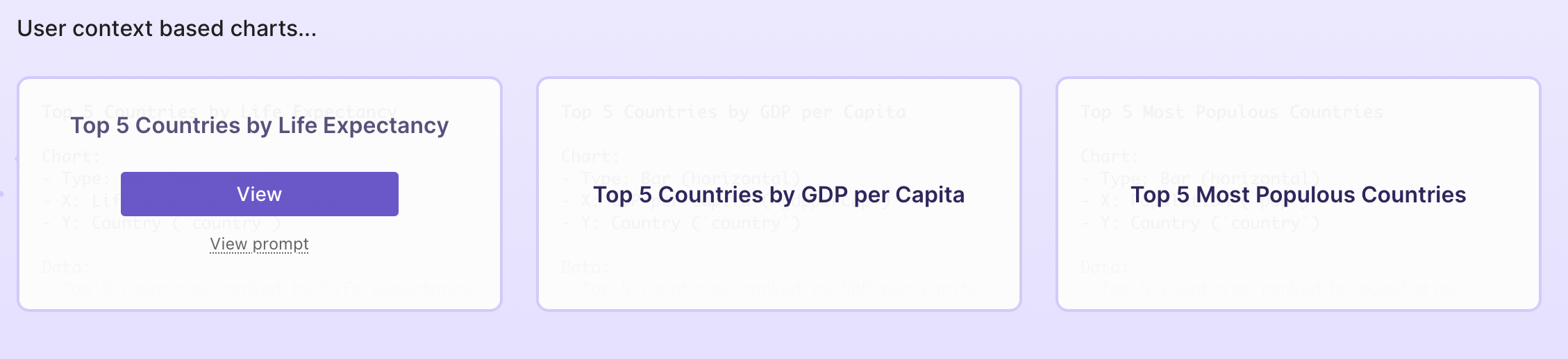
Custom chart types
Define domain-specific charts that appear as suggestions on the Explore page:
## Custom Charts
- A "Top 5 Chart" is a horizontal bar chart showing only the top 5 items
by the selected metric, sorted descending, with value labels on each bar.