Heatmaps
Heatmap charts use color to represent values in a two-dimensional grid. Heatmaps are useful for showing patterns and correlations across two categorical dimensions, helping you identify hot spots and trends. You can display aggregated values in a matrix format and apply styles and customizations like color scales and text annotations.
Writing prompts for Plotly Studio
You can create charts in Plotly Studio using natural language in different ways:
Ask a question - great for exploring your data:
Which factory produces the heaviest products?
Use a quick one-line prompt - concise and conversational:
Compare average weight by factory
Write structured detailed prompts - precise control and consistency:
Average Weight by Factory

Chart:
- Type: bar
- X: Factory location
- Y: Average weight

Data:
- Aggregation: average of weight by Factory location
Structured detailed prompts give you more control over chart type, data mappings, aggregations, and styling. Most examples on this page use this format.
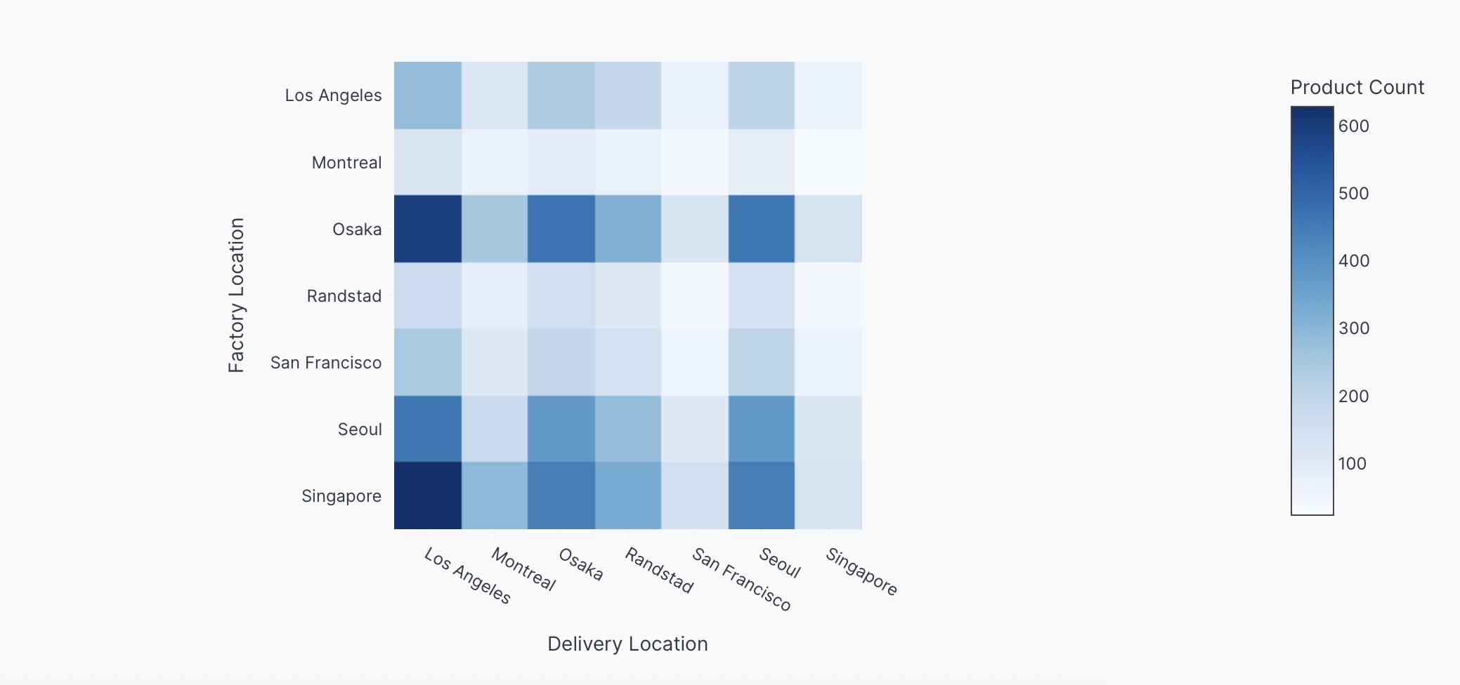
Basic heatmap example
Example of showing values in a matrix format.
<Chart Title>

Chart:
- Type: heatmap
- X: <Column Name>
- Y: <Column Name>
- Values: <Column Name>
The following example uses this prompt structure with the delivery_location and factory_location columns from the built-in Plotly Studio dataset, with a count aggregation:
Products by Factory and Delivery Location

Chart:
- Type: heatmap
- X: Delivery location
- Y: Factory location
- Values: Count of products

Data:
- Aggregation: count by Factory location and Delivery location
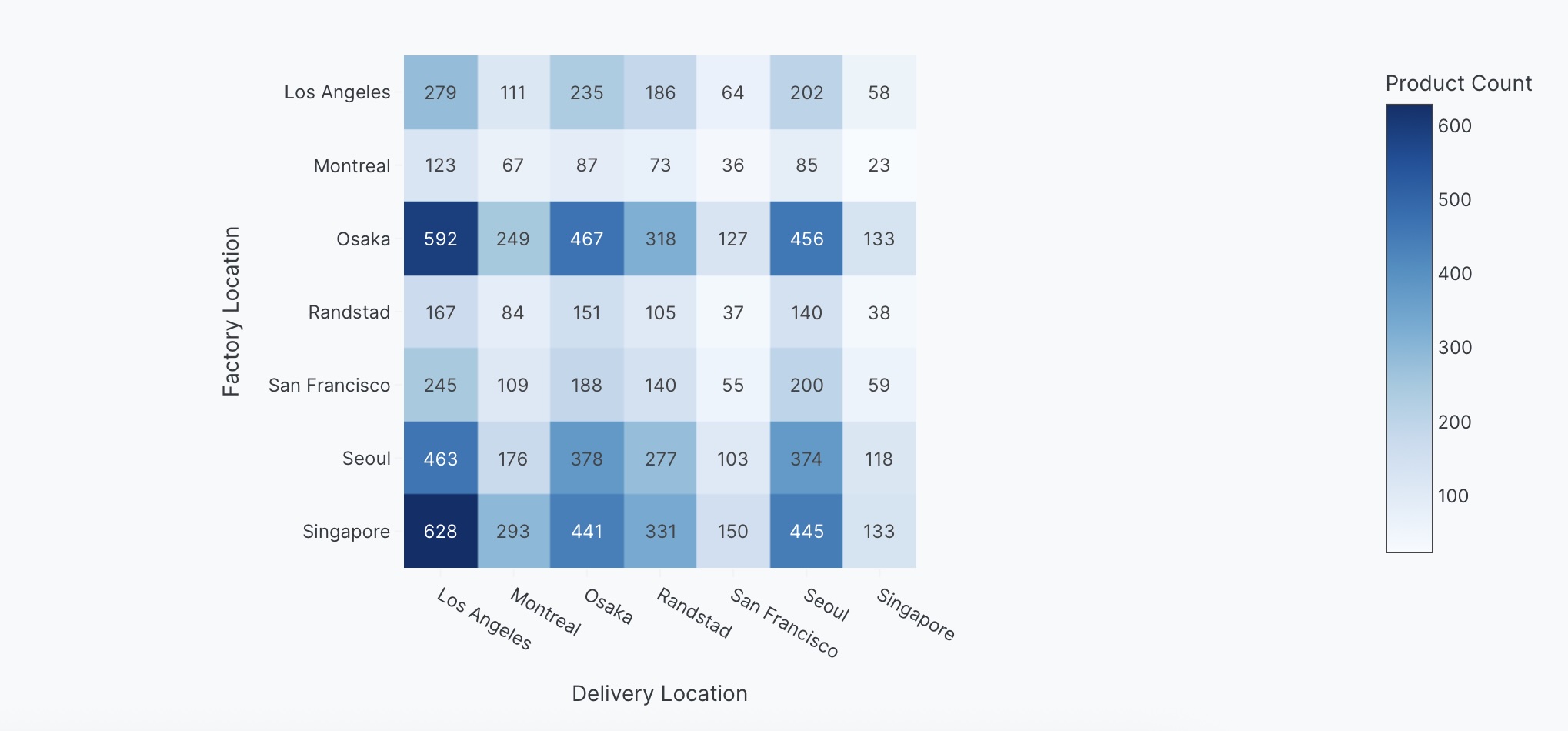
Annotated heatmap
Display the actual values as text on each cell for precise reading.
<Chart Title>

Chart:
- Type: heatmap
- X: <Column Name>
- Y: <Column Name>
- Values: <Column Name>

Chart styles:
- Show values as text on cells
The following example uses this prompt structure with the delivery_location and factory_location columns from the built-in Plotly Studio dataset with text annotations, with a count aggregation:
Products by Factory and Delivery Location

Chart:
- Type: heatmap
- X: Delivery location
- Y: Factory location
- Values: Count of products

Data:
- Aggregation: count by Factory location and Delivery location

Chart styles:
- Show values as text on cells
Interactive controls
Add dropdowns and other controls to make your heatmaps interactive. Controls let users filter and explore the data dynamically.
Products by Factory and Delivery Location

Chart:
- Type: heatmap
- X: Delivery location
- Y: Factory location
- Values: Count of products

Data:
- Aggregation: count by Factory location and Delivery location

Options:
- Dropdown to select color scale (Viridis, RdBu, YlOrRd) - Default Viridis
- Checkbox to toggle text annotations - Default show values
Prompt keywords reference
Use these keywords and phrases in your prompts to customize your heatmap.
Chart
Use a Chart: section in your prompt to define the basic structure of your heatmap, including the chart type and how columns map to visual properties.
Chart:
- Type: heatmap
- X: Delivery location
- Y: Factory location
- Values: Count of products
Here are some keyword suggestions to use in this section:
| Keyword/Phrase | Description | Example |
|---|---|---|
| Type | Specify the chart type as heatmap | Type: heatmap |
| X | The variable to show on the horizontal axis | X: Delivery location |
| Y | The variable to show on the vertical axis | Y: Factory location |
| Values | The variable to use for cell colors | Values: Count of products |
Data
Use a Data: section in your prompt to specify how to transform, filter, or aggregate your data before visualization.
Data:
- Aggregation: count by Factory location and Delivery location
- Computed field: Total value calculated as Price * Quantity
Here are some keyword suggestions to use in this section:
| Keyword/Phrase | Description | Example |
|---|---|---|
| Aggregation | Specify how to aggregate data | Aggregation: count by Factory location and Delivery location |
| Computed field | Create new calculated fields from existing data | Computed field: Total value calculated as Price * Quantity |
| Filter | Filter data to show only specific records | Filter to show only defect = true |
Options
Use an Options: section in your prompt to add interactive controls that allow users to dynamically filter, transform, and visualize data without regenerating the chart.
Options:
- Dropdown to select color scale (Viridis, RdBu, YlOrRd) - Default Viridis
- Checkbox to toggle text annotations - Default show values
Here are some keyword suggestions to use with this section. See Chart Controls for a complete list of control types and additional examples.
| Keyword/Phrase | Description | Example |
|---|---|---|
| Dropdown | Add a dropdown menu to filter by categories | Dropdown to select color scale (Viridis, RdBu, YlOrRd) - Default Viridis |
| Checkbox | Add a checkbox to toggle options | Checkbox to toggle text annotations - Default show values |
Chart styles
Use a Chart styles: section in your prompt to control the visual appearance and formatting of your heatmap.
Chart styles:
- Use Viridis color scale
- Show values as text on cells
- Hide gridlines
Here are some keyword suggestions to use in this section:
| Keyword/Phrase | Description | Example |
|---|---|---|
| Color scale | Color scale for the heatmap. See built-in color scales | Use Viridis color scale |
| Reverse color scale | Flip the color scale direction | Reverse color scale |
| Text annotations | Show values as text on cells | Show values as text on cells |
| Hover text | What to show when hovering over cells | Show Average weight on hover |
| Axis labels | Customize the text shown on the axes | Label x-axis as "Destination"Label y-axis as "Origin" |
| Gridlines | Control gridline display | Hide gridlines |