Layout Editor
Use the layout editor to arrange components, adjust their size and visibility, and configure your app's header.
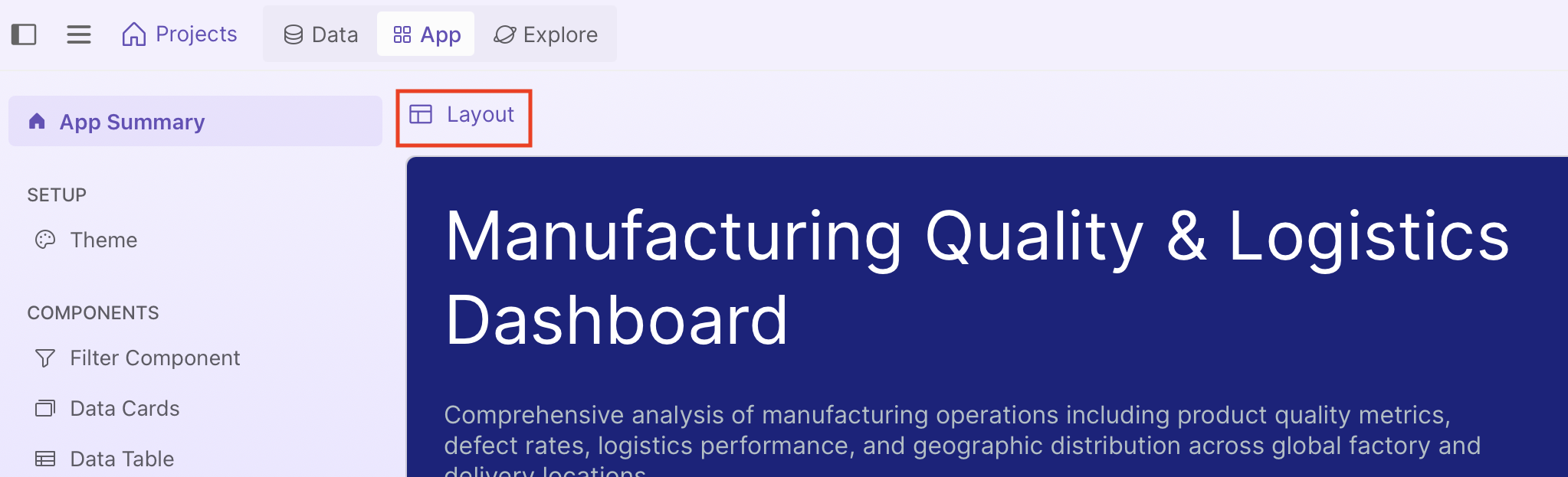
To open the layout editor, go to the App Summary page and then select Layout:
In the layout editor, there are two modes. GUI mode lets you drag, resize, and configure components visually, and is recommended as changes are applied immediately. Prompt mode lets you describe your layout in natural language, but can take longer as each request goes through the LLM which then regenerates the layout code.
GUI mode
Rearranging and resizing components
Drag cards to rearrange them, or drag their resize handles to adjust width. All app components except filters appear here.
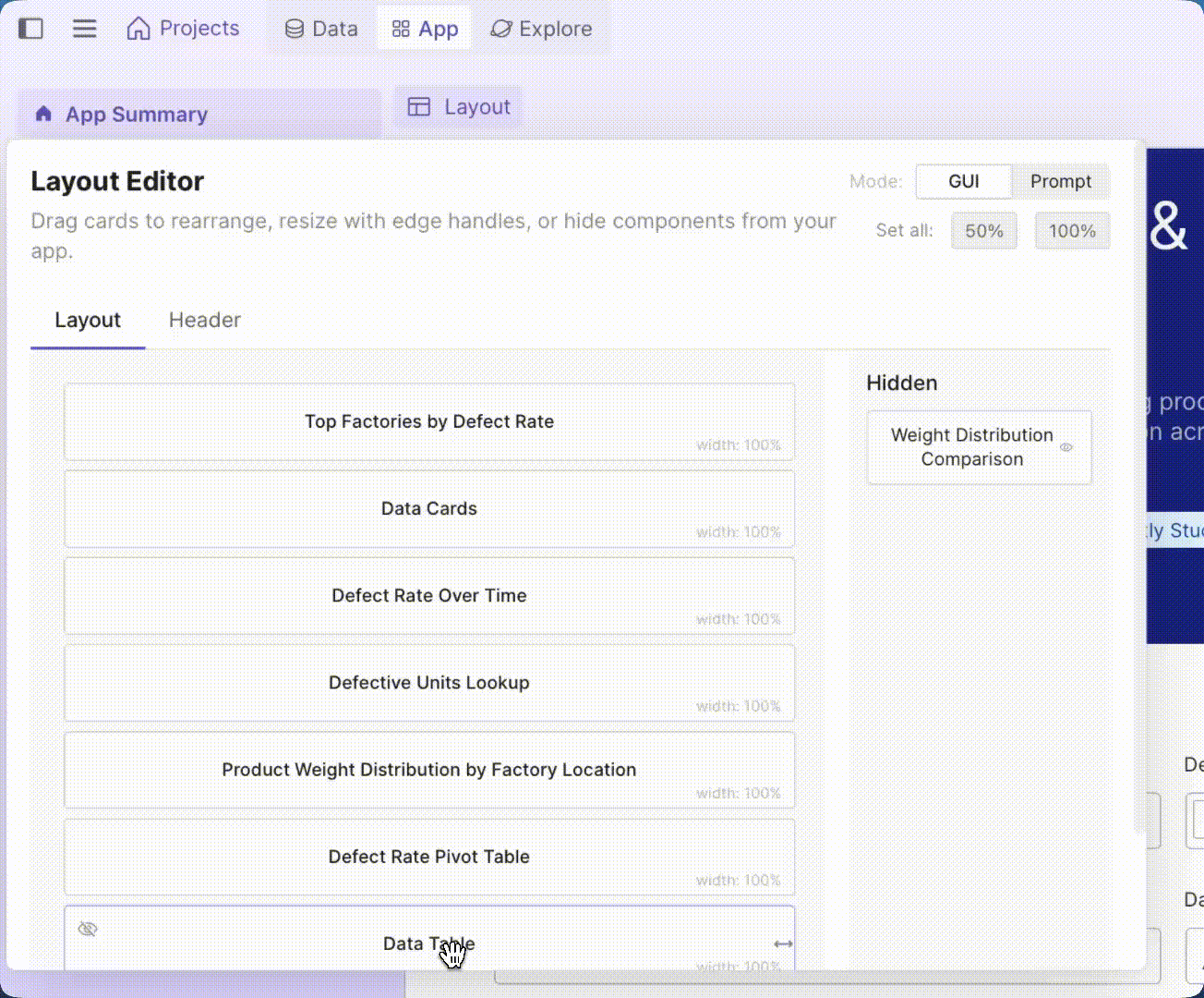
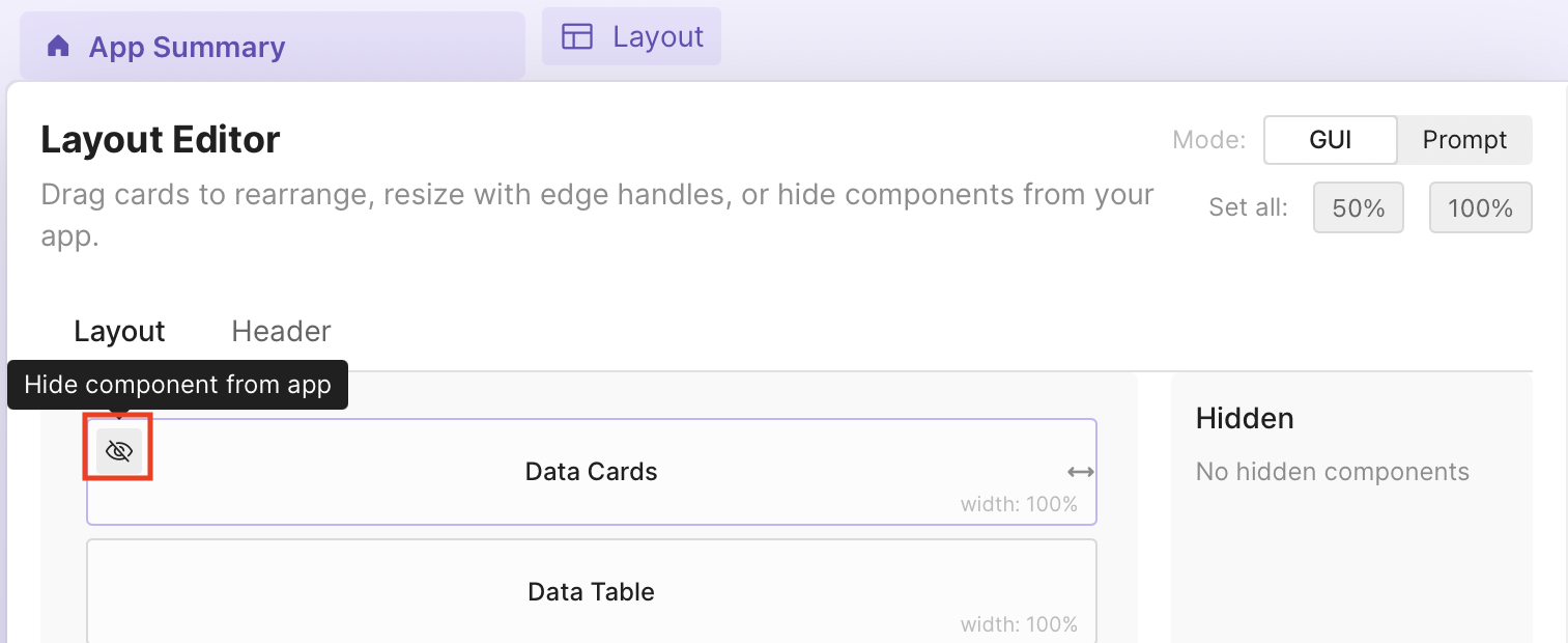
Hiding and showing components
To hide a component from your app, select Hide on the component.
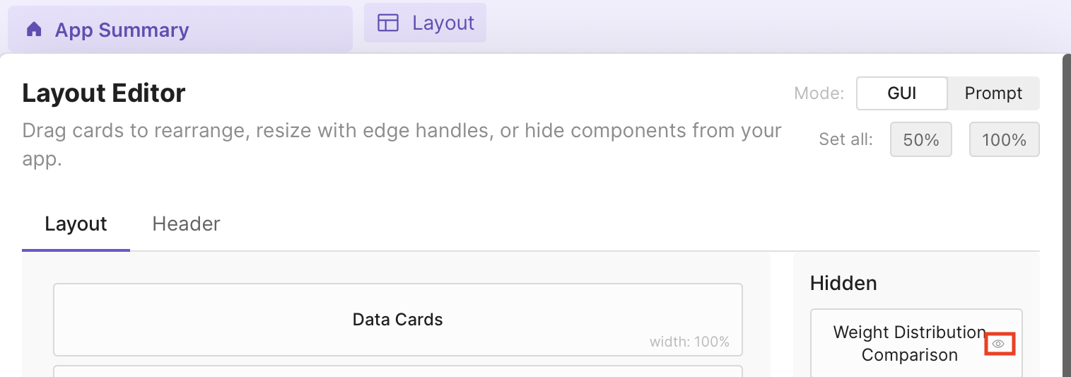
Hidden components appear in the Hidden panel on the right. To show a component again, select Show on the hidden component.
Header
Select the Header tab to customize your app's header. You can edit:
- Title: The name that is displayed at the top of your app.
- Description: A description for your app, which is displayed just below the title.
- Logo URL: A URL to a custom logo (for example,
https://example.com/logo.png). If left empty, the default Plotly logo is used. - Badges: Labels with icons that appear in the header. See Icons for available icons.
Prompt mode
Describe your layout in natural language. For example, to set the header title and description, place filters and data cards at full width, then add two charts side by side with a third below at full width:
Title: Sales Dashboard
Description: Regional sales performance and trends

Create a layout with:
- Global Filters (100%)
- Data Cards (100%)
- Add the chart sales_by_region with 50% width
- Add the chart monthly_trend with 50% width
- Add the chart top_products with 100% width