Legends
Legends display trace information, allowing users to identify data series in your charts. Clicking or double-clicking legend items lets users toggle visibility of specific data series interactively.
Show/hide legend
Control whether the legend is displayed on your chart.
<Chart Title>

Chart:
- Type: <chart_type>
- <axis mappings>

Chart styles:
- Hide legend
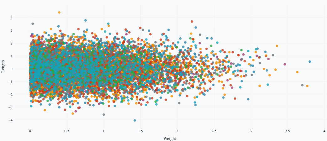
The following example uses this prompt structure with the built-in Plotly Studio dataset:
Product Weight vs Length by Defect Status

Chart:
- Type: scatter
- X: Weight
- Y: Length
- Color: Defect

Chart styles:
- Hide legend
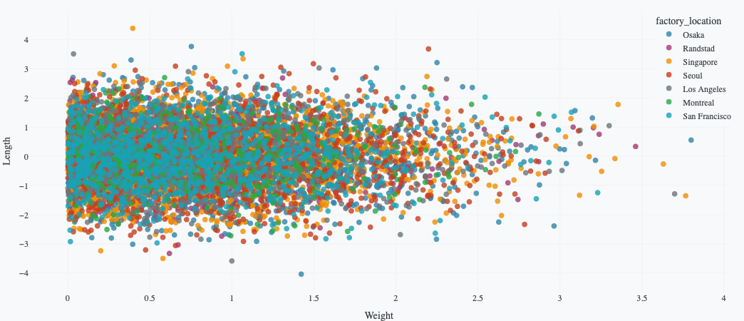
Legend orientation
Control whether legend items are arranged horizontally or vertically.
<Chart Title>

Chart:
- Type: <chart_type>
- <axis mappings>

Chart styles:
- Use horizontal legend
The following example uses this prompt structure with the built-in Plotly Studio dataset:
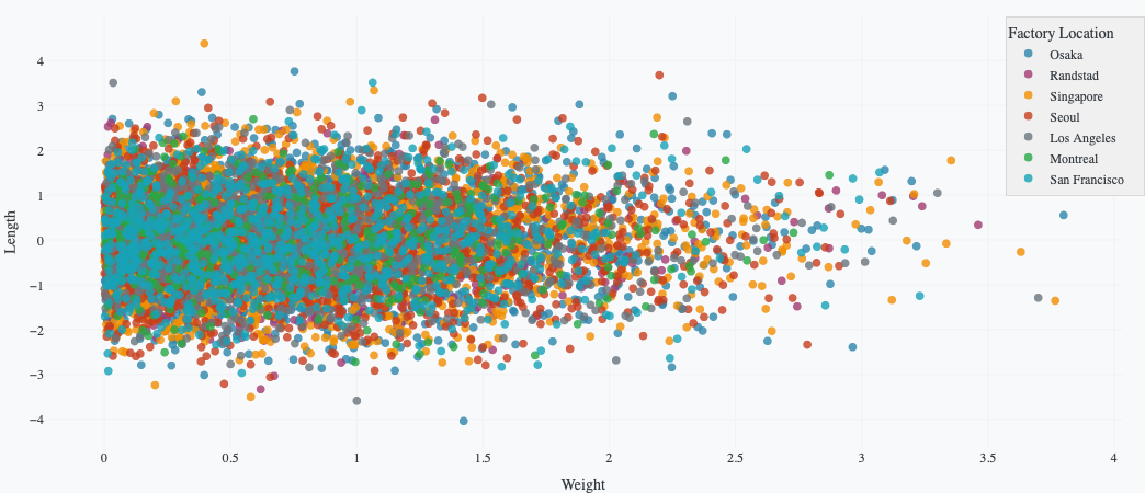
Product Weight vs Length by Factory

Chart:
- Type: scatter
- X: Weight
- Y: Length
- Color: Factory location

Chart styles:
- Use horizontal legend
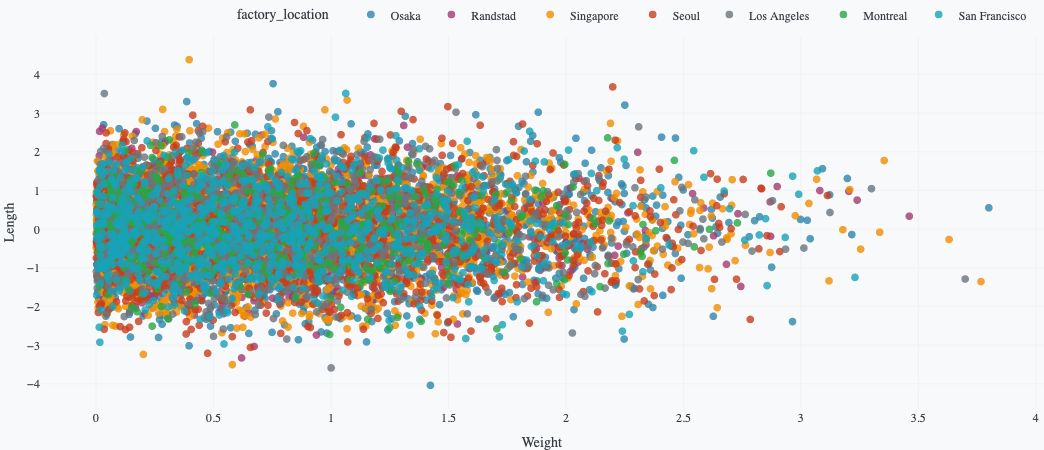
Position legend outside plot area
Position the legend in the margin if it covers data in the chart. You can specify where in the margin to place the legend and whether to display it vertically or horizontally.
<Chart Title>

Chart:
- Type: <chart_type>
- <axis mappings>

Chart styles:
- Position legend outside plot area on the right
- Use vertical legend
The following example using the built-in dataset puts the legend vertically and in the margin to the right of the chart:
Product Weight vs Length by Factory

Chart:
- Type: scatter
- X: Weight (weight)
- Y: Length (length)
- Color: Factory location (factory_location)

Chart styles:
- Position legend outside plot area on the right
- Use vertical legend

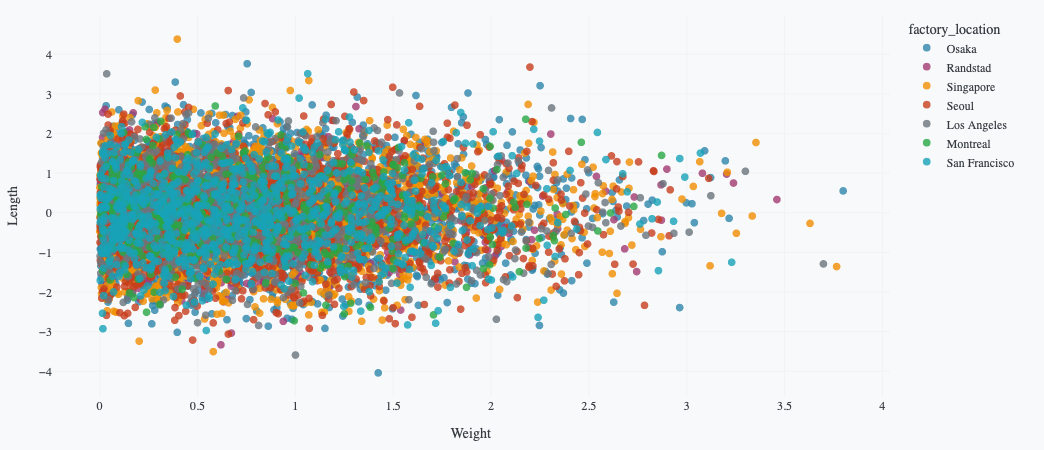
Legend background color
Set the background color of the legend box. You can use CSS color names (e.g., "lightgray", "white"), hex codes (e.g., "#F5F5F5"), or RGB values (e.g., "rgb(255, 255, 255)").
<Chart Title>

Chart:
- Type: <chart_type>
- <axis mappings>

Chart styles:
- Set legend background color to <color>
The following example uses this prompt structure with the built-in Plotly Studio dataset:
Product Weight vs Length by Factory

Chart:
- Type: scatter
- X: Weight
- Y: Length
- Color: Factory location

Chart styles:
- Set legend background color to lightgray
Prompt keywords reference
Use a Chart styles: section in your prompt to customize legend appearance.
Chart styles:
- Hide legend
- Show legend at top right
- Use horizontal legend
- Set legend background color to lightblue
- Set legend title to "Categories"
Here are some keyword suggestions to use in this section:
| Keyword/Phrase | Description | Example |
|---|---|---|
| Hide legend | Remove the legend from the chart | - Hide legend |
| Show legend | Display the legend | - Show legend |
| Show legend at | Control where the legend appears | - Show legend at top right |
| Legend title | Set a custom title for the legend | - Set legend title to "Categories" |
| Horizontal/vertical legend | Set legend to horizontal or vertical orientation | - Use horizontal legend- Use vertical legend |
| Legend background color | Set the background color of the legend box | - Set legend background color to lightblue |
| Legend border color | Set the color of the border around the legend | - Set legend border color to gray |
| Legend border width | Set the width of the border around the legend | - Set legend border width to 2px |
| Legend font size | Adjust the size of text in the legend | - Set legend font size to 12 |
| Legend text color | Change the color of legend text | - Set legend text color to gray |
| Reverse legend order | Flip the order of items in the legend | - Reverse legend order |