Line Charts
Line charts are useful for showing trends and changes over time or across ordered categories. You can create separate lines for different groups using color, and apply styles and customizations like line width, markers, and annotations.
Writing prompts for Plotly Studio
You can create charts in Plotly Studio using natural language in different ways:
Ask a question - great for exploring your data:
Which factory produces the heaviest products?
Use a quick one-line prompt - concise and conversational:
Compare average weight by factory
Write structured detailed prompts - precise control and consistency:
Average Weight by Factory

Chart:
- Type: bar
- X: Factory location
- Y: Average weight

Data:
- Aggregation: average of weight by Factory location
Structured detailed prompts give you more control over chart type, data mappings, aggregations, and styling. Most examples on this page use this format.
Basic line example
Here's an example of how to structure a prompt to show how a value changes over time.
<Chart Title>

Chart:
- Type: line
- X: <Column Name>
- Y: <Column Name>
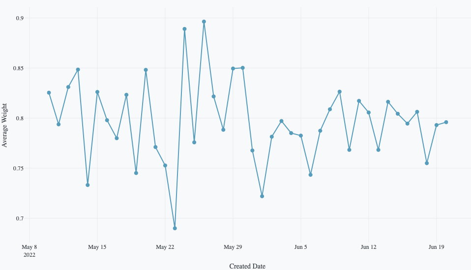
The following example shows the average weight over time using the built-in Plotly Studio dataset:
Average Weight Over Time

Chart:
- Type: line
- X: Created date
- Y: Average weight

Data:
- Aggregation: average of weight by Created date (daily)
Color by category
Create separate colored lines for different groups in your data to compare trends across categories.
<Chart Title>

Chart:
- Type: line
- X: <Column Name>
- Y: <Column Name>
- Color: <Column Name>
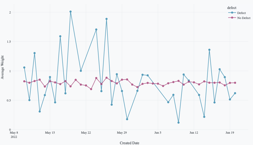
The following example uses this prompt structure with the weight, created_date, and defect columns from the built-in Plotly Studio dataset:
Average Weight Over Time by Defect

Chart:
- Type: line
- X: Created date
- Y: Average weight
- Color: Defect

Data:
- Aggregation: average of weight by Created date (daily)
Control markers
Show or hide markers on your line chart to highlight individual data points along the line.
<Chart Title>

Chart:
- Type: line
- X: <Column Name>
- Y: <Column Name>

Chart styles:
- Hide markers # Or: Show markers
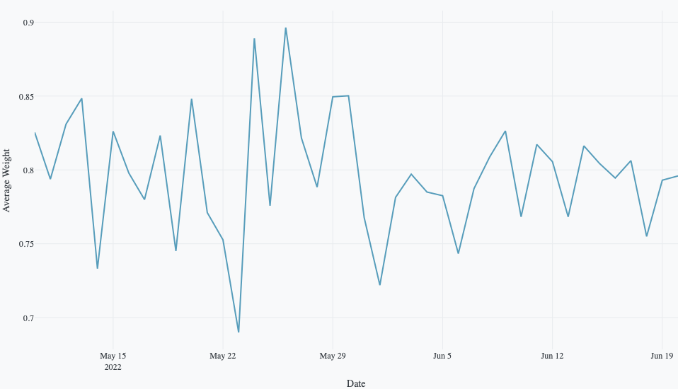
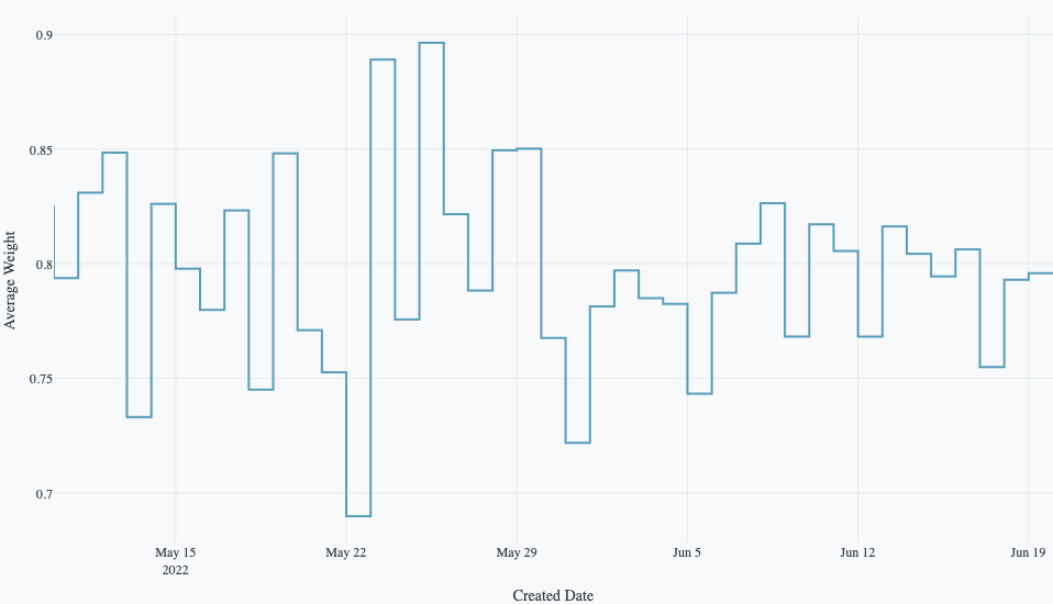
The following example uses this prompt structure with the weight and created_date columns from the built-in Plotly Studio dataset to show data points along the trend line
Average Weight Over Time

Chart:
- Type: line
- X: Created date
- Y: Average weight

Data:
- Aggregation: average of weight by Created date (daily)

Chart styles:
- Hide markers
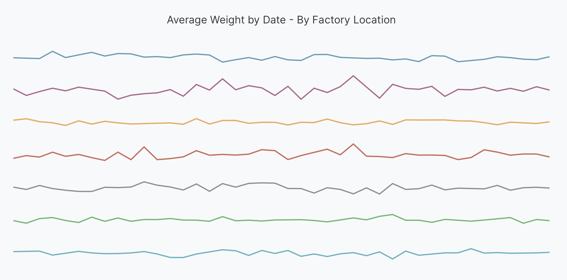
Sparklines
Sparklines are small, minimal line charts that show trends at a glance. Create sparklines by using separate rows for each category and hiding axes and gridlines.
<Chart Title>

Chart:
- Type: line
- X: <Column Name>
- Y: <Column Name>
- Facet rows: <Column Name>

Chart styles:
- Hide axes and gridlines
- Hide subplot labels
The following example uses this prompt structure with the weight, created_date, and factory_location columns from the built-in Plotly Studio dataset to create sparklines
Weight Trends by Factory Location

Chart:
- Type: line
- X: Created date
- Y: Average weight
- Facet rows: Factory location

Data:
- Aggregation: average of weight by Created date (daily)

Chart styles:
- Hide axes and gridlines
- Hide subplot labels
Styled line plots
Customize the appearance of your line charts with colors and dash patterns.
<Chart Title>

Chart:
- Type: line
- X: <Column Name>
- Y: <Column Name>
- Color: <Column Name>

Chart styles:
- Use different dash patterns for each <Column Name>
The following example shows customized line styling using the built-in Plotly Studio dataset:
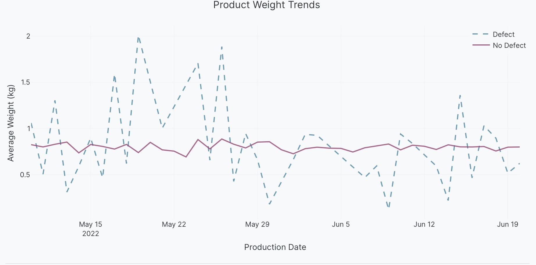
Product Weight Trends

Chart:
- Type: line
- X: Created date
- Y: Average weight
- Color: Defect

Data:
- Aggregation: average of weight by Created date (daily)

Chart styles:
- Use different dash patterns for defect and no defect
Line shape interpolation
Control how lines connect data points using different interpolation methods like linear, spline (curved), or step patterns.
<Chart Title>

Chart:
- Type: line
- X: <Column Name>
- Y: <Column Name>

Chart styles:
- Use <line_shape> lines
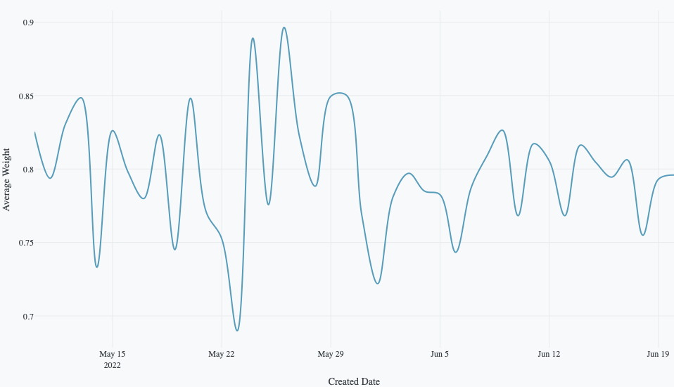
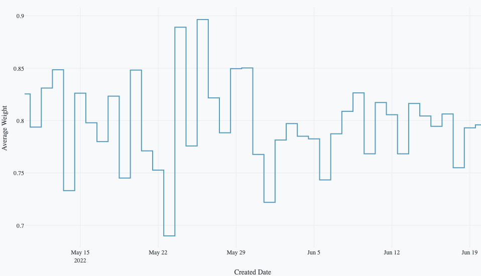
Average Weight Over Time

Chart:
- Type: line
- X: Created date
- Y: Average weight

Data:
- Aggregation: average of weight by Created date (daily)

Chart styles:
- Use spline lines
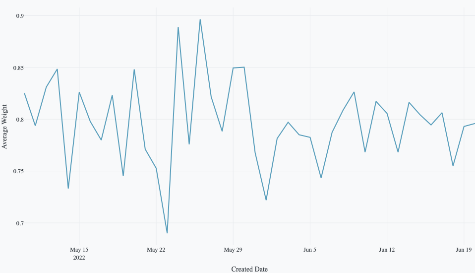
Average Weight Over Time

Chart:
- Type: line
- X: Created date
- Y: Average weight

Data:
- Aggregation: average of weight by Created date (daily)

Chart styles:
- Use linear lines
Average Weight Over Time

Chart:
- Type: line
- X: Created date
- Y: Average weight

Data:
- Aggregation: average of weight by Created date (daily)

Chart styles:
- Use hv lines
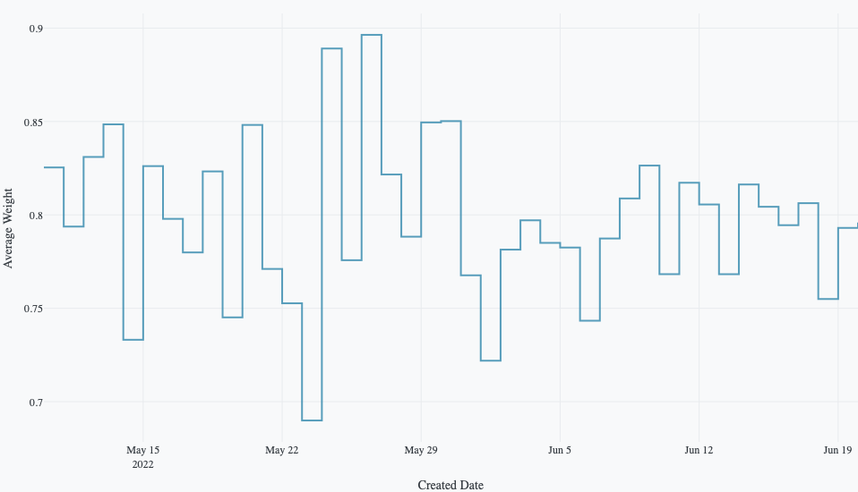
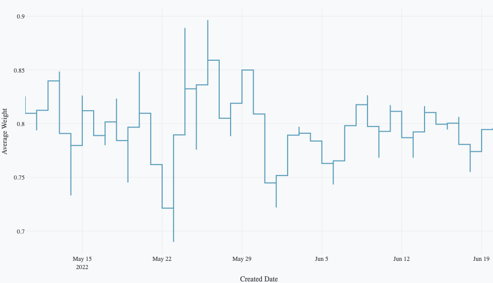
Average Weight Over Time

Chart:
- Type: line
- X: Created date
- Y: Average weight

Data:
- Aggregation: average of weight by Created date (daily)

Chart styles:
- Use vh lines
Average Weight Over Time

Chart:
- Type: line
- X: Created date
- Y: Average weight

Data:
- Aggregation: average of weight by Created date (daily)

Chart styles:
- Use hvh lines
Average Weight Over Time

Chart:
- Type: line
- X: Created date
- Y: Average weight

Data:
- Aggregation: average of weight by Created date (daily)

Chart styles:
- Use vhv lines
Adding annotations
Add text annotations to highlight specific points or trends in your line chart.
<Chart Title>

Chart:
- Type: line
- X: <Column Name>
- Y: <Column Name>
- Color: <Column Name>

Chart styles:
- Add annotation "<text>" at <location>
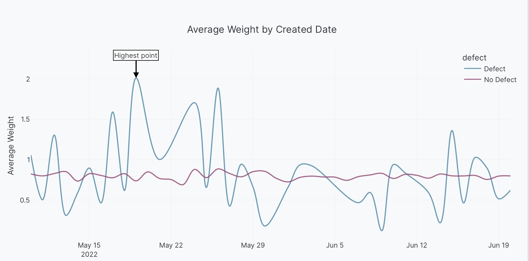
The following example shows an annotated line chart using the built-in Plotly Studio dataset:
Average Weight Over Time by Defect

Chart:
- Type: line
- X: Created date
- Y: Average weight
- Color: Defect

Data:
- Aggregation: average of weight by Created date (daily)

Chart styles:
- Add annotation "Highest point" at the highest point
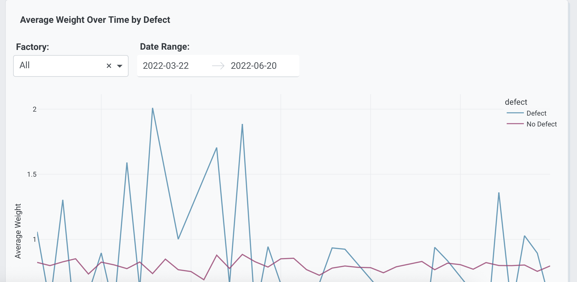
Interactive controls
Add dropdowns and other controls to make your line charts interactive. Controls let users filter and explore the data dynamically.
Average Weight Over Time by Defect

Chart:
- Type: line
- X: Created date
- Y: Average weight
- Color: Defect

Data:
- Aggregation: average of weight by Created date (daily)

Options:
- Dropdown to select factory (All, Osaka, Seoul, Singapore, Los Angeles, Montreal, Randstad) - Default All
- Date range picker to filter by date range - Default last 90 days
Prompt keywords reference
Use these keywords and phrases in your prompts to customize your line chart.
Chart
Use a Chart: section in your prompt to define the basic structure of your line chart, including the chart type and how columns map to visual properties.
Chart:
- Type: line
- X: Created date
- Y: Average weight
- Color: Factory location
- Facet columns: Defect
Here are some keyword suggestions to use in this section:
| Keyword/Phrase | Description | Example |
|---|---|---|
| Type | Specify the chart type as line | Type: line |
| X | The column to show on the horizontal axis | X: Created date |
| Y | The column to show on the vertical axis | Y: Average weight |
| Color | Create separate colored lines for different groups | Color: Factory location |
| Facet rows | Create multiple plots stacked vertically by group | Facet rows: Factory location |
| Facet columns | Create multiple plots side-by-side by group | Facet columns: Defect |
Data
Use a Data: section in your prompt to specify how to transform, filter, or aggregate your data before visualization.
Data:
- Aggregation: average of weight by Created date
- Computed field: Shipping days calculated as the difference between Shipped date and Created date in days
Here are some keyword suggestions to use in this section:
| Keyword/Phrase | Description | Example |
|---|---|---|
| Aggregation | Specify how to aggregate data | Aggregation: average of weight by Created date |
| Computed field | Create new calculated fields from existing data | Computed field: Shipping days calculated as the difference between Shipped date and Created date in days |
| Filter | Filter data to show only specific records | Filter to show only defect = true |
Options
Use an Options: section in your prompt to add interactive controls that allow users to dynamically filter, transform, and visualize data without regenerating the chart.
Options:
- Dropdown to select factory (All, Osaka, Seoul, Singapore) - Default All
- Date range picker to filter by date range - Default last 90 days
Here are some keyword suggestions to use with this section. See Chart Controls for a complete list of control types and additional examples.
| Keyword/Phrase | Description | Example |
|---|---|---|
| Dropdown | Add a dropdown menu to filter by categories | Dropdown to select factory (All, Osaka, Seoul) - Default All |
| Date range picker | Add a date range selector | Date range picker to filter by date range - Default last 90 days |
Chart styles
Use a Chart styles: section in your prompt to control the visual appearance and formatting of your line chart.
Chart styles:
- Use custom colors: #FF5733, #33FF57
- Set line width to 3
- Use spline lines
- Show markers
Here are some keyword suggestions to use in this section:
| Keyword/Phrase | Description | Example |
|---|---|---|
| Custom colors | Specify exact colors for lines | Use custom colors: #FF5733, #33FF57 |
| Hover text | What to show when hovering over points | Show Serial number on hover |
| Axis labels | Customize the text shown on the axes | Label x-axis as "Production Date"Label y-axis as "Average Weight (kg)" |
| Background color | Set the background color of the plot | Set background color to lightgray |
| Grid lines | Show or hide grid lines on the plot | Hide grid lines |
| Color scale | Specify color scale for continuous color mapping. See built-in color scales | Use Viridis color scale |
| Line width | Set the thickness of the line | Set line width to 3 |
| Dash patterns | Use different line styles (solid, dashed, dotted) | Use different dash patterns for each defect |
| Line shape | Control how lines connect points (linear, spline, step) | Use spline lines |
| Markers | Show or hide markers on the line to highlight data points | Show markersHide markers |
| Marker size | Set a fixed size for all markers | Set marker size to 12 |
| Marker symbol | Set a specific shape for all markers. See marker style options | Use square markers |
| Marker opacity | How see-through the markers are (0=invisible, 1=solid) | Set marker opacity to 0.5 |
| Text on points | Display text labels directly on data points | Show Average weight as text on points |
| Logarithmic scale | Use log scale for large ranges (useful for exponential data) | Use logarithmic scale for the y-axis |
| Axis range | Set minimum and maximum values for axes | Set x-axis range from 0 to 100 |
| Legend | Control legend display and position | Show legend at top right |
| Annotations | Add text labels to highlight specific points or trends | Add annotation "Highest point" at the highest point |