Pie Charts
Pie charts are useful for showing proportions and percentages of a whole. You can also create donut charts with a hole in the center, and apply styles and customizations like custom colors, pulled-out slices, and text labels.
Writing prompts for Plotly Studio
You can create charts in Plotly Studio using natural language in different ways:
Ask a question - great for exploring your data:
Which factory produces the heaviest products?
Use a quick one-line prompt - concise and conversational:
Compare average weight by factory
Write structured detailed prompts - precise control and consistency:
Average Weight by Factory

Chart:
- Type: bar
- X: Factory location
- Y: Average weight

Data:
- Aggregation: average of weight by Factory location
Structured detailed prompts give you more control over chart type, data mappings, aggregations, and styling. Most examples on this page use this format.
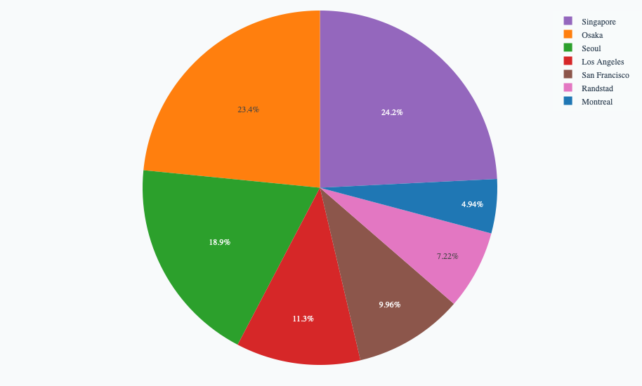
Basic pie example
Example of showing proportions across categories. Data visualized by the sectors of the pie is set in Values. The sector labels are set in Names.
<Chart Title>

Chart:
- Type: pie
- Values: <Column Name>
- Names: <Column Name>
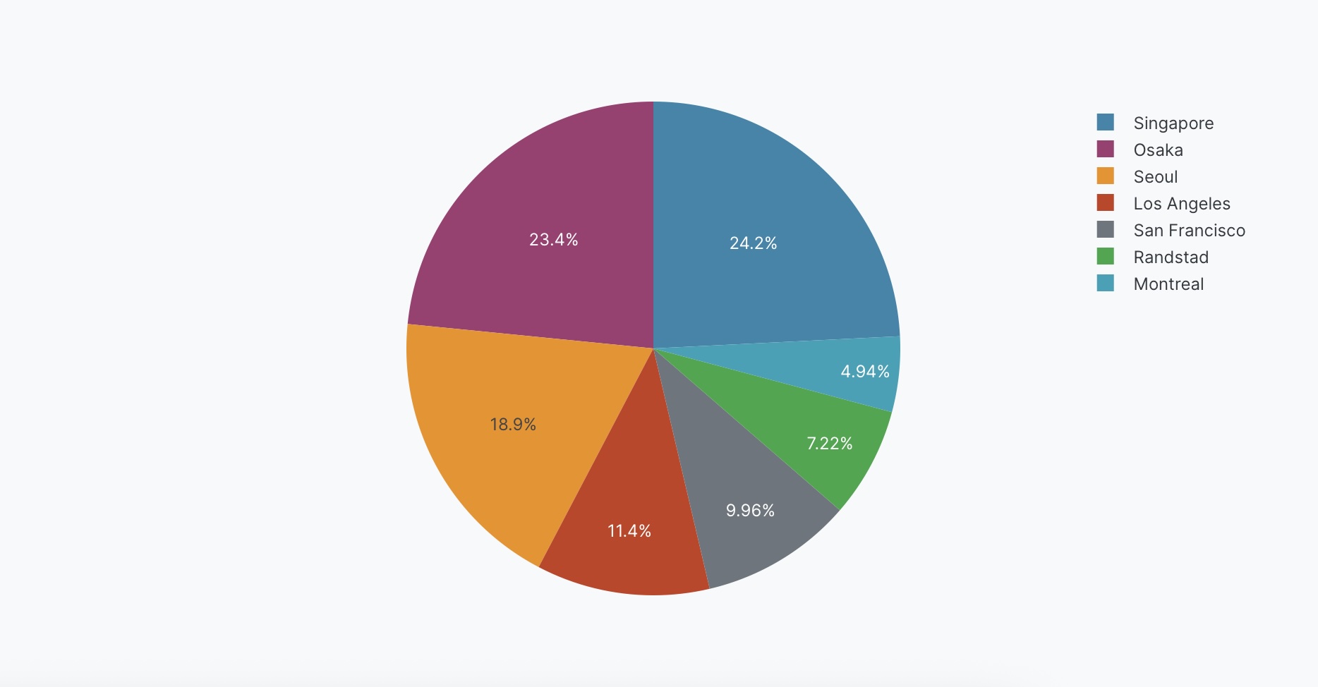
The following example uses this prompt structure with the factory_location column from the built-in Plotly Studio dataset with a count aggregation:
Products by Factory Location

Chart:
- Type: pie
- Values: Count of products
- Names: Factory location

Data:
- Aggregation: count by Factory location
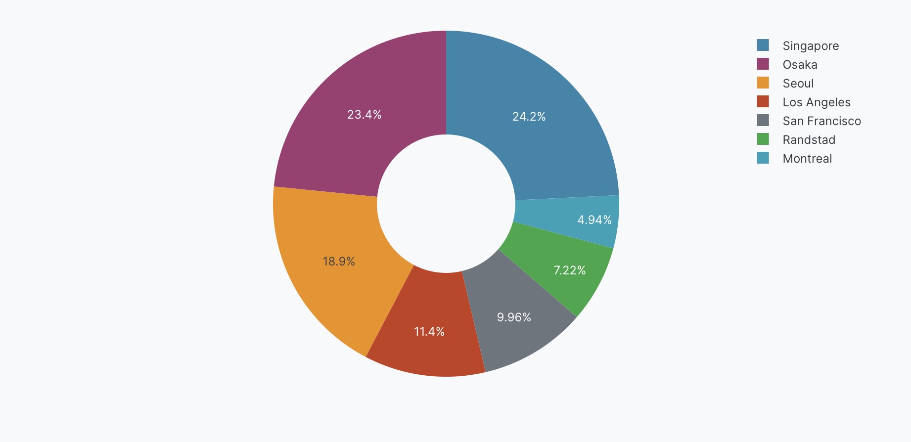
Donut chart
Create a donut chart by adding a hole in the center.
<Chart Title>

Chart:
- Type: pie
- Values: <Column Name>
- Names: <Column Name>

Chart styles:
- Use donut chart with hole size <value>
The following example uses this prompt structure with the factory_location column from the built-in Plotly Studio dataset with a count aggregation:
Products by Factory Location

Chart:
- Type: pie
- Values: Count of products
- Names: Factory location

Data:
- Aggregation: count by Factory location

Chart styles:
- Use donut chart with hole size 0.4
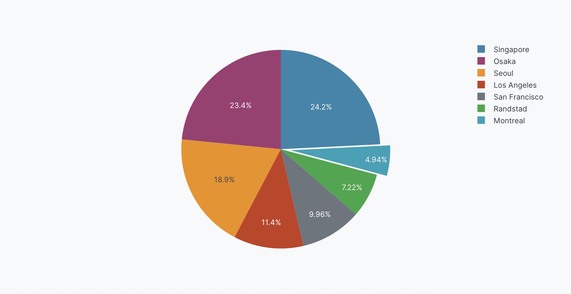
Pulled-out slices
Pull out specific slices to emphasize them. You can optionally specify how far to pull out the slice as a fraction (0 to 1, where higher values pull further out).
<Chart Title>

Chart:
- Type: pie
- Values: <Column Name>
- Names: <Column Name>

Chart styles:
- Pull out <category_name> slice by <value>
The following example uses this prompt structure with the factory_location column from the built-in Plotly Studio dataset with a count aggregation:
Products by Factory Location

Chart:
- Type: pie
- Values: Count of products
- Names: Factory location

Data:
- Aggregation: count by Factory location

Chart styles:
- Pull out Montreal slice by 0.2
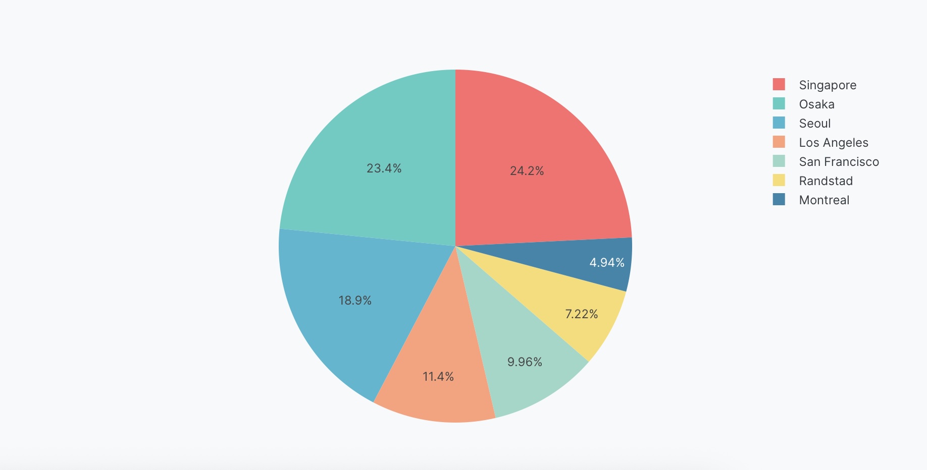
Custom colors
Specify exact colors for each slice.
<Chart Title>

Chart:
- Type: pie
- Values: <Column Name>
- Names: <Column Name>

Chart styles:
- Use custom colors: <color_list>
The following example uses this prompt structure with the factory_location column from the built-in Plotly Studio dataset with a count aggregation:
Products by Factory Location

Chart:
- Type: pie
- Values: Count of products
- Names: Factory location

Data:
- Aggregation: count by Factory location

Chart styles:
- Use custom colors: #FF6B6B, #4ECDC4, #45B7D1, #FFA07A, #98D8C8, #F7DC6F
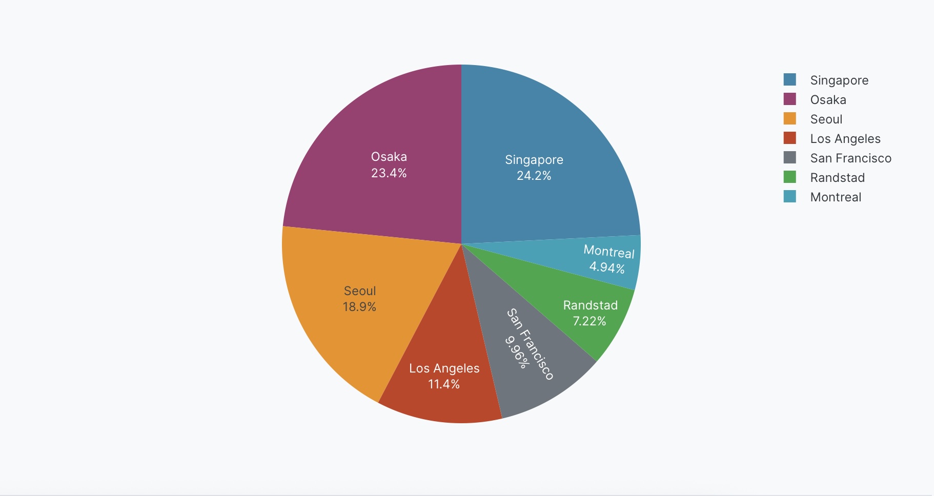
Explicit color mapping
You can also map colors to specific categories.
<Chart Title>

Chart:
- Type: pie
- Values: <Column Name>
- Names: <Column Name>

Data:
- <aggregation>

Chart styles:
- Map <category1> to <color1>
- Map <category2> to <color2>
The following example uses this prompt structure with the built-in Plotly Studio dataset to assign specific colors to each factory location:
Products by Factory Location

Chart:
- Type: pie
- Values: Count of products
- Names: Factory location

Data:
- Aggregation: count by Factory location

Chart styles:
- Map Montreal to #1f77b4
- Map Osaka to #ff7f0e
- Map Seoul to #2ca02c
- Map Los Angeles to #d62728
- Map Singapore to #9467bd
- Map San Francisco to #8c564b
- Map Randstad to #e377c2
Text on slices
Control what text appears on the slices (percentages, values, labels, or combinations).
<Chart Title>

Chart:
- Type: pie
- Values: <Column Name>
- Names: <Column Name>

Chart styles:
- Show <text_type> on slices
The following example uses this prompt structure with the factory_location column from the built-in Plotly Studio dataset with a count aggregation:
Products by Factory Location

Chart:
- Type: pie
- Values: Count of products
- Names: Factory location

Data:
- Aggregation: count by Factory location

Chart styles:
- Show percentages and labels on slices
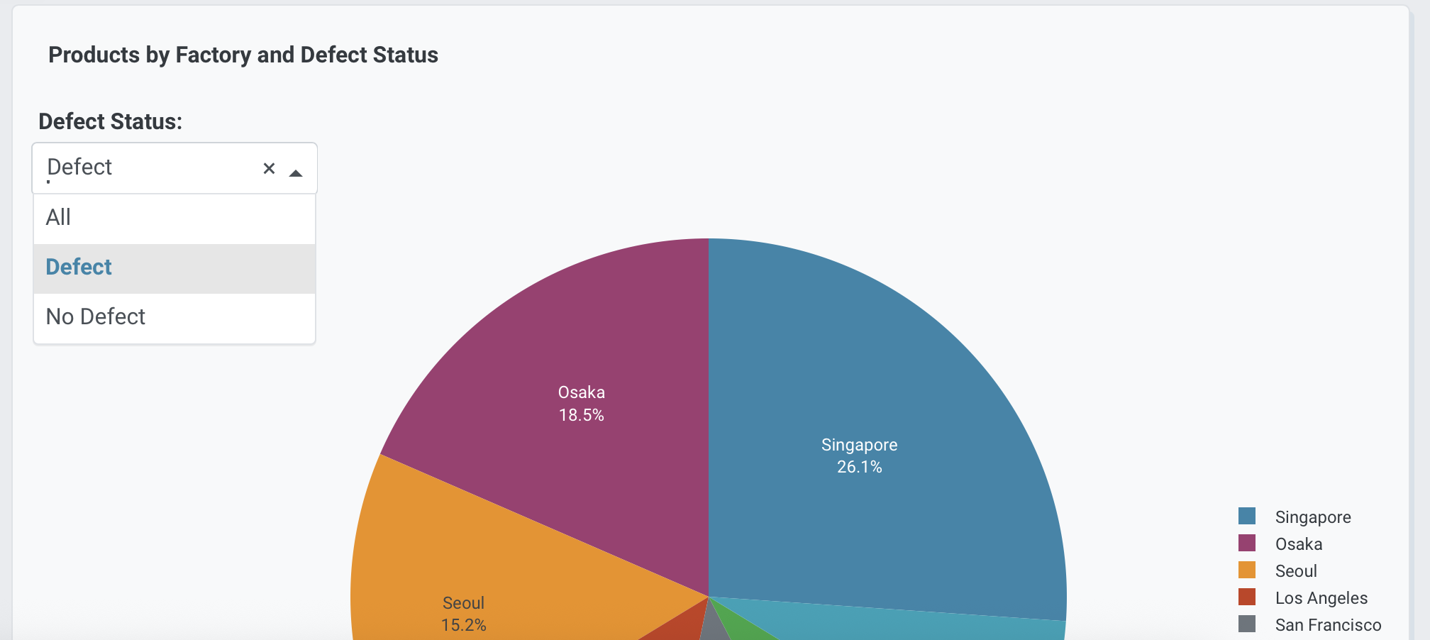
Interactive controls
Add dropdowns and other controls to make your pie charts interactive. Controls let users filter and explore the data dynamically.
Products by Factory and Defect Status

Chart:
- Type: pie
- Values: Count of products
- Names: Factory location

Data:
- Aggregation: count by Factory location

Options:
- Dropdown to select defect status (All, True, False) - Default All
Prompt keywords reference
Use these keywords and phrases in your prompts to customize your pie chart.
Chart
Use a Chart: section in your prompt to define the basic structure of your pie chart, including the chart type and how columns map to visual properties.
Chart:
- Type: pie
- Values: Count of products
- Names: Factory location
Here are some keyword suggestions to use in this section:
| Keyword/Phrase | Description | Example |
|---|---|---|
| Type | Specify the chart type as pie | Type: pie |
| Values | The column to use for slice sizes | Values: Count of products |
| Names | The column to use for slice labels | Names: Factory location |
| Facet columns | Create multiple subplots side-by-side for each category | Facet columns: Defect |
| Facet rows | Create multiple plots stacked vertically by group | Facet rows: Factory location |
Data
Use a Data: section in your prompt to specify how to transform, filter, or aggregate your data before visualization.
Data:
- Aggregation: count by Factory location
- Computed field: Total value calculated as Price * Quantity
Here are some keyword suggestions to use in this section:
| Keyword/Phrase | Description | Example |
|---|---|---|
| Aggregation | Specify how to aggregate data | Aggregation: count by Factory location |
| Computed field | Create new calculated fields from existing data | Computed field: Total value calculated as Price * Quantity |
| Filter | Filter data to show only specific records | Filter to show only defect = true |
Options
Use an Options: section in your prompt to add interactive controls that allow users to dynamically filter, transform, and visualize data without regenerating the chart.
Options:
- Dropdown to select defect status (All, True, False) - Default All
- Checkbox to toggle donut chart - Default regular pie
Here are some keyword suggestions to use with this section. See Chart Controls for a complete list of control types and additional examples.
| Keyword/Phrase | Description | Example |
|---|---|---|
| Dropdown | Add a dropdown menu to filter by categories | Dropdown to select defect status (All, True, False) - Default All |
| Checkbox | Add a checkbox to toggle options | Checkbox to toggle donut chart - Default regular pie |
Chart styles
Use a Chart styles: section in your prompt to control the visual appearance and formatting of your pie chart.
Chart styles:
- Use custom colors: #FF6B6B, #4ECDC4, #45B7D1
- Map Montreal to blue
- Use donut chart with hole size 0.4
- Show percentages and labels on slices
Here are some keyword suggestions to use in this section:
| Keyword/Phrase | Description | Example |
|---|---|---|
| Custom colors | Specify exact colors for slices | Use custom colors: #FF6B6B, #4ECDC4, #45B7D1 |
| Map colors | Map categories to colors | Map Montreal to blue |
| Donut chart | Add a hole in the center. Hole size (float) sets the fraction of the radius to cut out of the pie | Use donut chart with hole size 0.4 |
| Pull out slice | Emphasize one or more slices by pulling them out from the pie. Use values between 0 and 1, where higher values pull further out | Pull out Montreal slice by 0.2 |
| Text on slices | Control what text shows on slices | Show percentages and labels on slices |
| Text position | Where to position text on slices (inside, outside, auto) | Position text outside |
| Hover text | What to show when hovering over slices | Show Total weight on hover |
| Legend | Control legend display and position | Show legend at right |