Tables
Display data in a table with built-in sorting, filtering, and customizable styling.
Tables default to Dash AG Grid, which provides out-of-the-box features like sorting and pagination. Specify HTML table in your prompt when you want more control over styling.
Basic table example
Here's an example of how to create a basic table.
Show a table with <columns>, sorted by <column> <direction>.
The following example uses this prompt structure with the built-in Plotly Studio dataset:
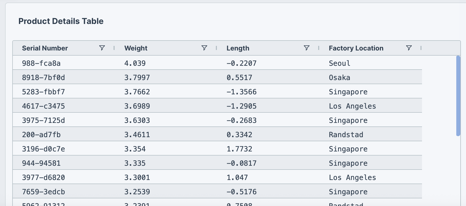
Show a table with serial number, weight, length, and factory location,
sorted by weight descending.
Pagination
Use pagination to customize the number of records to show per page.
Show a table with <columns>. Add pagination with <number> rows per page.
The following example uses this prompt structure with the built-in Plotly Studio dataset:
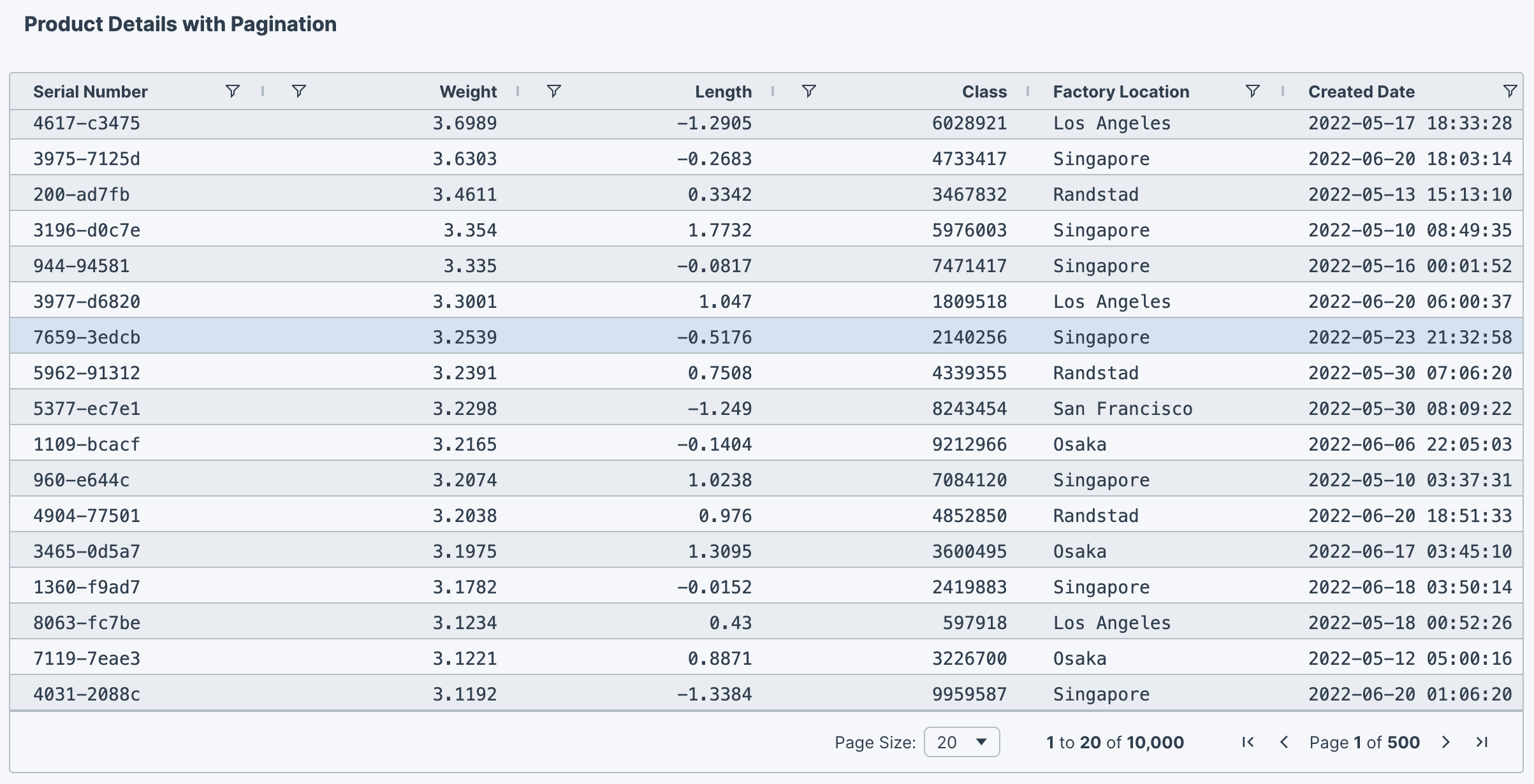
Show a table with serial number, weight, length, class,
factory location, and created date.
Sort by weight descending. Add pagination with 20 rows per page.
Column alignment
Columns can be right-aligned, center-aligned, or left-aligned.
Show a table with <columns>. <Alignment>-align <column names> columns.
The following example uses this prompt structure with the built-in Plotly Studio dataset:
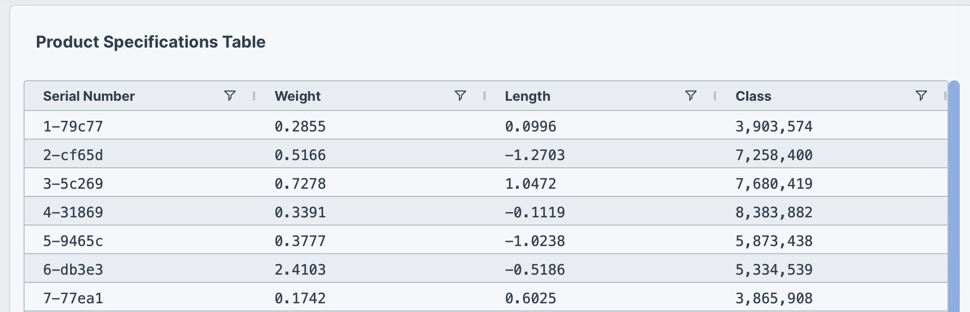
Show a table with serial number, weight, length, and class.
Show top 20 products. Left-align all columns.
Column pinning
Pinning columns (sometimes referred to as freezing columns) keeps them visible while scrolling the table horizontally. Pinned columns remain fixed as you scroll, allowing you to keep important reference information like IDs or names in view.
Show a table with <columns>. Pin <column> to the <left/right>.
The following example uses this prompt structure with the built-in Plotly Studio dataset:
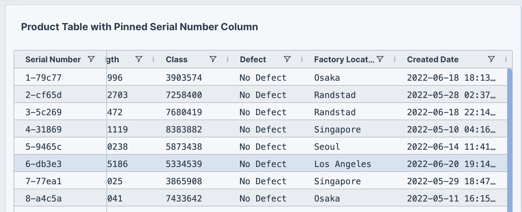
Show a table with serial number, weight, length, class, defect,
factory location, and created date.
Show top 20 products. Pin serial number to the left.
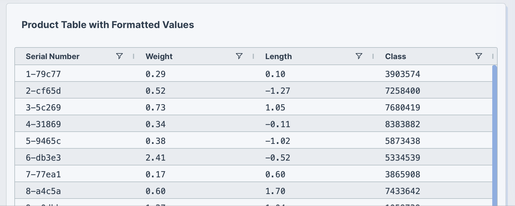
Formatting values
Format how values are displayed without changing the underlying data. Some examples of formatting data include adding currency symbols, specifying the number of decimal places, and adding a percentage sign.
Show a table with <columns>.
Format <column> with <number> decimal places.
Format <column> as currency.
The following example formats numeric columns with specific decimal precision:
Show a table with serial number, weight, length, and class.
Show top 20 products.
Format weight and length with 2 decimal places.
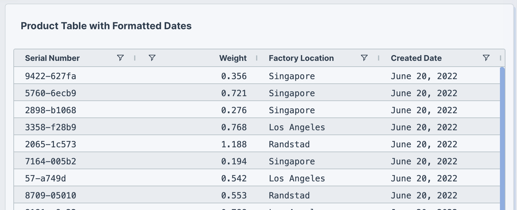
Date formatting
You can display date and time values in different formats by specifying a format in your prompt. For example, "Month Day, Year".
Show a table with <columns>. Format <date column> as "<date format>".
The following example formats the Created date column with a readable date format:
Show a table with serial number, weight, factory location, and created date.
Show top 20 products sorted by created date descending.
Format created date as "Month Day, Year" (e.g., November 19, 2024).
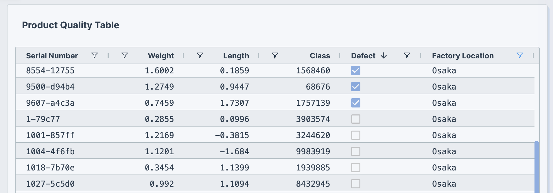
Checkboxes
Display boolean data ("True"/"False") as checkboxes instead of text.
Show a table with <columns>.
Display <column> as checkboxes (checked for <condition>, unchecked for <condition>).
The following example uses this prompt structure with the built-in Plotly Studio dataset:
Show a table with serial number, weight, length, class,
defect, and factory location, sorted by serial number.
Display defect as checkboxes (checked for defects, unchecked for no defects).
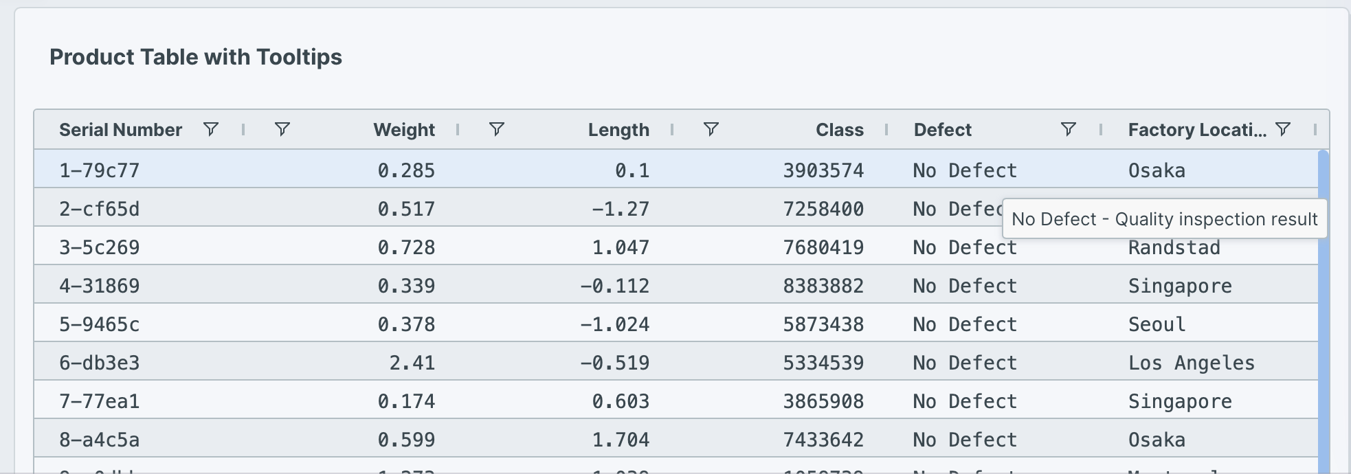
Tooltips
Add tooltips that are displayed when hovering over cells to provide additional context or explain what the data represents.
Show a table with <columns>.
Add tooltips to <columns> showing "<custom tooltip text>".
The following example uses this prompt structure with the built-in Plotly Studio dataset:
Show a table with serial number, weight, length, class,
defect, and factory location for the top 20 products.
Add tooltips to all columns showing the full cell value on hover.
Add a tooltip to weight showing "Product weight in kilograms".
Add a tooltip to defect showing "Quality inspection result".
Aggregation
Group rows together and calculate summary statistics like totals, counts, averages, minimum, or maximum values. Aggregation helps you analyze patterns and trends across categories in your data.
Show a table grouped by <column> with <aggregated columns>.
Sort by <column> <direction>.
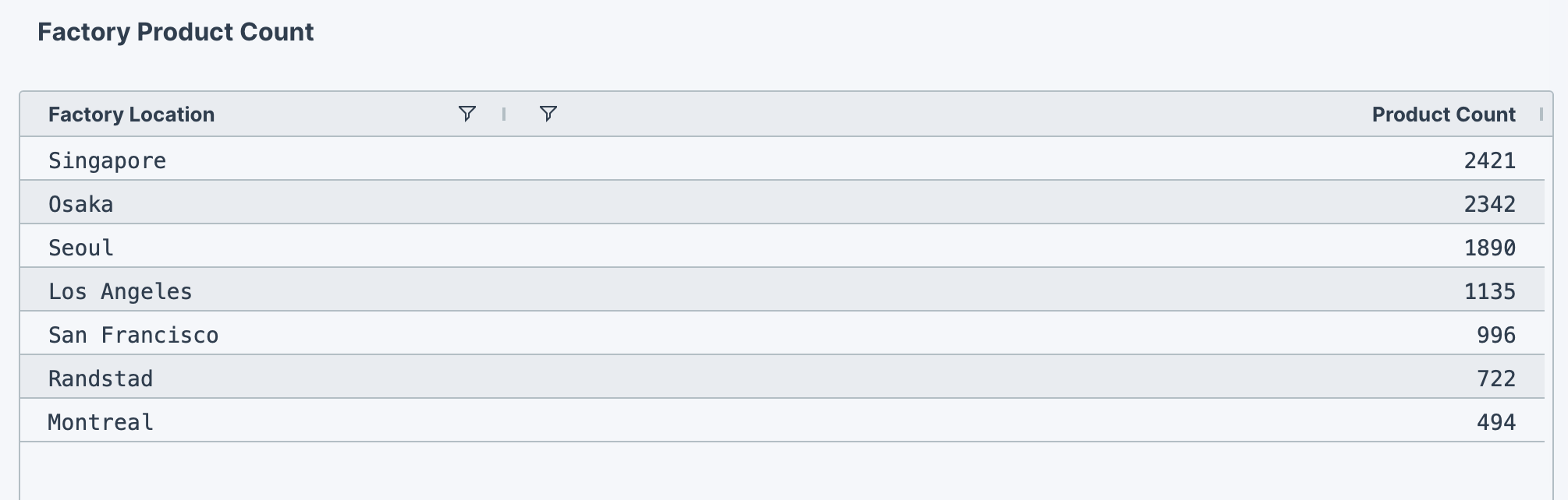
The following example uses this prompt structure with the factory_location column from the built-in Plotly Studio dataset:
Show a table grouped by factory location with product count.
Sort by count descending.
Examples of other aggregations
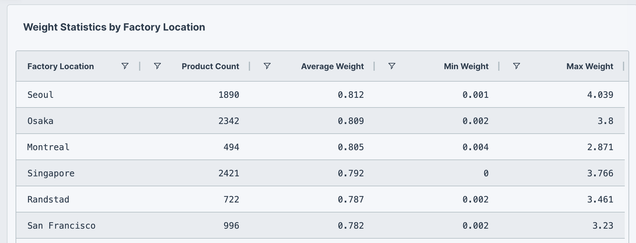
The following prompt example calculates multiple statistics (count, average, min, max) using the built-in Plotly Studio dataset:
Show weight statistics by factory location:
count, average, min, and max weight.
Sort by average weight descending.
Conditional formatting
Apply styles to rows based on values in columns. For example, use color-coding to highlight rows that meet certain thresholds or criteria. This can make it easier to see patterns, outliers, and important rows at a glance.
Show a table with <columns>.
Color rows where <column> <condition> as <color>.
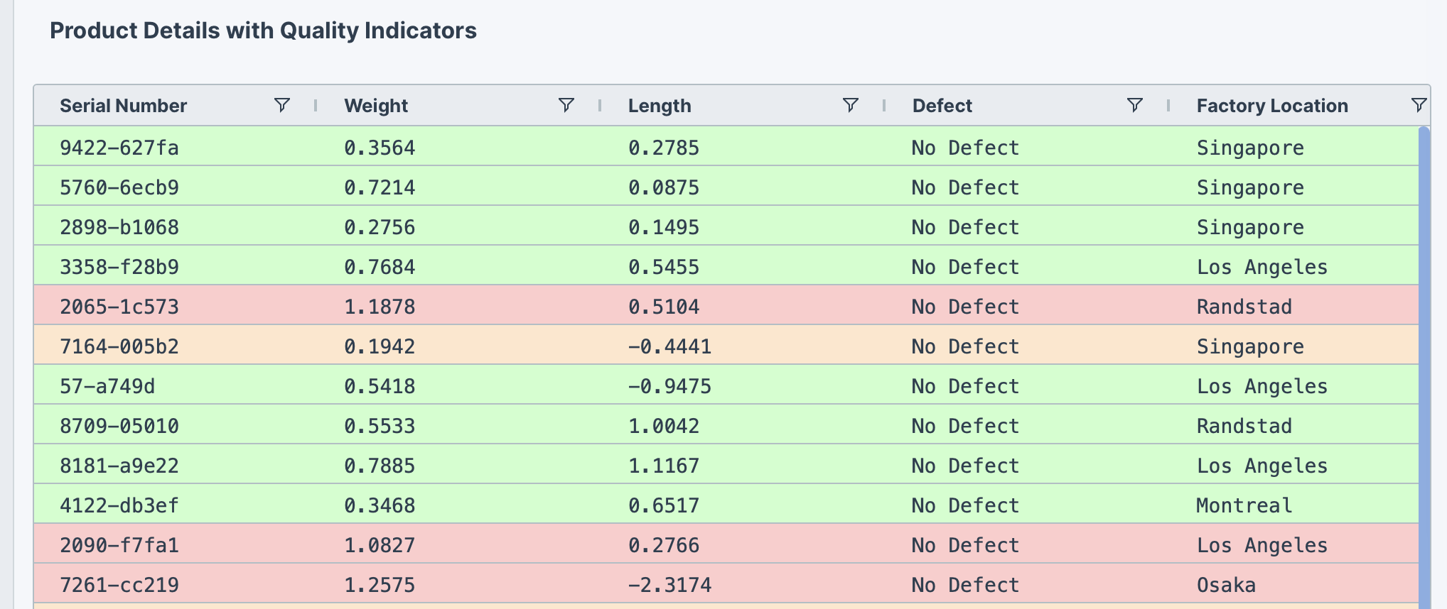
The following example uses this prompt structure with the built-in Plotly Studio dataset:
Show a table with serial number, weight, length, defect,
factory location, and created date.
Sort by created date descending. Show top 100 products.
Color rows where weight > 0.8 as red.
Color rows where weight < 0.2 as orange.
Color rows where defect != "No Defect" as yellow.
Color rows in normal range (0.2-0.8) as green.
HTML tables
You can ask Plotly Studio for an HTML table when you want more control over the table's styling.
Create an HTML table with <columns>.
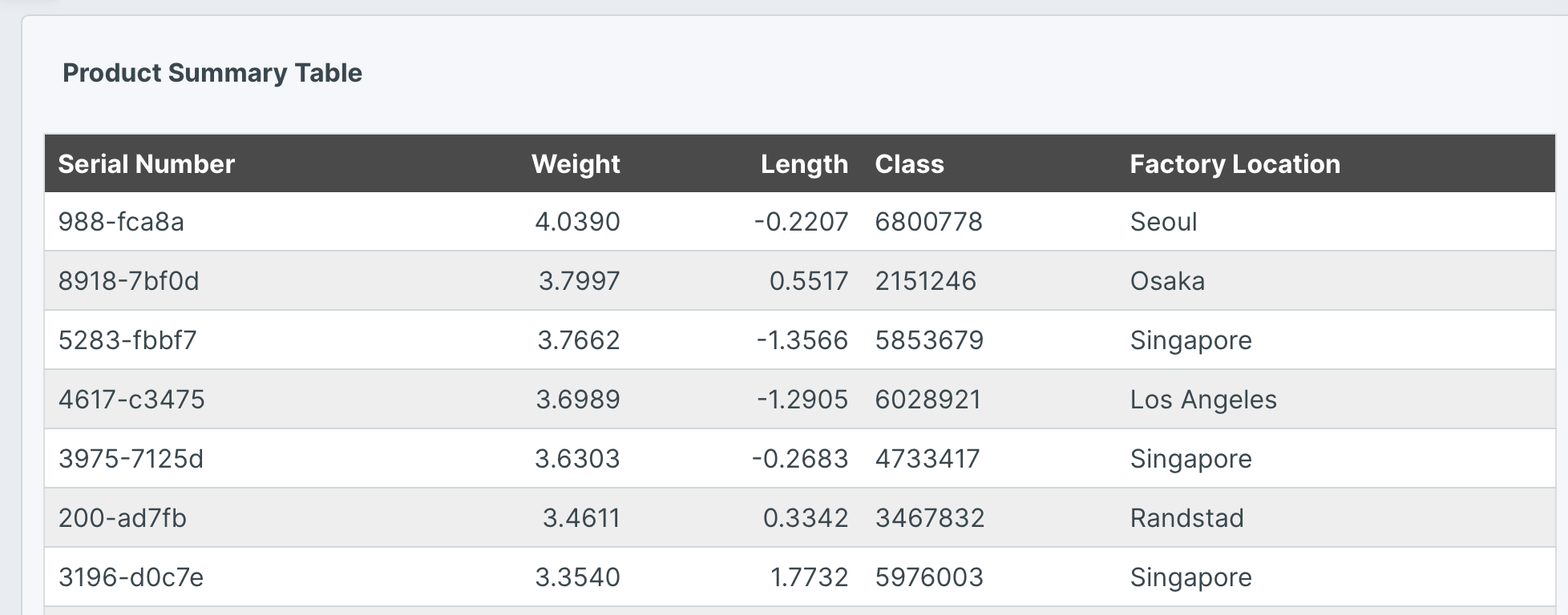
The following example uses this prompt structure with the built-in Plotly Studio dataset:
Create an HTML table with serial number, weight, length,
class, and factory location.
Show top 20 products sorted by weight descending.
Use alternating row colors (white and #eeeeee light gray).
Bold column headers with dark gray background (#4a4a4a).
Add a border around the entire table.
Right-align weight and length columns.
Use minimal cell padding for compact display.
Prompt keywords reference
Use these keywords and phrases in your prompts to customize your table.
Chart
Here are some keyword suggestions to create and customize a table:
Two table types are available — use table for built-in AG Grid features like sorting and pagination, or HTML table for full styling control.
| Keyword/Phrase | Description | Example |
|---|---|---|
| Columns | The columns to display in the table | serial number, weight, length, class |
Data
Specify data instructions in your prompt to transform, filter, sort, or aggregate your data before displaying it in the table.
Sort by weight descending.
Show top 20 products.
Here are some keyword suggestions:
| Keyword/Phrase | Description | Example |
|---|---|---|
| Sort by | Sort the table by a column in ascending or descending order | Sort by weight descending |
| Show top | Limit the number of rows displayed | Show top 20 products |
| Filter | Filter data to show only specific records | Filter to show only defect = true |
| Group by | Group rows together for aggregation | Group by factory location |
| Aggregation | Calculate summary statistics like count, sum, average, min, or max | Count products per factory |
| Computed field | Create new calculated fields from existing data | Calculate shipping days as the difference between shipped date and created date in days |
Options
Specify options in your prompt to customize the table's appearance and add interactive features like pagination, formatting, alignment, and conditional styling.
Add pagination with 20 rows per page.
Format weight with 2 decimal places.
Pin serial number to the left.
Here are some keyword suggestions:
| Keyword/Phrase | Description | Example |
|---|---|---|
| Pagination | Add pagination and specify rows per page | Add pagination with 20 rows per page |
| Column alignment | Align columns left, center, or right | Right-align serial number, weight, and length columns |
| Pin column | Pin columns to left or right to keep them visible while scrolling | Pin serial number to the left |
| Format values | Format numeric values with decimal places, as currency, or as percentages | Format weight with 2 decimal placesFormat price as currencyFormat discount as percentage |
| Format dates | Display date values in specific formats | Format created date as "Month Day, Year" |
| Display as checkboxes | Show boolean values as checkboxes | Display defect as checkboxes |
| Add tooltips | Add hover tooltips to provide additional context | Add a tooltip to weight showing "Product weight in kilograms" |
| Color rows | Apply conditional formatting to highlight rows based on conditions | Color rows where weight > 0.8 as red |