App Controls
App controls let people filter and adjust the whole app from a shared set of inputs at the top of the page.
Use them when you want one selection to update multiple charts, tables, or KPIs at once.
Basic app filter example
Start with a basic prompt that describes the control you want to add.
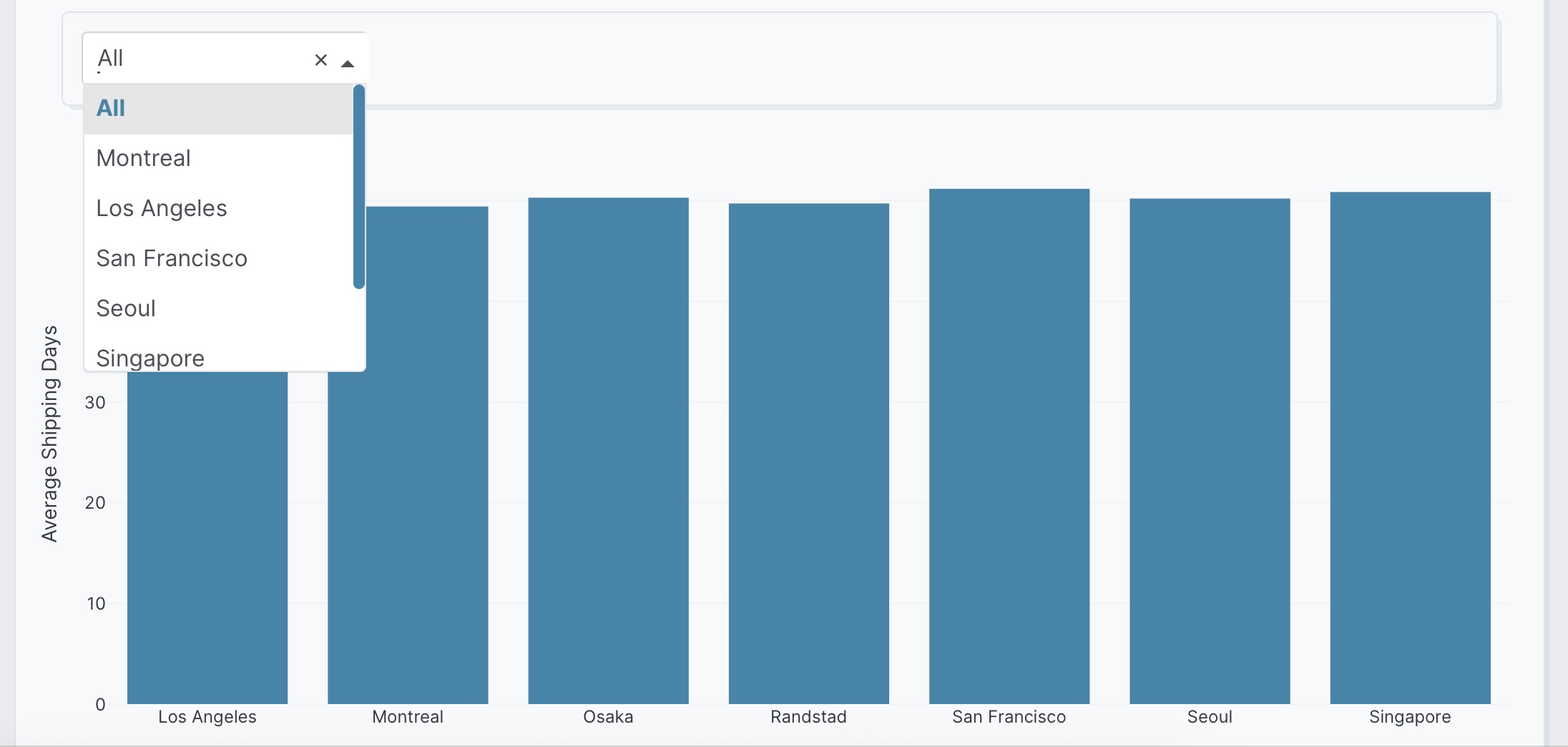
Add a dropdown at the top of the app for factory location
(All, Montreal, Los Angeles, San Francisco, Seoul, Singapore, Osaka, Randstad)
with default All.
The following example uses the built-in Plotly Studio dataset with the delivery_location, factory_location, and shipped_date columns:
Add a dropdown at the top of the app for factory location
(All, Montreal, Los Angeles, San Francisco, Seoul, Singapore, Osaka, Randstad)
with default All.
Available control types
You can ask for app-level controls in plain language. The examples below all describe controls placed at the top of the app so they can drive the full experience, not just one chart.
Date Range Terminology
Use "Latest" (not "Last") for time-based filters to reference dataset dates, not calendar dates.
Dropdowns are useful for choosing one value from a list or switching between a few app states.
Single-value:
Add a dropdown at the top of the app for factory location
(All, Montreal, Los Angeles, San Francisco) with default All.
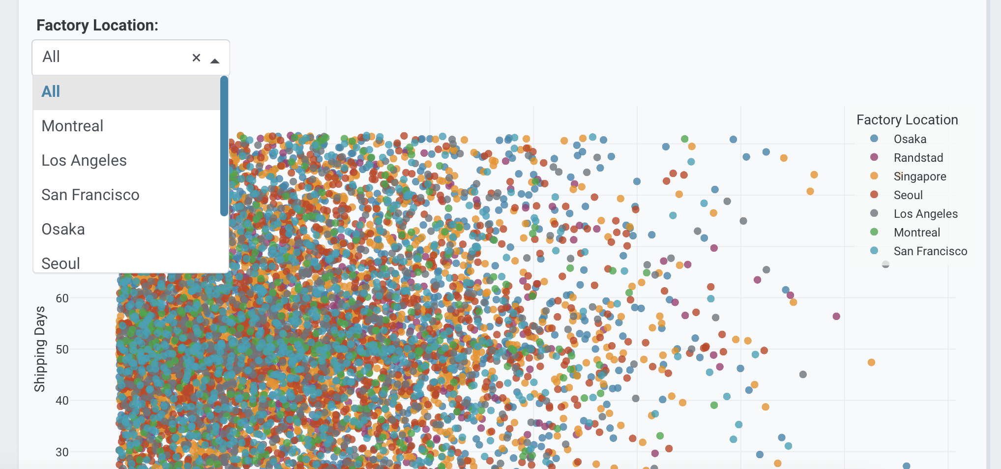
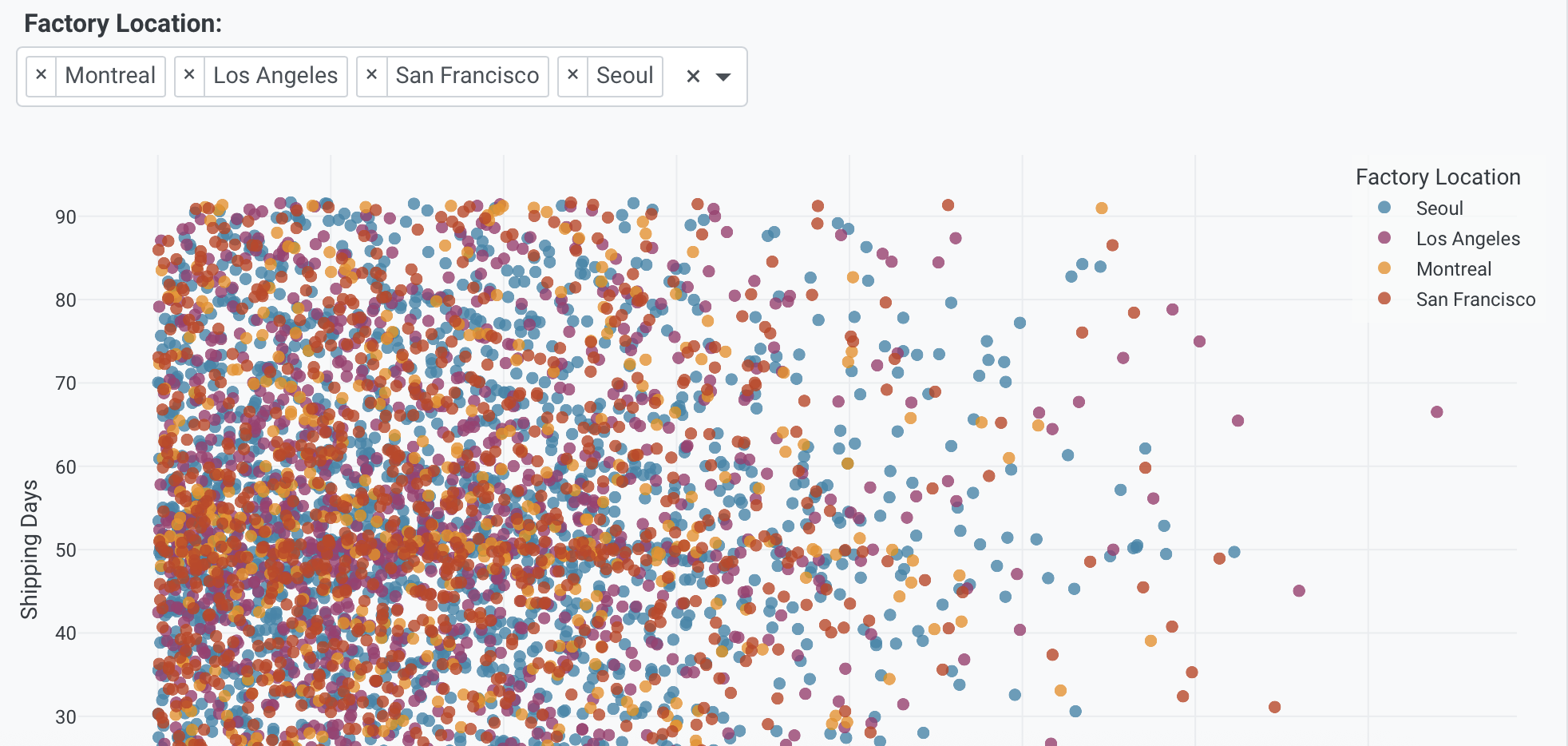
Multi-value:
Add a multi-select dropdown at the top of the app for factory location
(Montreal, Los Angeles, San Francisco, Seoul) with all selected by default.
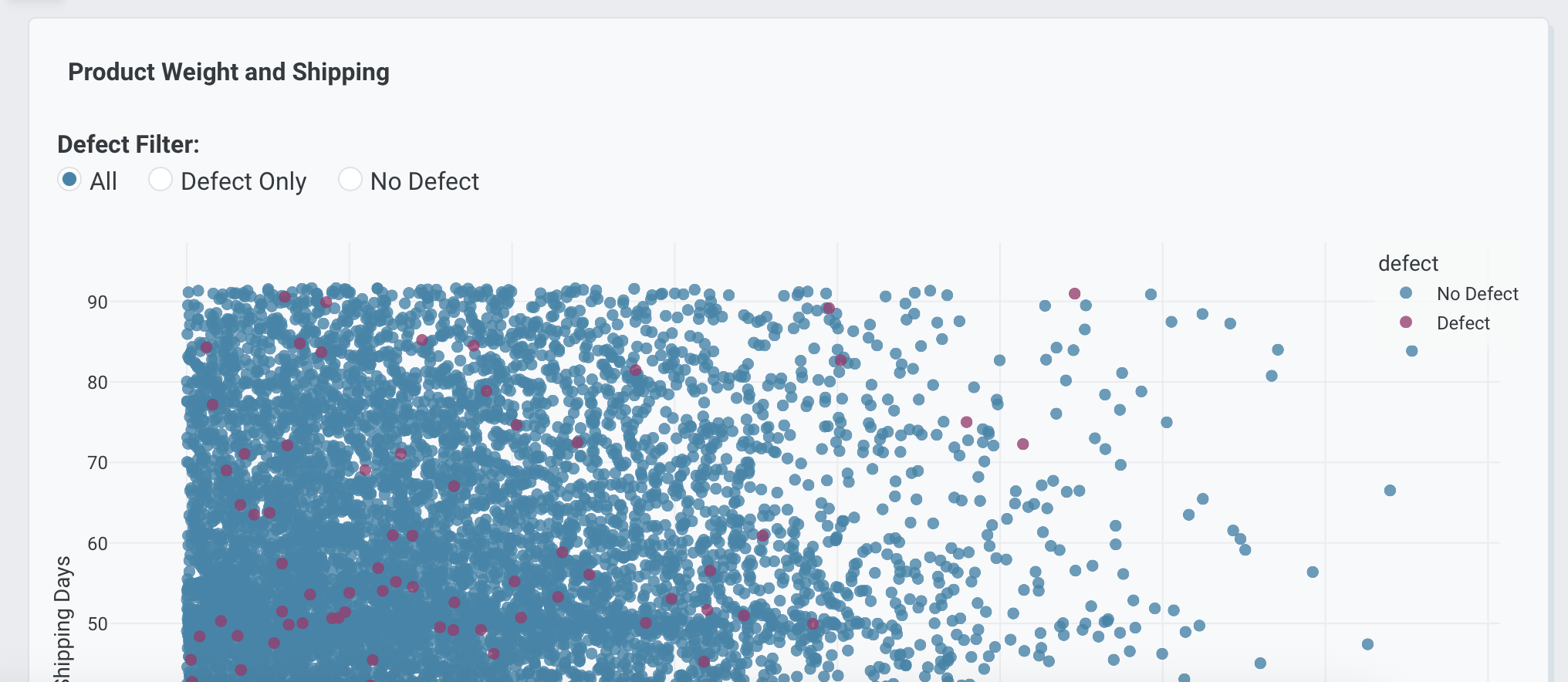
Radio buttons work well when you want one clearly visible choice among a small number of options.
Add radio buttons at the top of the app for defect status
(All, Defect Only, No Defect) with default All.
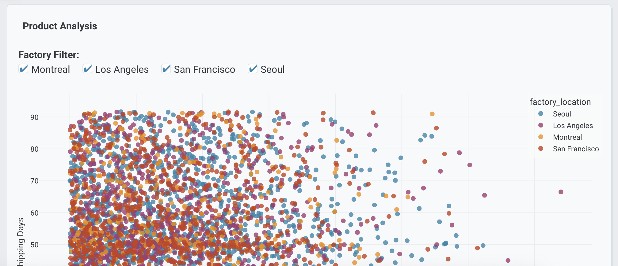
Checklists are useful when you want app users to turn multiple categories on or off.
Add a checklist at the top of the app for factory location
(Montreal, Los Angeles, San Francisco, Seoul) with all selected by default.
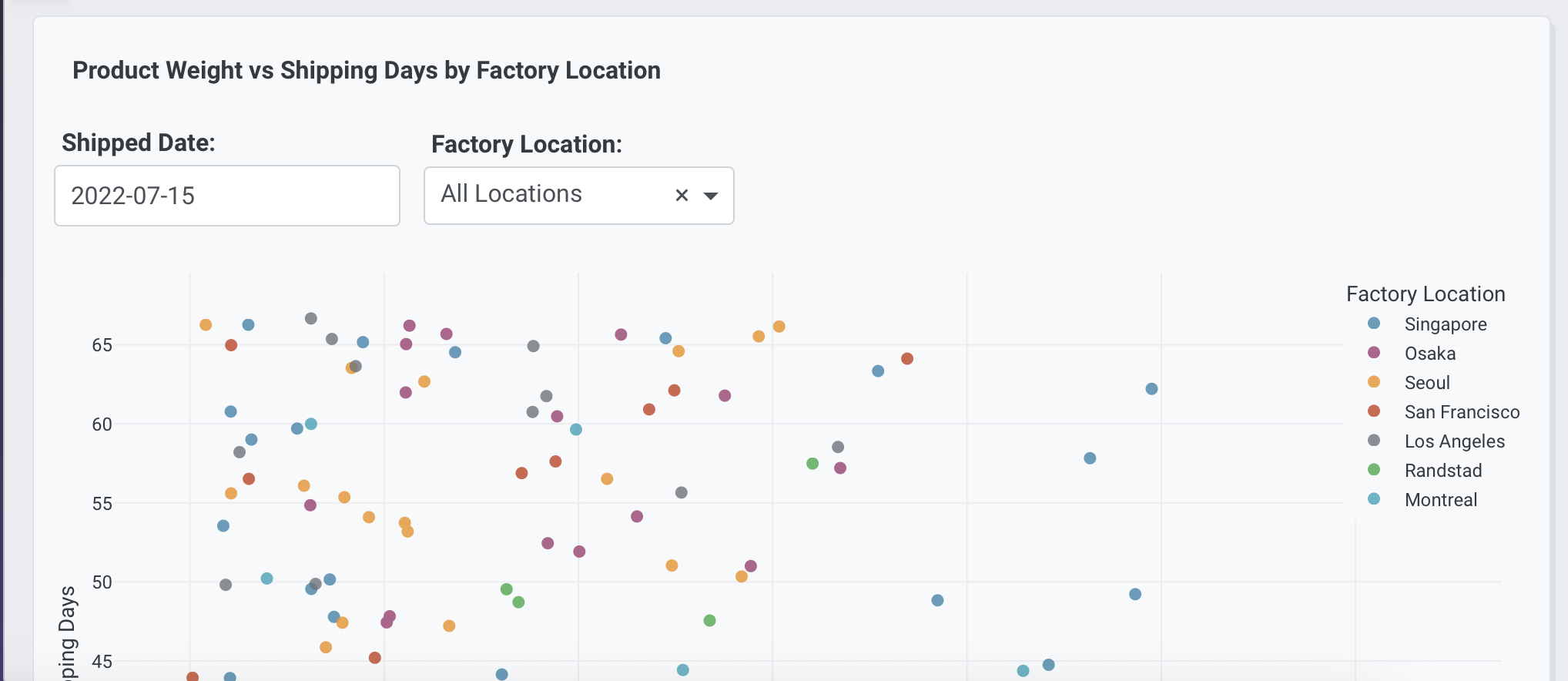
Use a date picker when the app should focus on one exact date.
Add a date picker at the top of the app for shipped date
with default 2024-01-01.
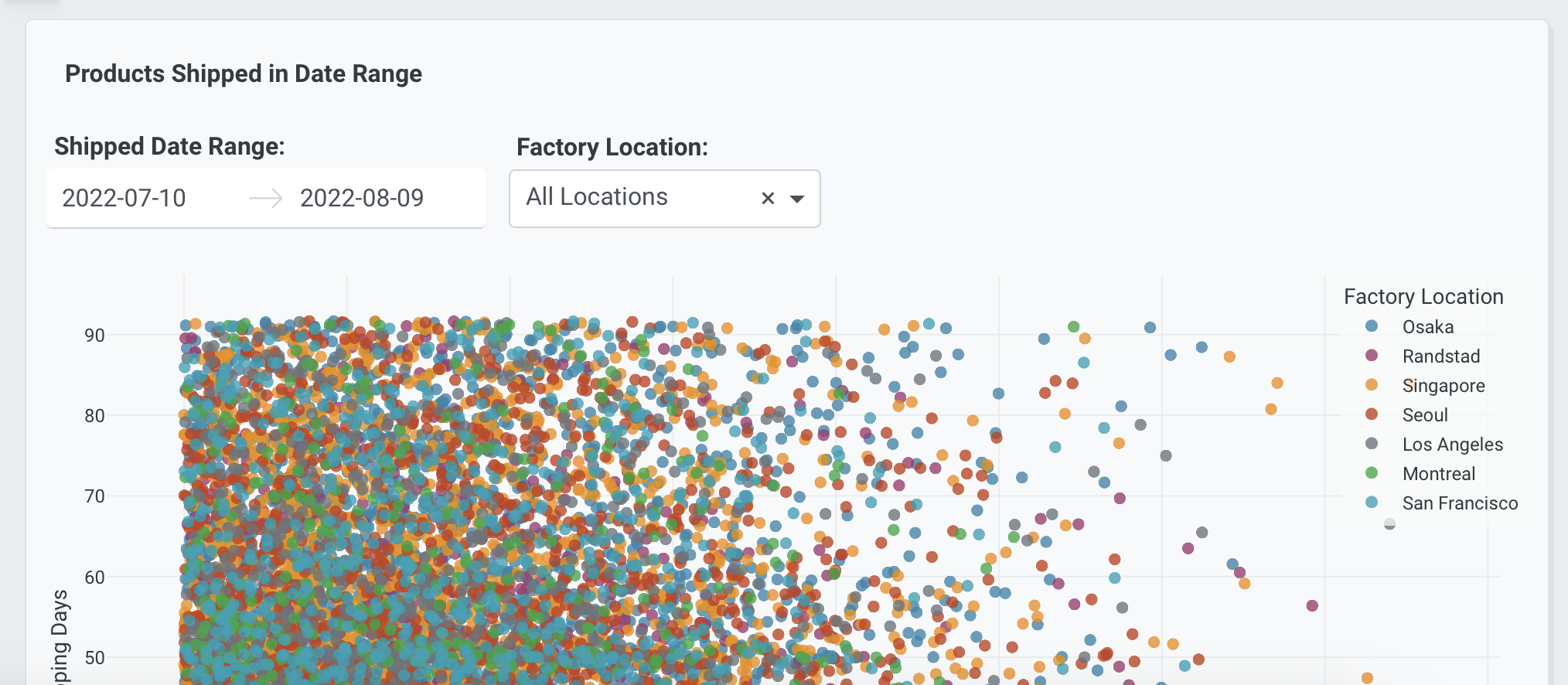
Use a date range picker when the app should filter data between two dates.
Add a date range picker at the top of the app for shipped date
with default Latest 30 days.
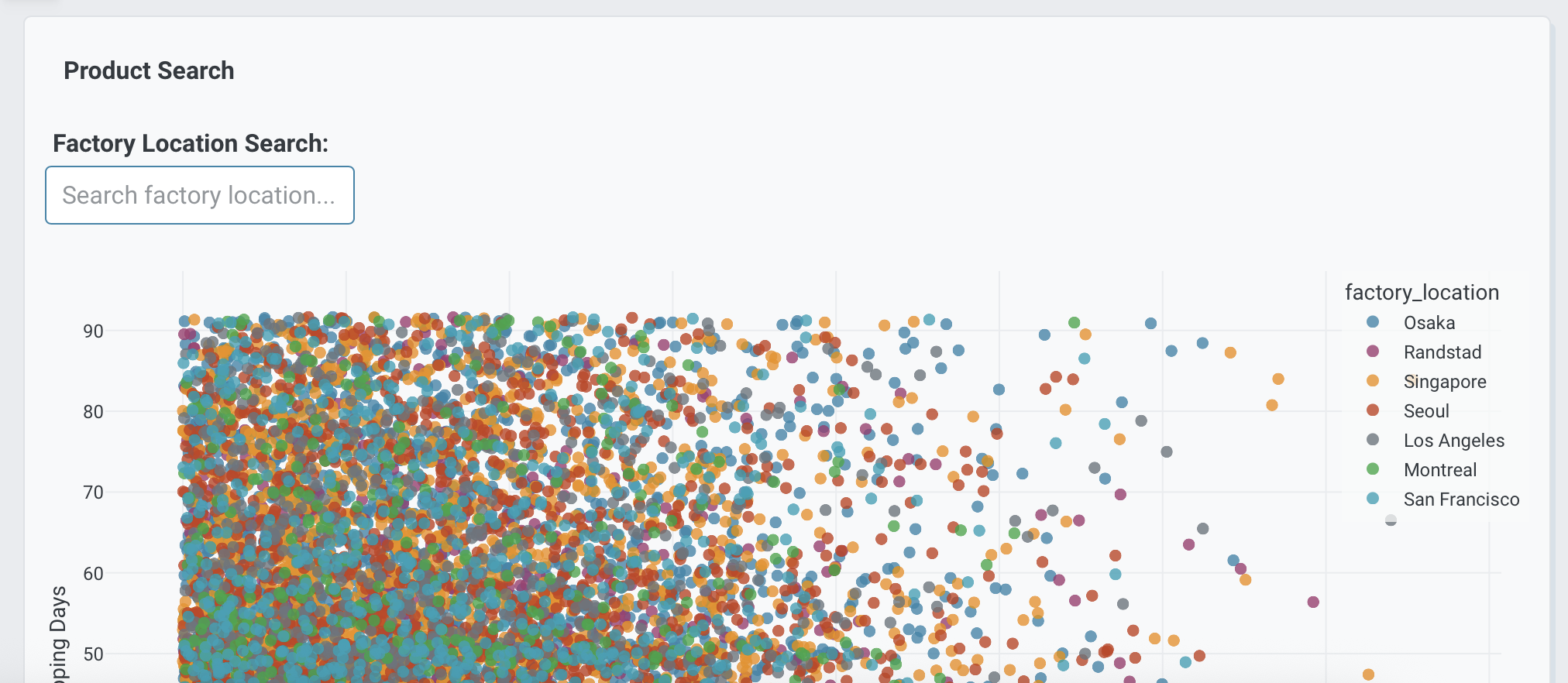
Text inputs are helpful for search terms, freeform IDs, or quick filtering.
Add a text input at the top of the app to search factory location.
Leave it empty by default.
Multiple app controls
It is common to combine several controls so the entire app can be filtered from one place.
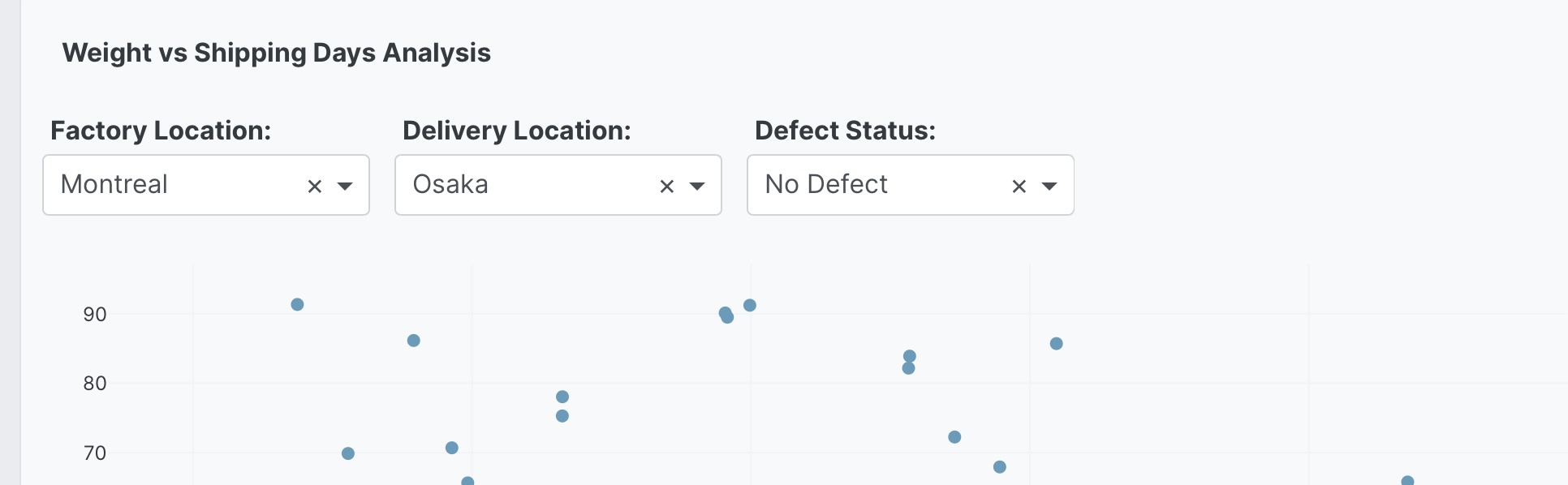
Add a dropdown at the top of the app for factory location
(All, Montreal, Los Angeles, San Francisco, Seoul, Singapore, Osaka, Randstad)
with default All.
Add a dropdown at the top of the app for delivery location
(All, Montreal, Los Angeles, San Francisco, Seoul, Singapore, Osaka, Randstad)
with default All.
Add a dropdown at the top of the app for defect status
(All, No Defect, Defect) with default All.
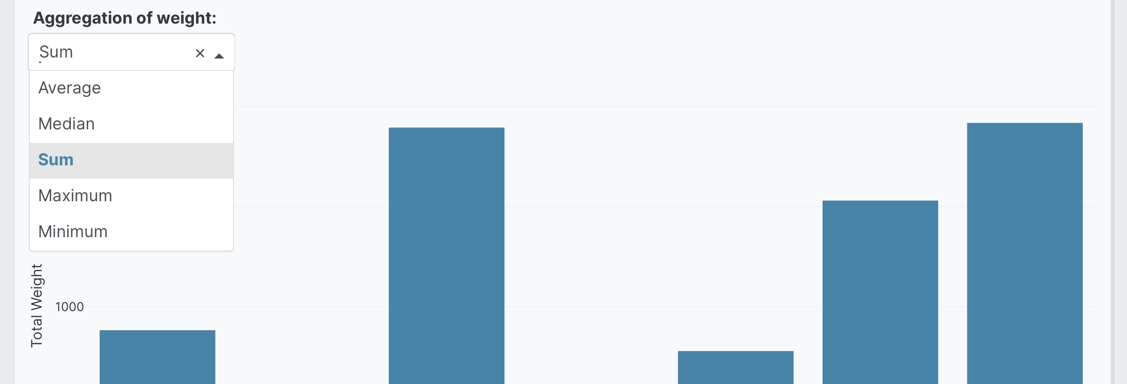
Aggregation controls
You can also add app controls that change how summaries are calculated across the app.
Add a dropdown at the top of the app for aggregation
(Sum, Average, Count, Min, Max, Median) with default Average.
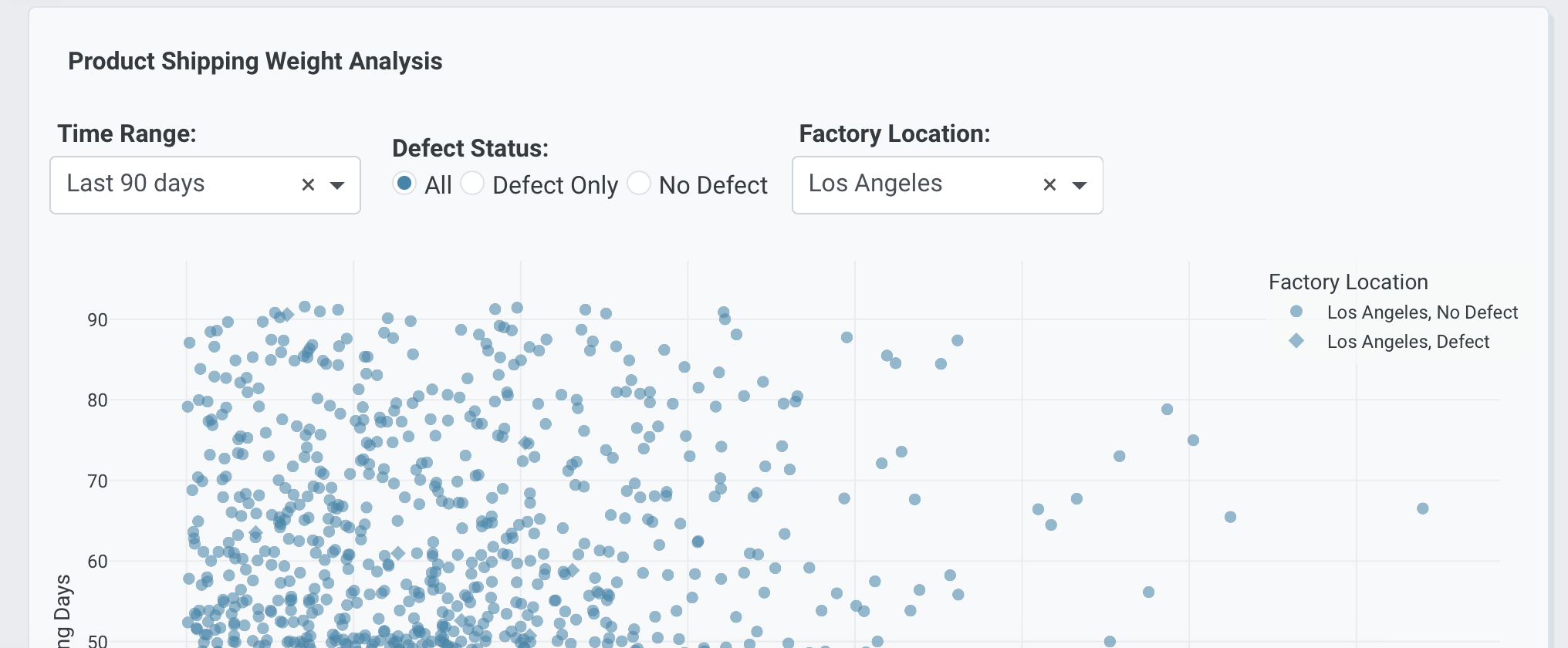
Combining filter and view controls
Controls can mix filtering with display choices so users can reshape the app without rewriting the prompt.
Add a dropdown at the top of the app for time range
(Latest 30 days, Latest 90 days, Latest year, All dates) with default Latest 90 days.
Add radio buttons at the top of the app for defect status
(All, Defect Only, No Defect) with default All.
Add a dropdown at the top of the app for chart type
(Bar chart, Pie chart, Treemap) with default Bar chart.
Prompt keywords reference
Use phrases like these when you want Plotly Studio to add controls to the top of the app.
Add a <control type> at the top of the app for <purpose> with default <value>.
Here are some keyword suggestions:
| Keyword/Phrase | Description | Example |
|---|---|---|
| Add a dropdown at the top of the app | Add a single-select menu for filtering or switching views | Add a dropdown at the top of the app for factory location (All, Montreal, Osaka) with default All |
| Add a multi-select dropdown at the top of the app | Add a dropdown that supports multiple selections | Add a multi-select dropdown at the top of the app for factory location (Montreal, Osaka, Seoul) with all selected by default |
| Add radio buttons at the top of the app | Add a small set of mutually exclusive choices | Add radio buttons at the top of the app for defect status (All, Defect Only, No Defect) with default All |
| Add a checklist at the top of the app | Add a visible set of multi-select options | Add a checklist at the top of the app for regions (Montreal, Osaka, Seoul) with all selected by default |
| Add a date picker at the top of the app | Filter the app to a single date | Add a date picker at the top of the app for shipped date with default 2024-01-01 |
| Add a date range picker at the top of the app | Filter the app to a date range | Add a date range picker at the top of the app for shipped date with default Latest 30 days |
| Add a text input at the top of the app | Let users search or enter a value | Add a text input at the top of the app to search factory location |
| with default | Set the initial value for any control | Add a dropdown at the top of the app for status (...) with default All |