Box Plots
A box plot is a statistical representation of the distribution of a column through its quartiles. The ends of the box represent the lower and upper quartiles, while the median (second quartile) is marked by a line inside the box. You can create grouped box plots to compare distributions across categories, and apply styles and customizations like colors, orientations, and point display.
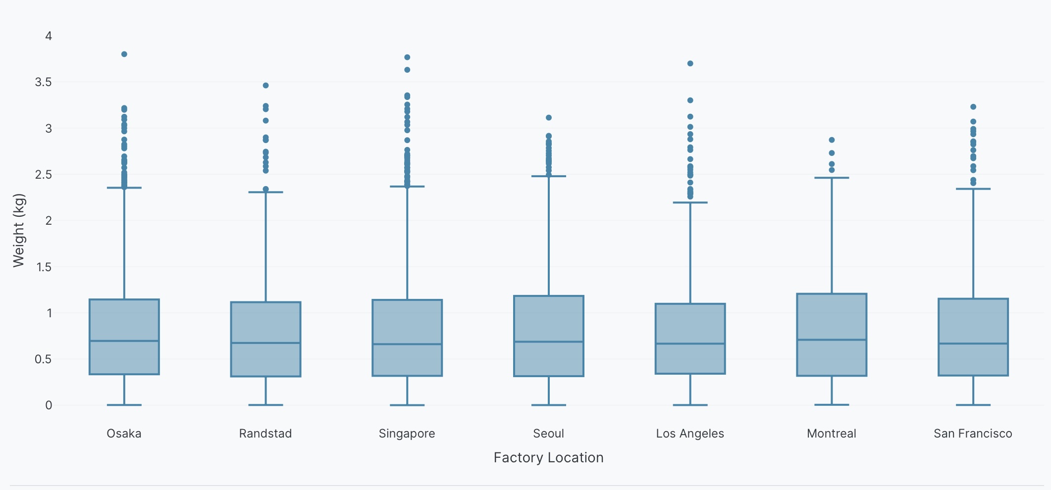
Basic box plot example
Here's an example of how to create a basic box plot showing the distribution of a single column.
Create a box plot of <Y> by <X>.
The following example uses this prompt structure with the factory_location and weight columns from the built-in Plotly Studio dataset:
Create a box plot of weight by factory location.
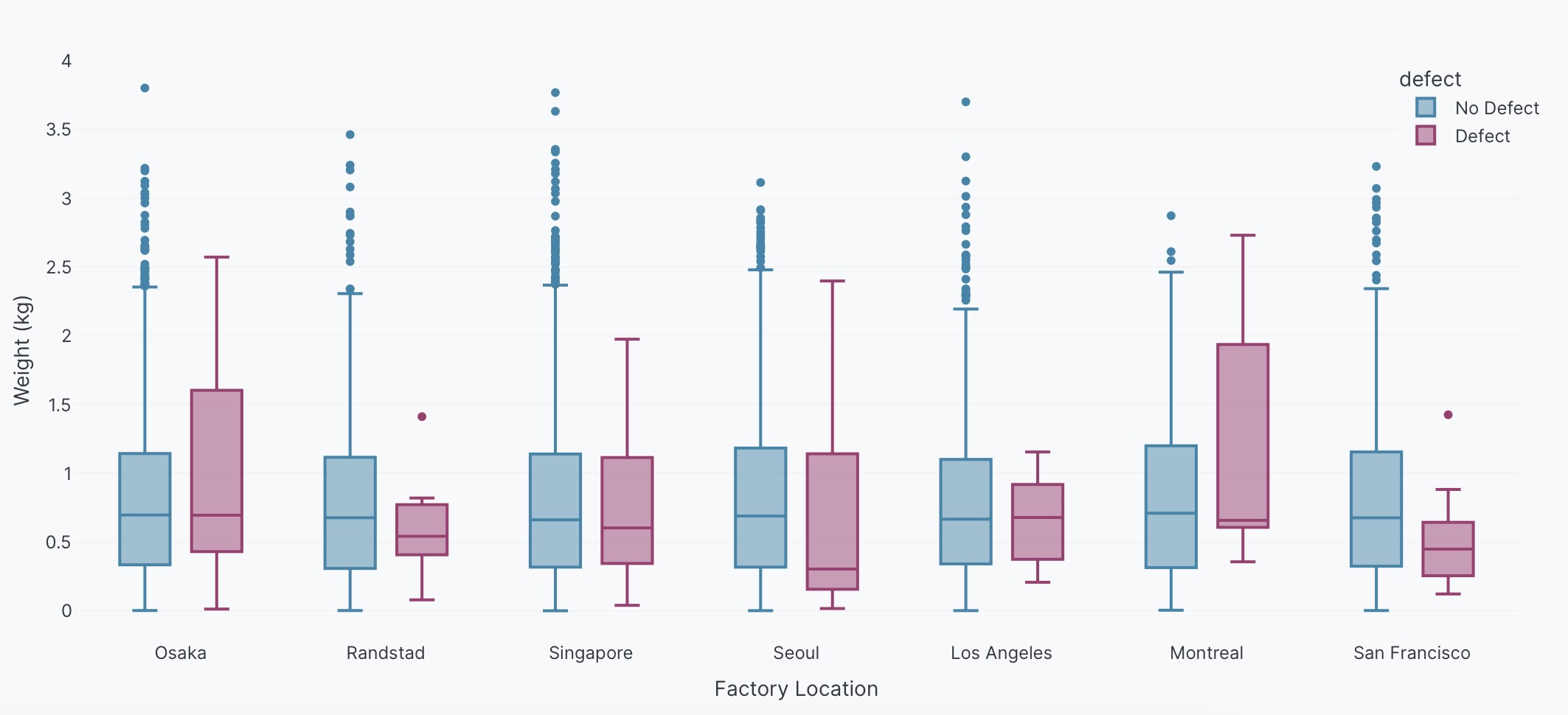
Grouped box plots
Compare distributions across multiple categories by adding color to create side-by-side box plots.
Create a box plot of <Y> by <X>, color by <Column>.
The following example uses this prompt structure with the factory_location, weight, and defect columns from the built-in Plotly Studio dataset:
Create a box plot of weight by factory location, color by defect.
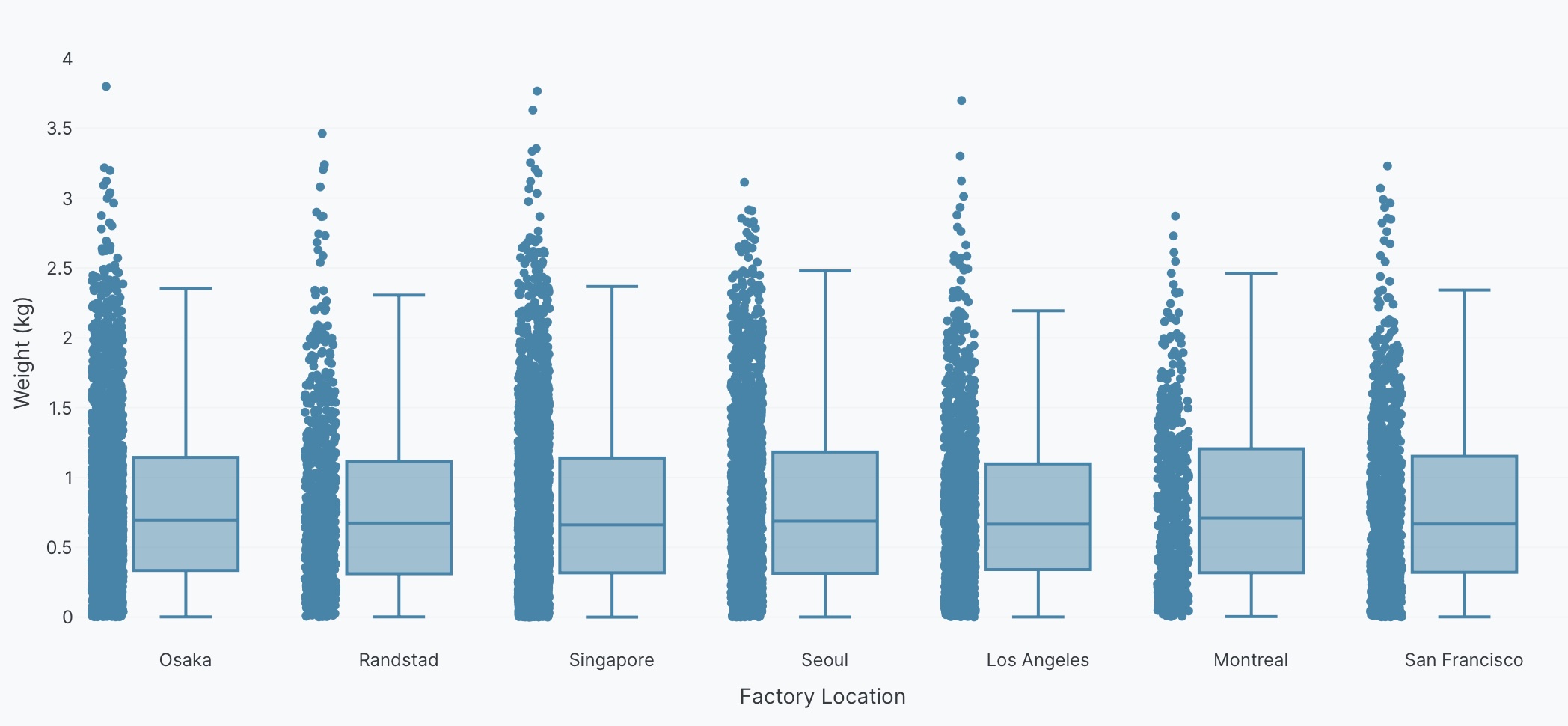
Display the underlying data
Display underlying data points with the box plot to show all points, outliers only, or hide them completely.
Create a box plot of <Y> by <X>. Show all points.
The following example uses this prompt structure with the factory_location and weight columns from the built-in Plotly Studio dataset:
Create a box plot of weight by factory location. Show all points.
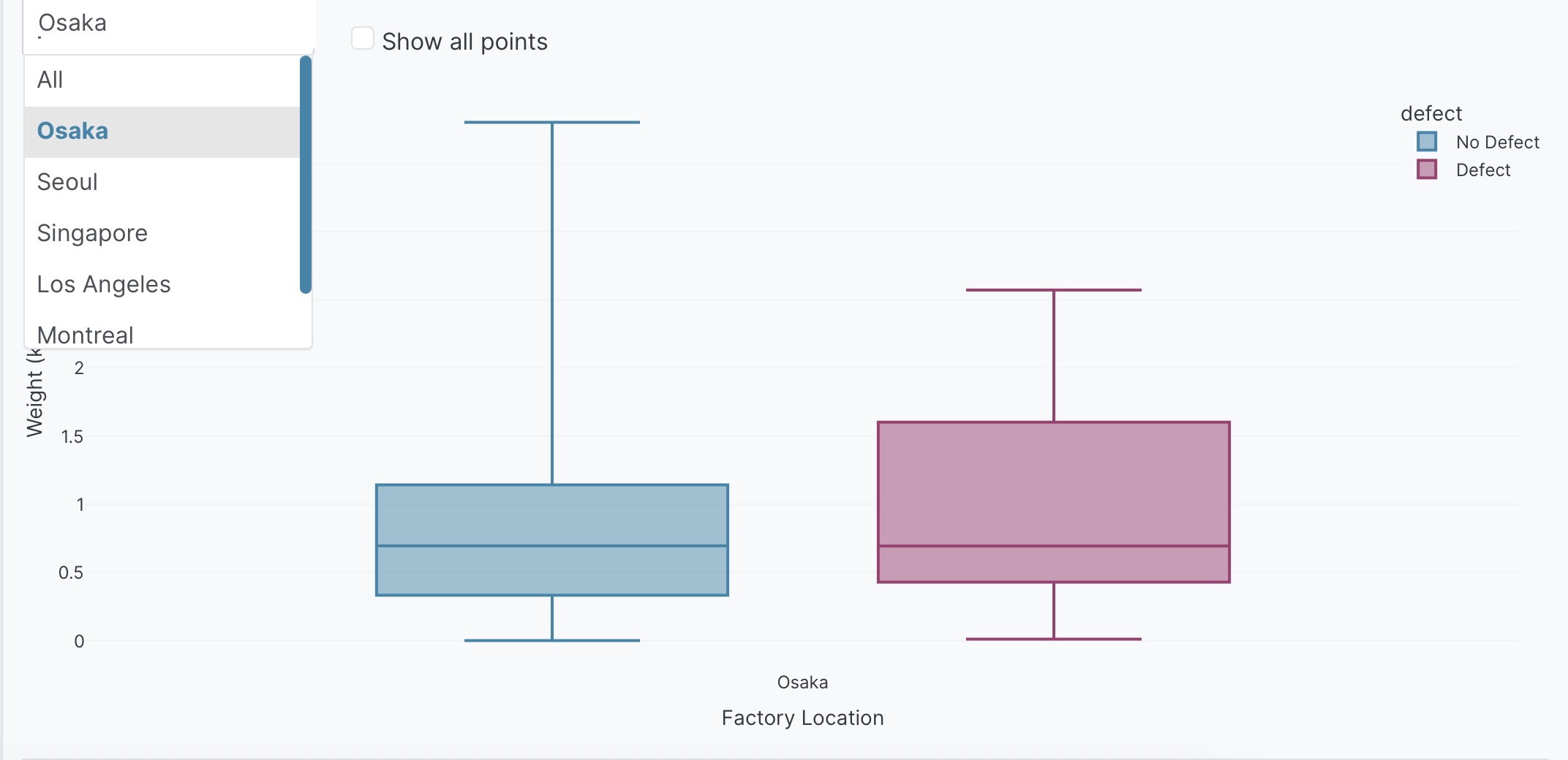
Interactive controls
Add dropdowns and other controls to make your box plots interactive. Controls let users filter and explore the data dynamically.
Create a box plot of weight by factory location, color by defect.
Add a dropdown to select factory
(All, Osaka, Seoul, Singapore, Los Angeles, Montreal, Randstad) - Default All.
Add a checkbox to toggle point display - Default hide points.
Prompt keywords reference
Use these keywords and phrases in your prompts to customize your box plot.
Chart
Here are some keyword suggestions to create and customize a chart:
| Keyword/Phrase | Description | Example |
|---|---|---|
| X | The categorical variable for grouping | factory location |
| Y | The numeric variable to show distribution for | weight |
| Color | Color box plots by different groups | color by defect |
| Facet columns | Create multiple subplots side-by-side for each category | facet by defect |
| Facet rows | Create multiple plots stacked vertically by group | facet vertically by factory location |
Data
Specify data instructions in your prompt to transform, filter, or aggregate your data before visualization.
Calculate weight category based on weight ranges.
Filter to show only defect = true.
Here are some keyword suggestions:
| Keyword/Phrase | Description | Example |
|---|---|---|
| Aggregation | Specify how to aggregate data | average weight by factory location |
| Computed field | Create new calculated fields from existing data | calculate weight category based on weight ranges |
| Filter | Filter data to show only specific records | filter to show only defect = true |
Options
Specify options in your prompt to add interactive controls that allow users to dynamically filter, transform, and visualize data without regenerating the chart.
Add a dropdown to select factory (All, Osaka, Seoul, Singapore) - Default All.
Add a checkbox to toggle point display - Default hide points.
Here are some keyword suggestions. See App Controls for a complete list of control types and additional examples.
| Keyword/Phrase | Description | Example |
|---|---|---|
| Dropdown | Add a dropdown menu to filter by categories | Add a dropdown to select factory (All, Osaka, Seoul) - Default All |
| Checkbox | Add a checkbox to toggle options | Add a checkbox to toggle point display - Default hide points |
Chart styles
Specify chart styles in your prompt to control the visual appearance and formatting of your box plot.
Use custom colors: #FF5733, #33FF57.
Make the chart horizontal.
Show all points.
Here are some keyword suggestions:
| Keyword/Phrase | Description | Example |
|---|---|---|
| Custom colors | Specify exact colors for box plots | Use custom colors: #FF5733, #33FF57 |
| Horizontal orientation | Flip box plots to horizontal orientation | Make the chart horizontal |
| Show points | Display individual data points on the box plot | Show all points |
| Show outliers only | Display only outlier points | Show outliers only |
| Point position | Control how points are displayed (jittered, overlaid) | Show points with jitter |
| Box mode | Set how grouped boxes are displayed (group, overlay) | Use overlay mode |
| Notched boxes | Add notches to show confidence interval around median | Show notched boxes |
| Quartile method | Specify quartile calculation method | Use inclusive quartile method |
| Hover text | What to show when hovering over boxes | Show factory location on hover |
| Axis labels | Rename axis labels to be more readable | Label x-axis as "Factory"Label y-axis as "Product Weight (kg)" |
| Axis range | Set minimum and maximum values for axes | Set y-axis range from 0 to 3 |
| Legend | Control legend display and position | Show legend at top right |