Maps
If your dataset includes geospatial data, you can represent it on a map. Plotly Studio supports the following map types:
- scatter map: Displays each row of data as a marker point at coordinates given by latitude and longitude columns
- density heatmap: Represents each point smoothed with a radius of influence to show concentration patterns
- choropleth map: Colors geographic regions (countries, states, counties) based on data values
You can customize map styles, zoom levels, and other visual properties.
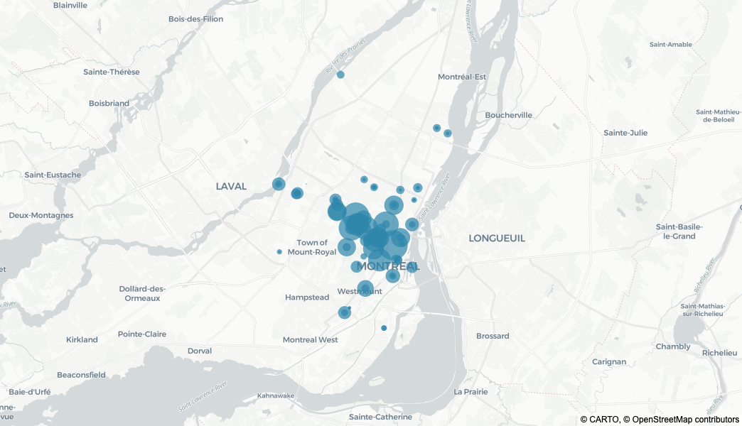
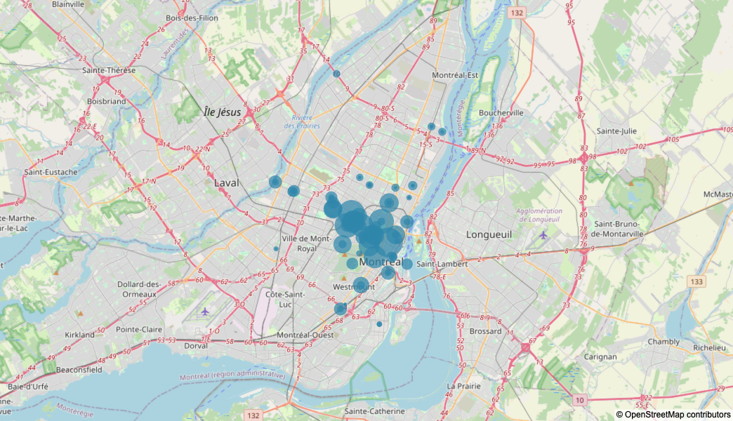
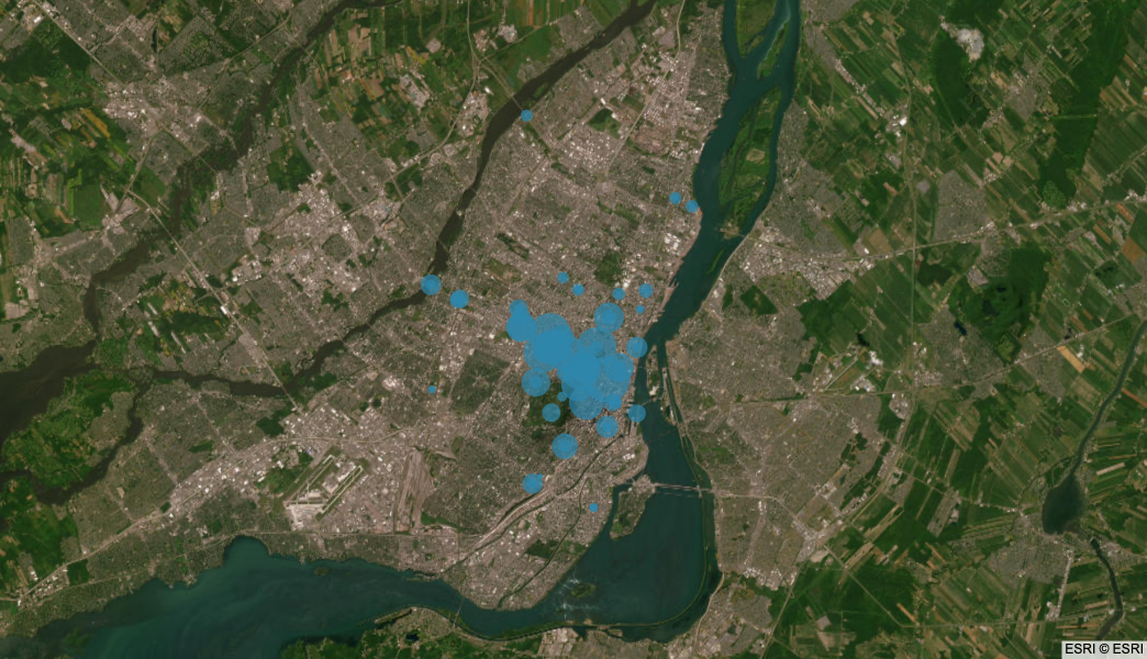
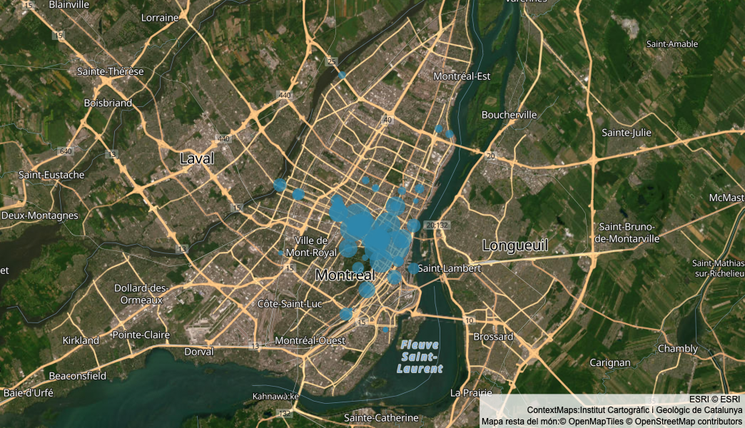
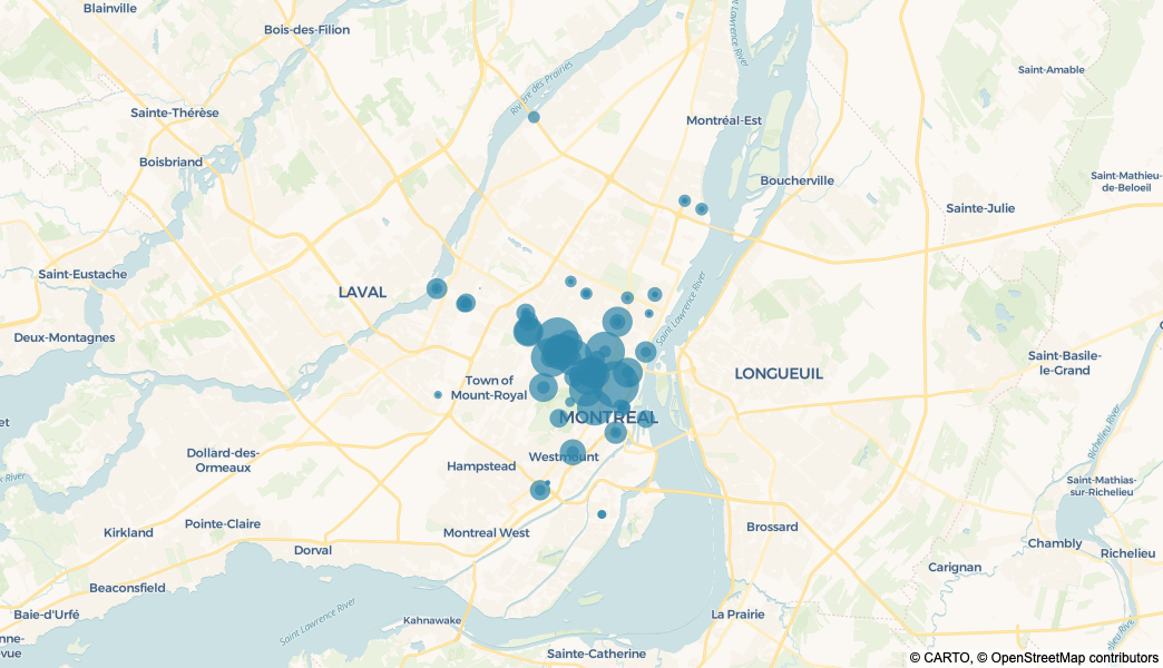
Scatter map
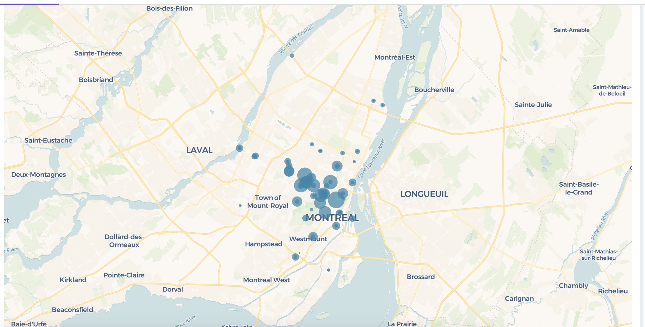
Display each row of data as a marker point at coordinates given by latitude and longitude columns.
Create a scatter map using <latitude> and <longitude>.
The following example uses this prompt structure with bicycle traffic counter data from the Montreal Open Data Portal:
Create a scatter map using latitude and longitude.
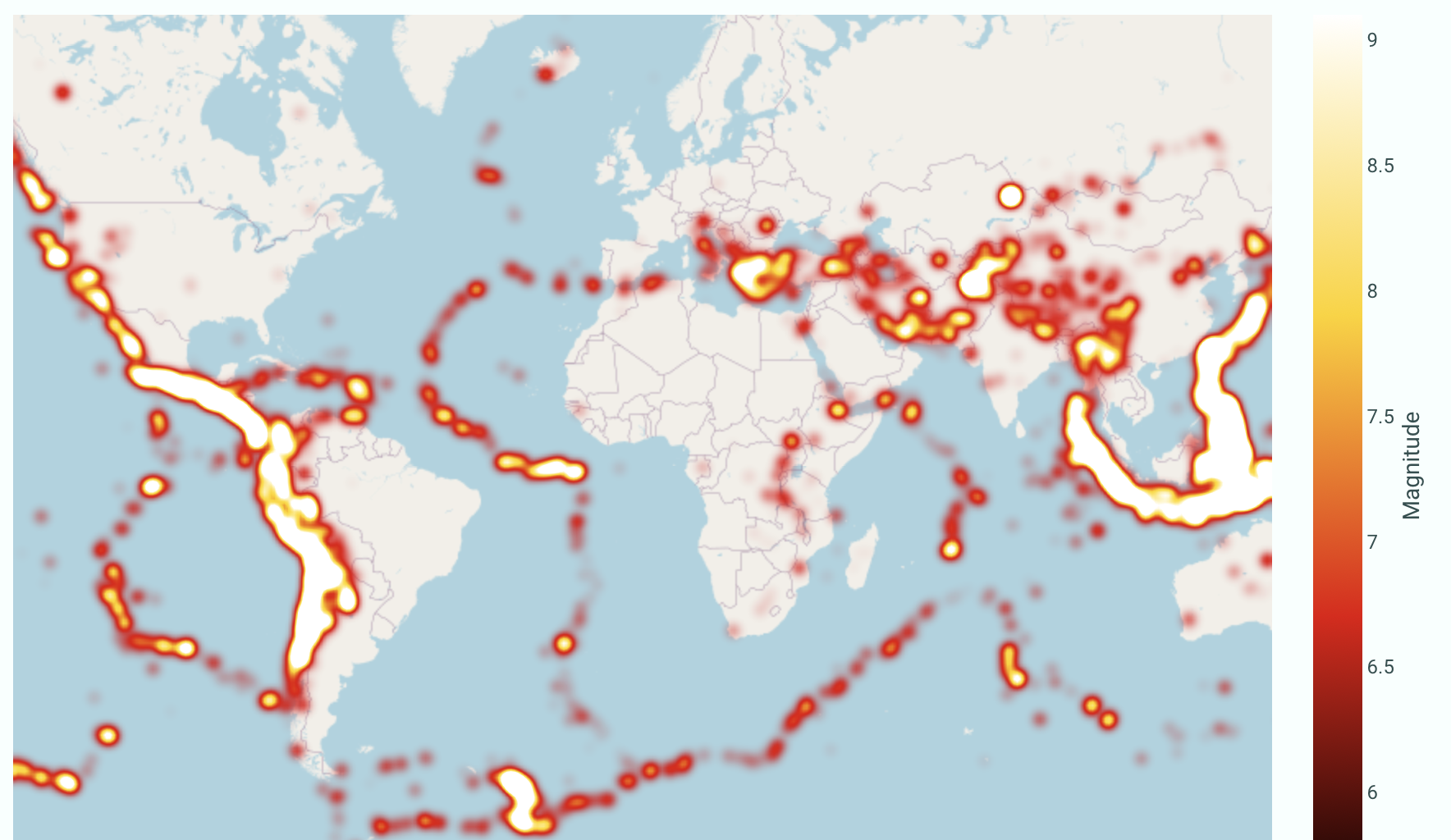
Density heatmap
Visualize point concentration patterns across geographic areas with density heatmaps, where each point is smoothed with a radius of influence.
Create a density heatmap map using <latitude> and <longitude>.
Use <Column> for intensity.
The following example uses this prompt structure with earthquake data from Plotly's public datasets repository to show areas of seismic activity:
Create a density heatmap map using latitude and longitude.
Use magnitude for intensity.
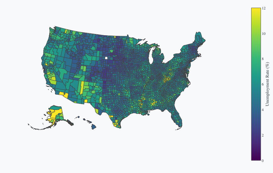
Choropleth map
Color geographic regions like countries, states, or counties based on data values. Choropleth maps require location identifiers (like state names, country codes, or FIPS codes) that match predefined geographic boundaries.
Create a choropleth map using <locations> colored by <Column>.
The following example uses this prompt structure with US county unemployment data from Plotly's public datasets repository. FIPS codes uniquely identify each US county, allowing the map to color counties based on their unemployment rates. The scope is set to USA to focus on the United States, the Viridis color scale provides clear visual distinction, and the color range is set from 0 to 12:
Create a choropleth map using county FIPS code for locations,
colored by unemployment rate.
Set scope to USA. Use Viridis color scale.
Set color range from 0 to 12.
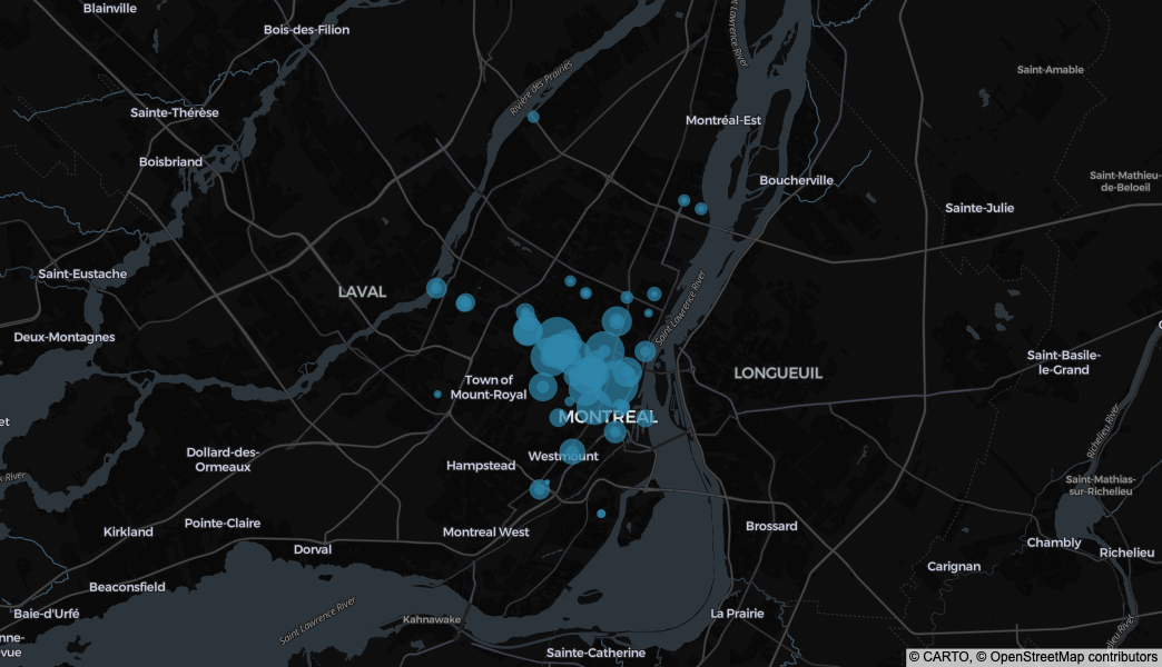
Map style customization
All three map types (scatter, density heatmap, and choropleth) support map style customization. Change the map style to suit your visualization needs, from basic to satellite imagery.
Create a scatter map using <latitude> and <longitude>.
Use <map_style> map style.
Here are prompts for the available map styles:
Create a scatter map using latitude and longitude. Use basic map style.

Create a scatter map using latitude and longitude. Use dark map style.
Create a scatter map using latitude and longitude. Use light map style.
Create a scatter map using latitude and longitude.
Use open-street-map map style.
Create a scatter map using latitude and longitude. Use satellite map style.
Create a scatter map using latitude and longitude.
Use satellite-streets map style.
Create a scatter map using latitude and longitude.
Use carto-voyager map style.
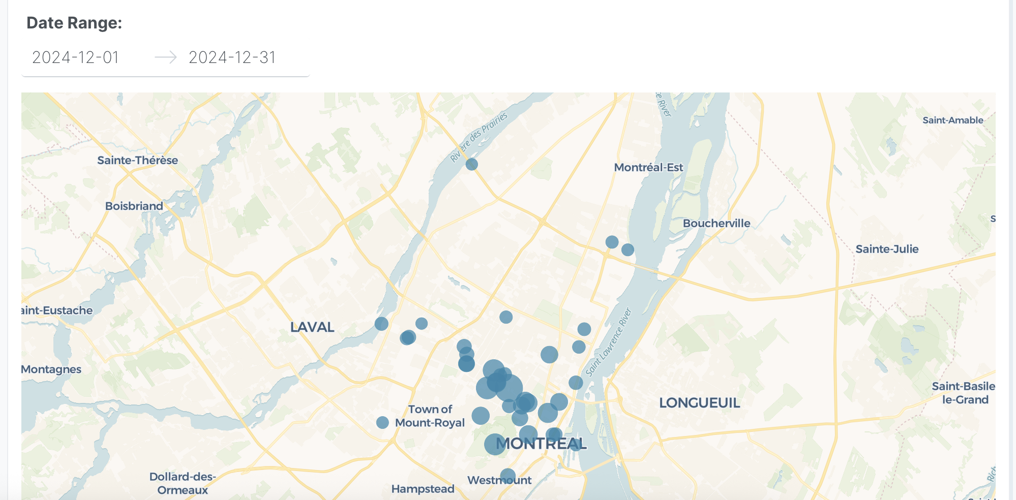
Interactive controls
Add dropdowns and other controls to make your scatter maps interactive. Controls let users filter and explore the data dynamically.
The following example uses this prompt structure with bicycle traffic counter data from the Montreal Open Data Portal:
Create a scatter map using latitude and longitude.
Size markers by total passages, aggregated by location and date.
Add a date range picker to filter by date range - Default last 30 days.
Prompt keywords reference
Use these keywords and phrases in your prompts to customize your map.
Chart
Here are some keyword suggestions to create and customize a chart:
| Keyword/Phrase | Description | Example |
|---|---|---|
| Latitude | The column containing latitude coordinates | latitude |
| Longitude | The column containing longitude coordinates | longitude |
| Color | Color markers by different groups or values | color by day of week |
| Size | Make markers larger or smaller based on a value | size by total passages |
| Keyword/Phrase | Description | Example |
|---|---|---|
| Latitude | The column containing latitude coordinates | latitude |
| Longitude | The column containing longitude coordinates | longitude |
| Z | Control the intensity/color of the heatmap | use magnitude for intensity |
| Keyword/Phrase | Description | Example |
|---|---|---|
| Locations | Geographic identifiers (state names, country codes, FIPS codes) | county FIPS code |
| Color | Color regions by different groups or values | colored by unemployment rate |
Data
Specify data instructions in your prompt to transform, filter, or aggregate your data before visualization.
Sum passages by location and date.
Filter to dates after 2024-01-01.
Here are some keyword suggestions:
| Keyword/Phrase | Description | Example |
|---|---|---|
| Aggregation | Specify how to aggregate data | sum passages by location |
| Computed field | Create new calculated fields from existing data | calculate weekday based on date |
| Filter | Filter data based on conditions | filter to dates after 2024-01-01 |
Options
Specify options in your prompt to add interactive controls that allow users to dynamically filter, transform, and visualize data without regenerating the chart.
Add a dropdown to select location type (All, Major, Minor) - Default All.
Add a date range picker to filter by date range - Default last 30 days.
Here are some keyword suggestions. See App Controls for a complete list of control types and additional examples.
| Keyword/Phrase | Description | Example |
|---|---|---|
| Dropdown | Add a dropdown menu to filter by categories | Add a dropdown to select location type (All, Major, Minor) - Default All |
| Date range picker | Add a date range selector | Add a date range picker to filter by date range - Default last 30 days |
Chart styles
Specify chart styles in your prompt to control the visual appearance and formatting of your map.
Use dark map style.
Set zoom level to 12.
Set marker opacity to 0.7.
Here are some keyword suggestions:
| Keyword/Phrase | Description | Example |
|---|---|---|
| Map style | Choose from map tile styles: basic, dark, light, open-street-map, satellite, satellite-streets, carto-voyager | Use satellite-streets map style |
| Zoom level | Set the initial zoom level (1-20) | Set zoom level to 12 |
| Center map | Set the center point of the map | Center map on Montreal |
| Marker size | Set fixed marker size for all points | Set marker size to 10 |
| Maximum marker size | Set maximum marker size when using Size mapping (default 20) | Set maximum marker size to 50 |
| Marker opacity | Control marker transparency | Set marker opacity to 0.7 |
| Show labels | Display text labels on markers from a data field | Show labels from counter name |
| Custom colors | Specify exact colors for categories or gradients | Use custom colors: #FF5733, #33FF57, #3357FF |
| Color scale | Specify color scale for continuous color mapping. See built-in color scales | Use Viridis color scale |
| Hover text | What to show when hovering over markers | Show counter name on hover |
Use dark map style.
Set radius to 10 pixels.
Set opacity to 0.5.
Here are some keyword suggestions:
| Keyword/Phrase | Description | Example |
|---|---|---|
| Map style | Choose from map tile styles: basic, dark, light, open-street-map, satellite, satellite-streets, carto-voyager | Use dark map style |
| Zoom level | Set the initial zoom level (1-20) | Set zoom level to 2 |
| Center map | Set the center point of the map | Center map on Pacific Ocean |
| Radius | Set the smoothing radius in pixels | Set radius to 10 pixels |
| Opacity | Set the transparency of the heatmap layer (0-1) | Set opacity to 0.5 |
| Custom colors | Specify exact colors for gradients | Use custom colors: #FF5733, #33FF57, #3357FF |
| Color scale | Specify color scale for continuous color mapping. See built-in color scales | Use Hot color scale |
| Color range | Set the min and max values for color scaling | Set color range from 0 to 8 |
| Hover text | What to show when hovering over the heatmap | Show location name on hover |
Use light map style.
Use Viridis color scale.
Set color range from 0 to 12.
Here are some keyword suggestions:
| Keyword/Phrase | Description | Example |
|---|---|---|
| Map style | Choose from map tile styles: basic, dark, light, open-street-map, satellite, satellite-streets, carto-voyager | Use light map style |
| Zoom level | Set the initial zoom level (1-20) | Set zoom level to 4 |
| Center map | Set the center point of the map | Center map on USA |
| Custom colors | Specify exact colors for categories or gradients | Use custom colors: #FF5733, #33FF57, #3357FF |
| Color scale | Specify color scale for continuous color mapping. See built-in color scales | Use Viridis color scale |
| Color range | Set the min and max values for color scaling | Set color range from 0 to 12 |
| Hover text | What to show when hovering over regions | Show county name on hover |